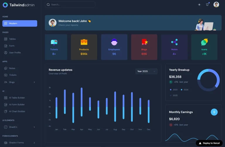
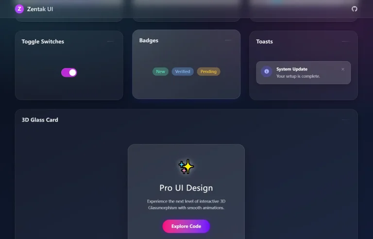
The Future of Web Dev
The Future of Web Dev
Free Next.js Admin Dashboard Template with Shadcn UI – AdminCN
Start a SaaS dashboard or internal tool with AdminCN Free, a Next.js template with an orders dashboard, mail, calendar, users, and forms.
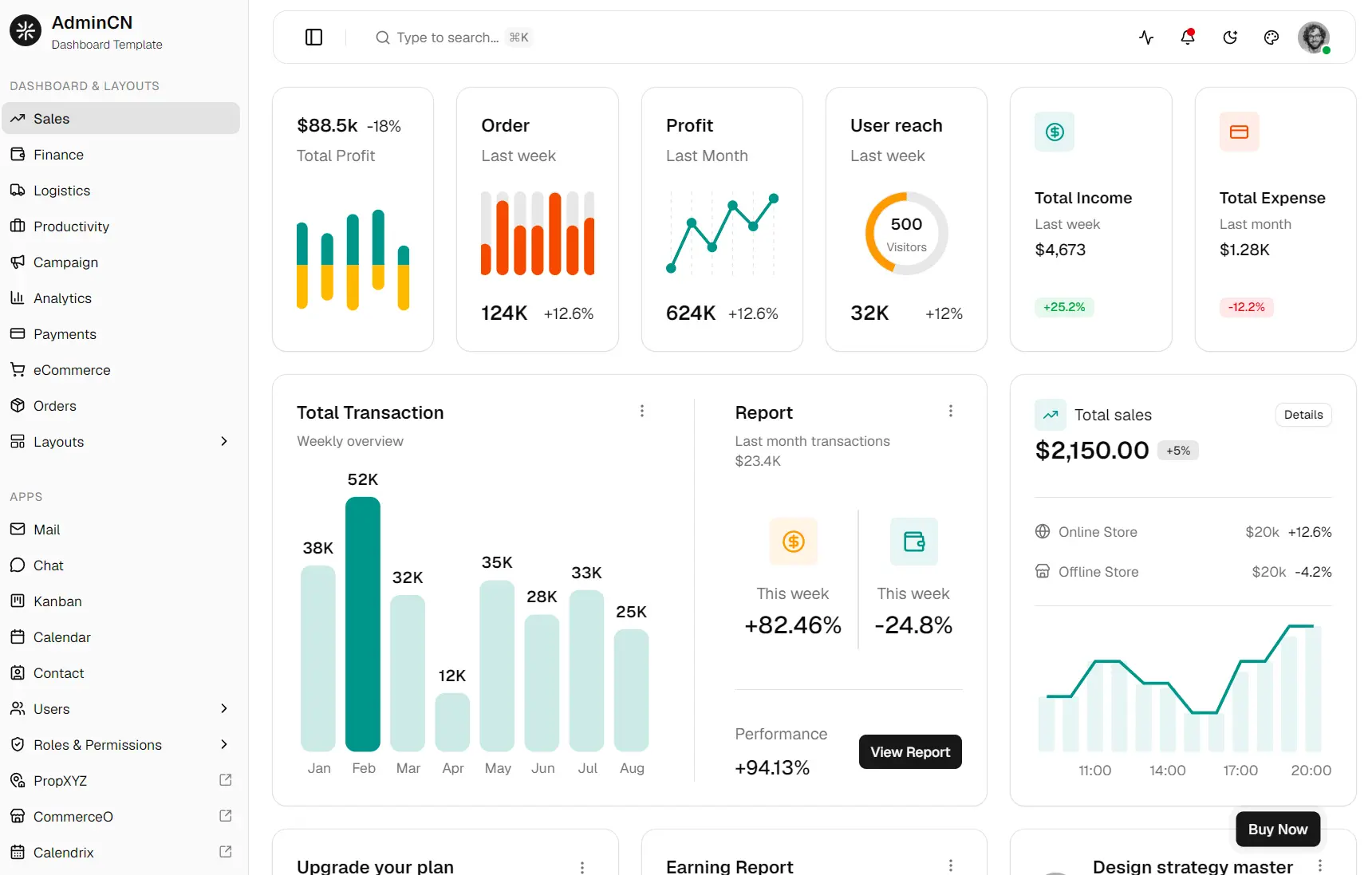
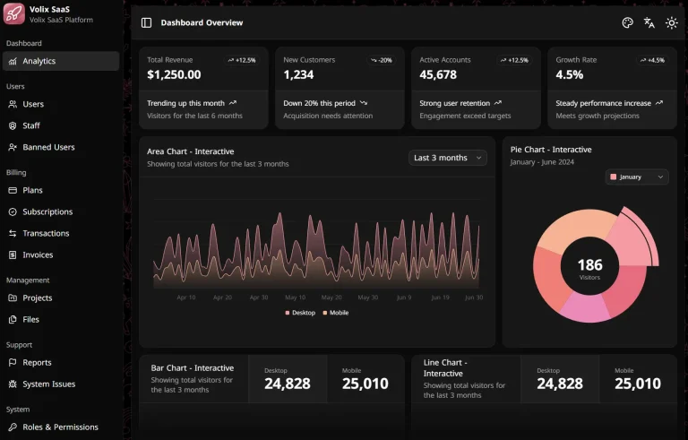
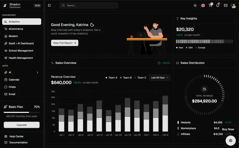
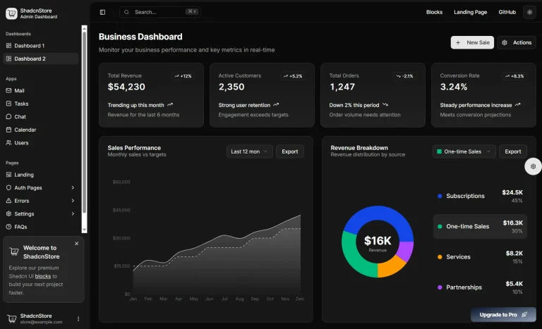
AdminCN Free is an open-source Next.js/shadcn admin dashboard template that provides an orders dashboard, mail and calendar interfaces, user pages, authentication screens, forms, charts, and data tables.
The template is designed for Next.js App Router projects with React, TypeScript, Tailwind CSS, and shadcn/ui.
Its route groups, dashboard shell, shared components, and configuration files form a frontend base for SaaS back offices, CRM screens, customer portals, internal tools, and order management systems.
How to Run AdminCN Free
Clone the AdminCN Free GitHub repository, install dependencies, and start the Next.js development server.
git clone https://github.com/shadcnstudio/shadcn-nextjs-admincn-admin-template-free.git
cd shadcn-nextjs-admincn-admin-template-free
pnpm install
pnpm dev
Open http://localhost:3000. The default dashboard route is /dashboard/orders.
Create a production build with the same scripts defined in package.json:
pnpm build
pnpm start
What AdminCN Free Contains
The free edition exposes one orders dashboard, three application areas, profile and settings pages, six authentication flows, form examples, and a reusable transaction table.
| Page | What’s included |
|---|---|
| Dashboard | Orders statistics, charts, earnings cards, product insights, and transactions |
| Mailbox interface and message views | |
| Calendar | Calendar and event interface |
| Users | User list and user detail views |
| Settings | General and workspace settings |
| Profile | Profile and connection pages |
| Authentication | Login, registration, forgotten password, email verification, password reset, and two-step verification |
| Forms | Vertical forms, horizontal forms, and validation examples |
| Data | Searchable transaction data table |
| System | Custom not-found page |
Project Structure
The source tree separates App Router routes, shared interface code, page-level views, configuration files, and mock data. The (pages) route group renders inside the admin shell. The (blank) group stores authentication and standalone screens.
src/
├── app/
│   ├── (pages)/
│   │   ├── dashboard/
│   │   ├── apps/
│   │   ├── pages/
│   │   ├── datatable/
│   │   └── forms/
│   ├── (blank)/
│   │   └── pages/
│   │       ├── auth/
│   │       └── misc/
│   ├── api/
│   ├── server/
│   ├── globals.css
│   ├── layout.tsx
│   └── not-found.tsx
├── assets/
├── components/
│   ├── layout/
│   ├── shared/
│   └── ui/
├── configs/
│   ├── navConfig.tsx
│   ├── themeConfig.ts
│   └── mailConfig.ts
├── fake-db/
├── hooks/
├── lib/
├── types/
├── utils/
└── views/
    ├── apps/
    ├── dashboards/
    ├── datatables/
    ├── forms/
└── pages/| Development Task | Primary Location |
|---|---|
| Change the application name or home route | src/configs/themeConfig.ts |
| Edit sidebar links and groups | src/configs/navConfig.tsx |
| Change colors and CSS variables | src/app/globals.css |
| Edit shadcn aliases | components.json |
| Change shared controls | src/components |
| Edit dashboard widgets and charts | src/views/dashboards |
| Edit application interfaces | src/views/apps |
| Replace sample records | Route files and src/fake-db |
| Add an admin route | src/app/(pages) |
| Add a standalone route | src/app/(blank) |
Add a New Admin Page
Create page-level interface code under src/views, then expose it through a route inside src/app/(pages). The admin route group supplies the existing sidebar and header shell.
Create src/views/reports/reports-view.tsx:
const ReportsView = () => {
  return (
    <div className="space-y-6">
      <div>
        <h1 className="text-2xl font-semibold">Reports</h1>
        <p className="text-muted-foreground">
          Review revenue, order volume, and customer activity.
        </p>
      </div>
    </div>
  )
}
export default ReportsView
Create src/app/(pages)/reports/page.tsx:
import ReportsView from '@/views/reports/reports-view'
const ReportsPage = () => {
  return <ReportsView />
}
export default ReportsPage
Add the Sidebar Entry
navConfig.tsx defines menu groups, Lucide icon names, routes, nested items, badges, and external targets. Add the reports route to the relevant items array.
{
  icon: 'BarChart3',
  label: 'Reports',
  href: '/reports'
}
Configure shadcn/ui
The repo has an existing components.json file with React Server Components and TypeScript enabled. It points shadcn UI files to src/components/ui, global CSS to src/app/globals.css, shared utilities to src/lib, and hooks to src/hooks. The selected style is base-vega, the base color is neutral, and Lucide supplies the icons.
{
  "style": "base-vega",
  "rsc": true,
  "tsx": true,
  "tailwind": {
    "css": "src/app/globals.css",
    "baseColor": "neutral",
    "cssVariables": true,
    "prefix": ""
  },
  "iconLibrary": "lucide",
  "aliases": {
    "components": "@/components",
    "utils": "@/lib/utils",
    "ui": "@/components/ui",
    "lib": "@/lib",
    "hooks": "@/hooks"
  }
}
Add another shadcn component from the project root. The CLI writes the component through the paths defined in components.json.
pnpm dlx shadcn@latest add dialogCustomize Colors and Layout Styles
Edit src/app/globals.css for global color variables, chart tokens, sidebar colors, border radius values, and dark mode values.
The shadcn configuration has cssVariables enabled. Components reference semantic classes such as bg-background, text-foreground, border-border, and text-muted-foreground. Update the related CSS variables to apply a consistent palette across the admin shell and local UI files.
Component files live inside the application. Edit Tailwind classes, variants, markup, and interaction logic directly under src/components/ui, src/components/shared, or the matching view folder.
Replace Demo Data with an API
The template uses local arrays, route handlers, Server Actions, and files under src/fake-db for its demonstration interfaces. Replace each mock source after the related backend endpoint is ready. Search the repository for imports from @/fake-db before deleting the folder.
App Router pages are Server Components by default. Fetch records at the route level, then pass serializable data into client-side tables, forms, charts, and filters. Add "use client" only to components that use state, effects, event handlers, or browser APIs.
Add the private API address to .env.local:
API_BASE_URL=https://api.example.comCreate src/lib/data/transactions.ts:
import type { Item } from '@/views/datatables/datatable-transaction'
export async function getTransactions(): Promise<Item[]> {
  const apiBaseUrl = process.env.API_BASE_URL
  if (!apiBaseUrl) {
    throw new Error('API_BASE_URL is not set')
  }
  const response = await fetch(`${apiBaseUrl}/transactions`, {
    cache: 'no-store'
  })
  if (!response.ok) {
    throw new Error('Failed to load transactions')
  }
  return response.json()
}
Replace the local transaction array in the orders route:
import { Card } from '@/components/ui/card'
import { getTransactions } from '@/lib/data/transactions'
import TransactionDatatable from '@/views/datatables/datatable-transaction'
const OrdersDashboard = async () => {
  const transactions = await getTransactions()
  return (
    <Card className="w-full py-0">
      <TransactionDatatable data={transactions} />
    </Card>
  )
}
export default OrdersDashboard
Free and Pro Scope
AdminCN Free contains the default orders dashboard and a smaller set of apps and page variants. The paid edition adds dashboard categories, alternative shell layouts, more application interfaces, onboarding screens, additional settings pages, and extra form and table variants.
| Free Edition | Pro Edition | |
|---|---|---|
| Dashboards | Orders | Sales, finance, logistics, productivity, campaign, analytics, payments, ecommerce, and orders |
| Shell layouts | Default | Horizontal, full navbar, split, icon menu, and paper |
| Apps | Mail, calendar, and users | Mail, chat, kanban, calendar, contacts, users, roles, and permissions |
| Settings | General and workspace | Notifications, integrations, members, security, billing, and more |
| Authentication | One variant per flow | Three variants per flow |
| Form layouts | Vertical and horizontal | Extra form variants, sticky forms, and form wizards |
| Data table | One implementation | Additional table variants |
| Landing and onboarding pages | None | Present |
Deployment
Run the production build before deploying the project:
pnpm buildSet private environment values through the hosting platform. Deploy the generated Next.js application through Vercel or another Node.js host that runs the next start command.
Alternatives and Related Resources