The Future of Web Dev
The Future of Web Dev
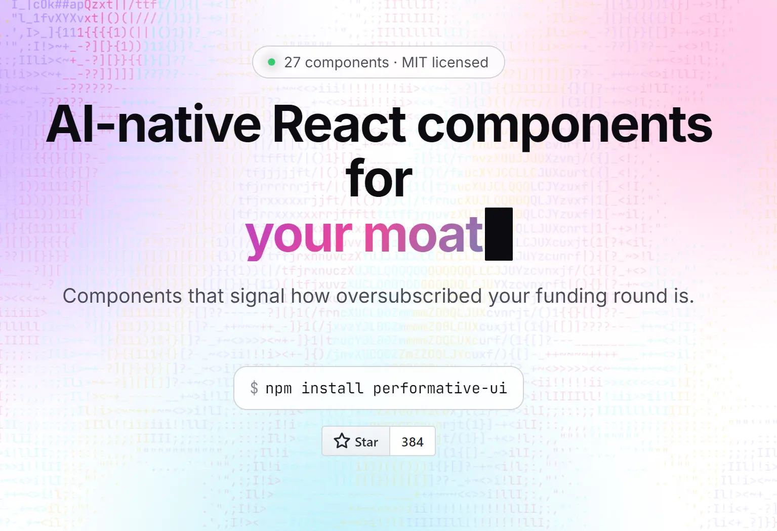
performative-UI: 27+ React Components for AI Startups
React/Next.js UI components for AI landing pages with prompt boxes, chat bubbles, token streams, pricing cards, logo marquees, and animated heroes.
performativeUI is a React component library designed for AI startups, landing pages, product sites, waitlists, demos, and pitch-style prototypes.
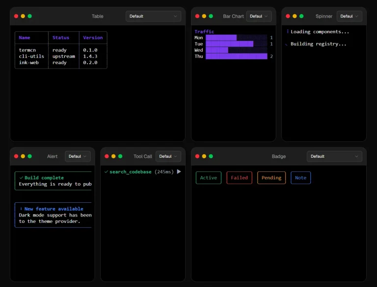
It currently includes 27 UI components, from gradient text and sparkle animations to chat bubbles and waitlist forms.
Features
- React components for AI landing pages and SaaS marketing screens.
- Prompt boxes, chat bubbles, token streams, and chat floating action buttons.
- Hero patterns such as rotating text, word rolls, prompt heroes, and ASCII hero sections.
- Abstract backgrounds such as aurora blobs, node graphs, and floating sparkles.
- Pricing and conversion UI through pricing cards, before and after blocks, waitlist forms, and popovers.
- Exports TypeScript types for components, hooks, and utility helpers.
Use Cases
- An AI SaaS landing page needs sparkle animations and gradient headlines to match the current trend.
- A demo for investors requires a chat interface and waitlist form without building from scratch.
- A product launch page wants social proof components like logo rows and stat counters.
- An internal prototype needs a mock IDE or glass card surface to visualize the final UI direction.
How To Use It
Table Of Contents
Install
npm install performative-uiThe package lists react and react-dom as peer dependencies. It supports React 18 and React 19.
For a standard React or Vite app, import components directly from the package:
import { Button, PromptHero } from "performative-ui";The main entry imports the library stylesheet. The package also exports a CSS file at this path:
import "performative-ui/styles.css";Use that explicit CSS import when your framework needs a direct stylesheet entry.
Basic Usage
import { Button, PromptHero } from "performative-ui";
export default function LandingHero() {
  return (
    <section>
      <h1>Build a research assistant for your team</h1>
      <PromptHero
        placeholder="Ask for a market summary..."
        ctaLabel="Run analysis"
        onSubmit={(prompt) => {
          console.log("Submitted prompt:", prompt);
        }}
      />
      <Button variant="glow" sparkle>
        Join the waitlist
      </Button>
    </section>
  );
}
Next.js App Router Usage
Place interactive examples in a Client Component. PromptHero, TokenStream, and several animated components use client-side state or effects.
"use client";
import { PromptHero, TokenStream } from "performative-ui";
export function ProductHero() {
  return (
    <section>
      <h1>AI workflow reviews for product teams</h1>
      <PromptHero
        placeholder="Review this onboarding funnel..."
        ctaLabel="Start review"
        onSubmit={(value) => {
          window.location.href = `/demo?prompt=${encodeURIComponent(value)}`;
        }}
      />
      <p>
        <TokenStream
          text="Analyzing activation drop-off, support friction, and conversion paths..."
          speedMs={35}
        />
      </p>
    </section>
  );
}
Keep this component out of a Server Component file. You may still render it inside a Server Component by importing the Client Component wrapper.
Available Components
Button
Button supports variant, size, sparkle, loading, block, and as.
<Button variant="wave" size="lg" sparkle>
  Edit in chat
</Button>
<Button as="a" href="/demo" variant="ghost">
  View demo
</Button>
Available variants include glow, shimmer, ghost, solid, and wave. Available sizes include sm, md, and lg.
PromptHero
PromptHero renders a form with a leading icon, text input, and CTA button. It supports controlled and uncontrolled usage.
Useful props include placeholder, defaultValue, value, onChange, onSubmit, leading, ctaLabel, and hideCta.
ChatBubble
ChatBubble accepts role="user" or role="ai". AI bubbles support agent, thinking, and icon.
<ChatBubble role="ai" agent="Research Bot" thinking="reading sources...">
  I found three relevant product pages.
</ChatBubble>
Pass thinking={false} to hide the thinking pill.
TokenStream
TokenStream reveals text over time. It accepts text, speedMs, tokenize, loop, loopDelayMs, onComplete, and hideCaret.
<TokenStream
  text="Drafting launch copy from your product notes..."
  speedMs={30}
  onComplete={() => console.log("done")}
/>
PricingCard
PricingCard uses compound subcomponents: PricingCard.Flag, PricingCard.Tier, PricingCard.Amount, PricingCard.Blurb, PricingCard.Features, and PricingCard.CTA.
Set featured on the root card to apply the highlighted pricing style.
Alternatives and Related Resources
- Copy-paste React Components for AI Chat UI – Nexus UI
- JSON-Native UI Components for AI Conversations – Tool UI
- Chat UI Components for React and shadcn/ui – chatcn
- Build AI-native Apps Faster with Vercel’s AI Elements Component Library
- 26+ Animated React Components for Next.js – Vengeance UI
FAQs
Q: Is this a full AI app UI framework?
A: No. It focuses on landing page and marketing UI patterns. You still need your own chat state, backend routes, LLM API calls, auth, and analytics.
Q: Can I customize the components?
A: Yes. Most components accept standard HTML props and className. For deeper changes, inspect the TypeScript source and override the related pui- CSS classes.
Q: Does it work with Next.js App Router?
A: Yes. Add "use client" at the top of any file that imports components. The client-side components rely on browser APIs for animations and SSE.
Q: Does the TokenStream component require a backend?
A: Yes. The component consumes SSE streams from a server endpoint. Set up a route that returns text/event-stream responses.