The Future of Web Dev
The Future of Web Dev
React Document Components for Document-heavy Apps – Extend UI
Build React document workflows with PDF, DOCX, XLSX, CSV viewers, file upload, review panels, citations, and shadcn registry installs.
Extend UI is a React & shadcn/ui component library that adds document viewers, file upload, review panels, citations, and file browsing to document-heavy apps.
It’s great for document agents, user-facing review flows, and internal tools where your users need to inspect PDFs, Word files, spreadsheets, uploads, OCR output, and extracted fields in one React interface.
The library uses the shadcn registry model. Install the components into your project as a local source, then adjust the generated files to match your own design system, aliases, and UI primitives.
Features
- Adds PDF, DOCX, XLSX, and CSV viewing surfaces for document workflows.
- Includes review UI for extracted values, bounding box citations, and JSON diffs.
- Installs individual components through the shadcn CLI.
- Uses local component source that you can edit inside your app.
- Handles file upload flows with validation, progress states, retry controls, and queues.
- Adds Finder-style file browsing for object-store manifests.
- Supports OCR layout review with selectable blocks, confidence overlays, and PDF-linked regions.
Use Cases
- A document automation app needs PDF previews next to extracted invoice fields.
- Internal review teams can track scanned paperwork through upload queues, thumbnails, and file status panels.
- Manual validation becomes faster when extracted values link back to exact regions in the source document.
- Claims, finance, and legal dashboards need folder-style browsing for contracts, invoices, receipts, and supporting files.
How To Use It
Install
Extend UI uses the shadcn registry model. Each component installs separately through the shadcn CLI:
npx shadcn@latest add @extend/pdf-viewerOr install several at once:
npx shadcn@latest add @extend/pdf-viewer
npx shadcn@latest add @extend/docx-viewer
npx shadcn@latest add @extend/xlsx-viewer
npx shadcn@latest add @extend/file-upload
npx shadcn@latest add @extend/file-thumbnail
npx shadcn@latest add @extend/e-signature
The CLI writes component source files into your project at the paths your components.json maps. Shared base primitives like Button, Select, Dialog, ScrollArea, and Tooltip come from Coss UI and land in your existing components/ui/ folder alongside other shadcn components. Set your path aliases in components.json before running any install command. Updating aliases afterward means editing import paths inside the generated files manually.
The PDF Viewer loads PDF.js CMap and standard font assets from unpkg by default. To avoid external CDN requests, copy pdfjs-dist/cmaps and pdfjs-dist/standard_fonts into your public folder and pass a documentOptions prop with the local paths.
Basic Usage
import { PDFViewer } from "@/components/ui/pdf-viewer"
export default function Page() {
  return <PDFViewer file="/contracts/agreement.pdf" className="h-[720px]" />
}
The file prop takes a URL or public path. The viewer renders all toolbar controls (zoom, rotation, navigation, text selection) with no additional configuration.
Practical Examples
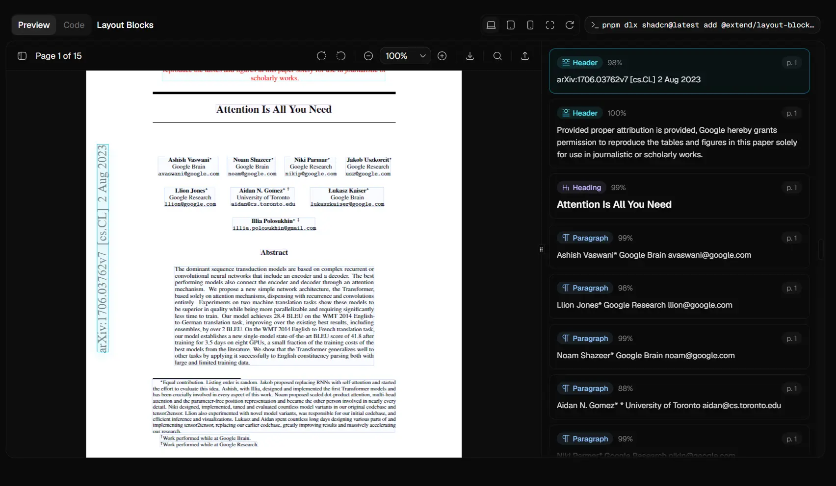
Bounding Box Citation Review
The bounding box citations component places extracted field values next to the source location in the PDF. Each field maps to a page area, so reviewers can confirm that extracted data matches what appears on the page. This is the primary human-in-the-loop review surface.
npx shadcn@latest add @extend/bounding-box-citations-blockimport type { ReviewField } from "@/components/ui/bounding-box-citations"
import { HumanReviewBlock } from "@/components/blocks/bounding-box-citations-block"
const fields: ReviewField[] = [
{
key: "contract_value",
schema: {
type: "number",
title: "Contract value",
description: "Total contract amount in USD.",
},
actual: 48500,
expected: 48500,
location: {
page: 1,
area: { left: 62, top: 82, width: 22, height: 4 },
},
},
]
export default function ReviewPage() {
return (
<HumanReviewBlock
file="/documents/contract.pdf"
fields={fields}
className="h-[720px]"
/>
)
}File Upload with Queue Management
The file upload component handles drag-and-drop, file type validation, progress tracking, and retry states for batches of PDFs, DOCX files, Excel workbooks, images, and CSVs.
npx shadcn@latest add @extend/file-uploadimport { FileUpload } from "@/components/ui/file-upload"
export default function UploadPage() {
return (
<FileUpload
description="PDF, DOCX, or XLSX only"
multiple={true}
onFilesAccepted={(files) => {
// Forward accepted files to your processing endpoint
console.log(files)
}}
/>
)
}File System (Finder-style Browser)
The file system component reads an array of file and folder items and renders them in icon, list, column, or gallery view. Clicking a file opens it in a viewer dialog for PDF, DOCX, XLSX, and images.
npx shadcn@latest add @extend/file-system-blockimport type { FileSystemItem } from "@/components/ui/file-system"
import { FileSystemBlock } from "@/components/blocks/file-system-block"
const items: FileSystemItem[] = [
{
kind: "folder",
path: "contracts/",
hasChildren: true,
},
{
kind: "file",
path: "nda-2025.pdf",
contentType: "application/pdf",
url: "/documents/nda-2025.pdf",
previewImageUrl: "/documents/nda-2025-thumb.png",
},
]
export default function FilesPage() {
return (
<FileSystemBlock
items={items}
title="Contract Files"
defaultView="icons"
className="h-[720px]"
getFileUrl={(file) =>
`/api/files/sign?path=${encodeURIComponent(file.path)}`
}
loadChildren={async ({ path }) => {
const res = await fetch(`/api/files?prefix=${encodeURIComponent(path)}`)
return res.json()
}}
/>
)
}All Available Components
| Component | Registry Handle | Status |
|---|---|---|
| PDF Viewer | @extend/pdf-viewer | Stable |
| DOCX Viewer | @extend/docx-viewer | Stable |
| DOCX Editor | @extend/docx-editor | Experimental |
| Excel Viewer | @extend/xlsx-viewer | Stable |
| Excel Editor | @extend/xlsx-editor | Experimental |
| CSV Viewer | @extend/csv-tsv-viewer | Stable |
| File Upload | @extend/file-upload | Stable |
| File System (Finder) | @extend/file-system-block | Stable |
| Bounding Box Citations | @extend/bounding-box-citations-block | Stable |
| Schema Builder | @extend/schema-builder | Stable |
| File Thumbnail | @extend/file-thumbnail | Stable |
| Layout Blocks | @extend/layout-blocks-block | Stable |
| E-Signature | @extend/e-signature | Stable |
| Document Splits | @extend/document-splits | Stable |
| Document Viewer Sidebar | @extend/document-viewer-sidebar | Stable |
Alternatives and Related Resources
- Modern Drag-and-Drop File Uploader with shadcn/ui
- Clean Drag & Drop File Input Component – Shadcn Dropzone
- Customizable Table Views – Shadcn View Table
- Accessible Copy-paste UI Components for shadcn – Dice UI
- Copy-Paste PDF Components for React (PDFx)
- React PDF Viewer Powered By Hooks
FAQs
Q: Does Extend UI work like a normal npm component package?
A: No. It follows the shadcn registry workflow. You copy component source into your project and then maintain that source with your app.
Q: What should I do if a document component fails during Next.js SSR?
A: Move the viewer or review surface into a Client Component first. For Bounding Box Citations, the docs recommend next/dynamic with ssr: false if browser-only APIs cause SSR errors.
Q: Can I use Extend UI with my own file storage API?
A: Yes. The File System component expects normalized file data, signed URLs, and thumbnail paths from your app. Keep S3, R2, or backend-specific listing logic in your API routes.
Q: Which component should I start with for document processing apps?
A: Start with @extend/pdf-viewer for document preview, @extend/file-upload for ingestion, or @extend/bounding-box-citations for human review. Add File System later when users need folder browsing or object-store navigation.
Q: Can I use Extend UI components in a Next.js App Router project?
A: Yes, but viewer components use browser APIs and run only as Client Components. Add "use client" to any file that renders them directly, or use next/dynamic with { ssr: false } to lazy-load them on the client.
Q: Can I override component styles to match my design system?
A: Yes. Each component is source code in your project. Edit the files in components/ui/ directly to change layout, colors, toolbar slots, or any other behavior. No separate config file governs the styling.