The Future of Web Dev
The Future of Web Dev
NeonBlade UI: Futuristic React Components for Tailwind CSS
Add animated sci-fi backgrounds, neon controls, charts, tables, loaders, and navigation to React projects.
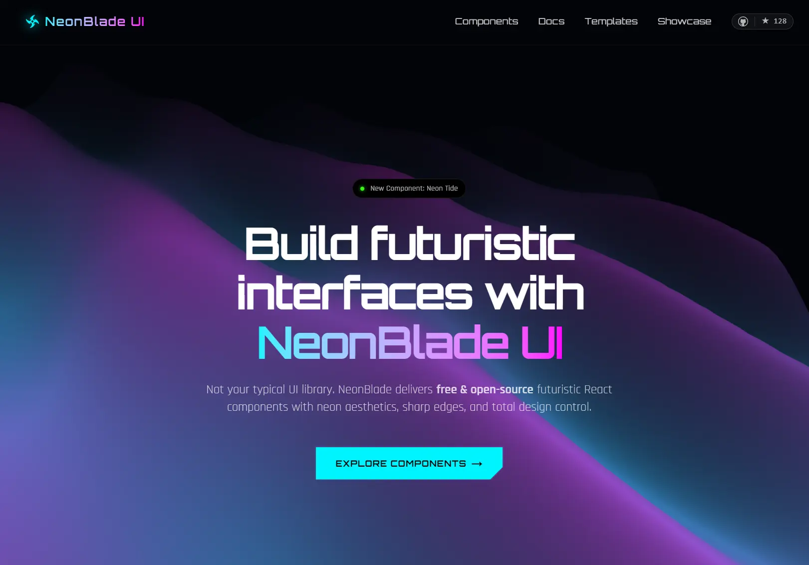
NeonBlade UI is a React component library for building neon, sci-fi, and cyberpunk UIs with Tailwind CSS.
ASCII Rain, Holographic Terrain, glitch text, and custom cursors define its sci-fi styling. Forms, navigation, tables, charts, cards, and loaders handle the rest of the UI.
Features
- 40+ React UI components.
- 10 animated and static background effects.
- Local component source installed through the NeonBlade CLI.
- Tailwind CSS utilities plus component-scoped CSS for specialized effects.
- Component-specific props for colors, sizes, variants, animation settings, glow intensity, layout, and interaction behavior.
- Recharts-powered line, bar, and donut charts, plus Three.js effects such as Holographic Terrain.
- Automatic npm, pnpm, and Yarn detection.
- Two free Next.js templates built from NeonBlade components.
Use Cases
- Cyberpunk dashboards with KPI cards, neon charts, sortable tables, progress indicators, and themed navigation.
- Sci-fi landing pages with ASCII rain, synthwave grids, glitch text, holographic terrain, and corner-cut controls.
- Admin and monitoring screens with inputs, selects, toggles, modals, tables, loaders, and status components.
- Developer portfolios, game-related sites, and experimental React projects that need a strong neon design language.
How To Use NeonBlade UI
Set Up Tailwind CSS
NeonBlade UI uses Tailwind CSS v4. For Next.js:
npm install tailwindcss @tailwindcss/postcssImport Tailwind from the global stylesheet:
@import "tailwindcss";For Vite React:
npm install tailwindcss @tailwindcss/viteList Available Components
Run the CLI with no component name:
npx neonblade addInstall a Component
Add a registry item by name:
npx neonblade add corner-cut-buttonThe CLI prompts for an output path before writing files. Its default location depends on the project structure:
| Project Structure | Default Component Directory |
|---|---|
Project has src/ | src/components/neonblade-ui/ |
Project has app/ and no src/ | app/components/neonblade-ui/ |
| Neither directory exists | components/neonblade-ui/ |
Each component manifest defines its source files and npm dependencies. corner-cut-button writes an index.tsx file plus component CSS and has no extra package dependency. neon-line-chart also writes local source and CSS, then installs recharts.
Basic Usage
Import the installed component from the output directory selected during installation. This example assumes @ resolves to the project source root:
import CornerCutButton from "@/components/neonblade-ui/corner-cut-button";
export default function DashboardAction() {
  return (
    <CornerCutButton
      color="cyan"
      variant="solid"
      corner="bottom-right"
      hoverEffect="glow"
      glowIntensity="medium"
      showArrow
    >
      Open dashboard
    </CornerCutButton>
  );
}
CLI Telemetry
The current CLI sends anonymous component download events by default and shows a telemetry notice on first use. Disable telemetry with:
npx neonblade telemetry disableCheck or re-enable it with:
npx neonblade telemetry status
npx neonblade telemetry enable
Available UI Components
| Category | Components |
|---|---|
| Backgrounds | Datalines With Grid, Ascii Rain, Glyph City, Cyber Circuit, Hexagons, Pluviophile, Holographic Terrain, Neon Tide, Grid Floor, Grid Scene |
| Cards | Border Beam Corner Cut, Notch Card, Neon Glow Corner Cut Card |
| Elements | Accent Frame, Badge, Timeline, Neon Modal |
| Progress | Progress Bar, Circular Progress, Arrow Loader, Rain Loader, Turbine Loader |
| Text | Glitch Text, Neon Glow, Outline Text |
| Buttons | Corner Cut Button |
| Navbars | NavBar |
| Footers | Footer |
| Inputs | Neon Input, Neon Toggle, Neon Checkbox, Neon Select |
| Sliders | Card Slider |
| Cursors | Crosshair, Fox Cursor |
| Tables | Neon Table |
| Charts | Neon Line Chart, Neon Bar Chart, Neon Donut Chart, Neon Sparkline, Stat Card |
Free NeonBlade Templates
| Template | Stack | Main UI |
|---|---|---|
| Nexus – Analytics Dashboard | Next.js, TypeScript, Tailwind CSS, Recharts | Sidebar navigation, KPI cards, neon charts, sortable tables, settings forms |
| Software Developer Portfolio | Next.js, TypeScript, Tailwind CSS | Projects, skills, experience, contact content, dark portfolio layout |
Alternatives and Related Resources