enhanced-button is an extension for the default shadcn/ui button component that currently provides 9 additional visual styles and animated effects.
It’s created to help you apply complex button styles to modern web apps, without the need to write custom CSS or manage multiple button components.
Features & Effects
🔧 Drop-in replacement for existing shadcn-ui button components with no breaking changes.
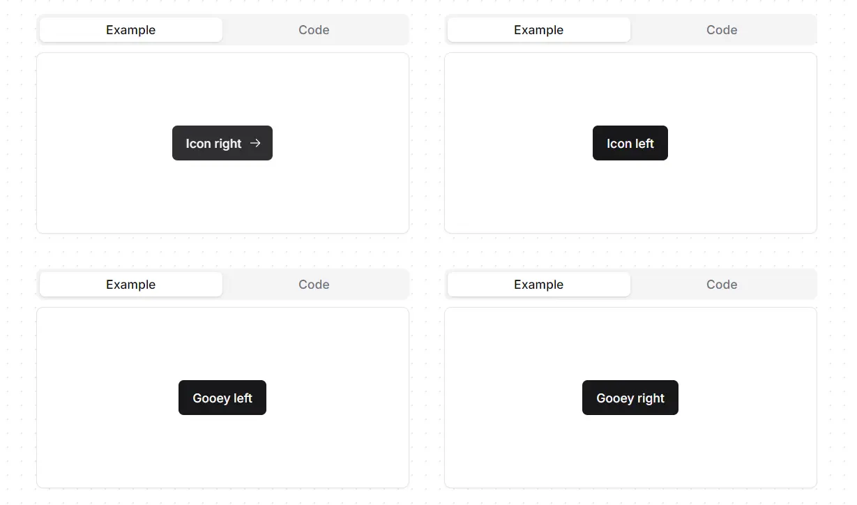
↔️ expandIcon: An icon animates into view from the side when you hover over the button.
💍 ringHover: A colored ring appears around the button on hover, providing visual feedback.
✨ shine: A continuous, looping shine animation moves across the button’s surface.
🌟 shineHover: A single shine animation plays across the button when you hover over it.
💧 gooeyRight: A fluid, “gooey” background effect animates from the right side on hover.
💧 gooeyLeft: A fluid, “gooey” background effect animates from the left side on hover.
✍️ underline: A static underline appears beneath the button text.
✒️ hoverUnderline: An underline animates into view under the button text on hover.
🎨 gradientSlideShow: The button’s background features a continuously flowing animated gradient.
Use Cases
- Create a primary call-to-action button on a landing page using the
shineorgooeyRighteffect to draw user attention. - Design “Learn More” or “Continue” buttons with the
expandIconeffect and an arrow icon to signify forward movement. - Style subtle text-based buttons or navigation links with the
hoverUnderlineeffect for a clean and modern user interface. - Develop engaging form submission buttons that use the
ringHovereffect to confirm the user’s focus.
How to Use It
1. To get started, your project must have shadcn-ui and the standard button component installed in your project.
2. Navigate to the src/components/ui/ directory in your project and open the button.tsx file. Replace the entire contents of this file with the new code:
// button.tsx
import * as React from 'react';
import { Slot, Slottable } from '@radix-ui/react-slot';
import { cva, type VariantProps } from 'class-variance-authority';
import { cn } from '@/lib/utils';

const buttonVariants = cva(
  'inline-flex items-center justify-center gap-2 whitespace-nowrap rounded-md text-sm font-medium ring-offset-background transition-colors focus-visible:outline-none focus-visible:ring-2 focus-visible:ring-ring focus-visible:ring-offset-2 disabled:pointer-events-none disabled:opacity-50 [&_svg]:pointer-events-none [&_svg]:size-4 [&_svg]:shrink-0',
  {
    variants: {
      variant: {
        default: 'bg-primary text-primary-foreground hover:bg-primary/90',
        destructive: 'bg-destructive text-destructive-foreground hover:bg-destructive/90',
        outline: 'border border-input bg-background hover:bg-accent hover:text-accent-foreground',
        secondary: 'bg-secondary text-secondary-foreground hover:bg-secondary/80',
        ghost: 'hover:bg-accent hover:text-accent-foreground',
        link: 'text-primary underline-offset-4 hover:underline',
      },
      effect: {
        expandIcon: 'group gap-0 relative',
        ringHover: 'transition-all duration-300 hover:ring-2 hover:ring-primary/90 hover:ring-offset-2',
        shine:
          'before:animate-shine relative overflow-hidden before:absolute before:inset-0 before:rounded-[inherit] before:bg-[linear-gradient(45deg,transparent_25%,rgba(255,255,255,0.5)_50%,transparent_75%,transparent_100%)] before:bg-[length:250%_250%,100%_100%] before:bg-no-repeat background-position_0s_ease',
        shineHover:
          'relative overflow-hidden before:absolute before:inset-0 before:rounded-[inherit] before:bg-[linear-gradient(45deg,transparent_25%,rgba(255,255,255,0.5)_50%,transparent_75%,transparent_100%)] before:bg-[length:250%_250%,100%_100%] before:bg-[position:200%_0,0_0] before:bg-no-repeat before:transition-[background-position_0s_ease] hover:before:bg-[position:-100%_0,0_0] before:duration-1000',
        gooeyRight:
          'relative z-0 overflow-hidden transition-all duration-500 before:absolute before:inset-0 before:-z-10 before:translate-x-[150%] before:translate-y-[150%] before:scale-[2.5] before:rounded-[100%] before:bg-gradient-to-r from-white/40 before:transition-transform before:duration-1000  hover:before:translate-x-[0%] hover:before:translate-y-[0%]',
        gooeyLeft:
          'relative z-0 overflow-hidden transition-all duration-500 after:absolute after:inset-0 after:-z-10 after:translate-x-[-150%] after:translate-y-[150%] after:scale-[2.5] after:rounded-[100%] after:bg-gradient-to-l from-white/40 after:transition-transform after:duration-1000  hover:after:translate-x-[0%] hover:after:translate-y-[0%]',
        underline:
          'relative !no-underline after:absolute after:bg-primary after:bottom-2 after:h-[1px] after:w-2/3 after:origin-bottom-left after:scale-x-100 hover:after:origin-bottom-right hover:after:scale-x-0 after:transition-transform after:ease-in-out after:duration-300',
        hoverUnderline:
          'relative !no-underline after:absolute after:bg-primary after:bottom-2 after:h-[1px] after:w-2/3 after:origin-bottom-right after:scale-x-0 hover:after:origin-bottom-left hover:after:scale-x-100 after:transition-transform after:ease-in-out after:duration-300',
        gradientSlideShow:
          'bg-[size:400%] bg-[linear-gradient(-45deg,var(--gradient-lime),var(--gradient-ocean),var(--gradient-wine),var(--gradient-rust))] animate-gradient-flow',
      },
      size: {
        default: 'h-10 px-4 py-2',
        sm: 'h-9 rounded-md px-3',
        lg: 'h-11 rounded-md px-8',
        icon: 'h-10 w-10',
      },
    },
    defaultVariants: {
      variant: 'default',
      size: 'default',
    },
  }
);

interface IconProps {
  icon: React.ElementType;
  iconPlacement: 'left' | 'right';
}

interface IconRefProps {
  icon?: never;
  iconPlacement?: undefined;
}

export interface ButtonProps extends React.ButtonHTMLAttributes<HTMLButtonElement>, VariantProps<typeof buttonVariants> {
  asChild?: boolean;
}

export type ButtonIconProps = IconProps | IconRefProps;

const Button = React.forwardRef<HTMLButtonElement, ButtonProps & ButtonIconProps>(
  ({ className, variant, effect, size, icon: Icon, iconPlacement, asChild = false, ...props }, ref) => {
    const Comp = asChild ? Slot : 'button';
    return (
      <Comp className={cn(buttonVariants({ variant, effect, size, className }))} ref={ref} {...props}>
        {Icon &&
          iconPlacement === 'left' &&
          (effect === 'expandIcon' ? (
            <div className="w-0 translate-x-[0%] pr-0 opacity-0 transition-all duration-200 group-hover:w-5 group-hover:translate-x-100 group-hover:pr-2 group-hover:opacity-100">
              <Icon />
            </div>
          ) : (
            <Icon />
          ))}
        <Slottable>{props.children}</Slottable>
        {Icon &&
          iconPlacement === 'right' &&
          (effect === 'expandIcon' ? (
            <div className="w-0 translate-x-[100%] pl-0 opacity-0 transition-all duration-200 group-hover:w-5 group-hover:translate-x-0 group-hover:pl-2 group-hover:opacity-100">
              <Icon />
            </div>
          ) : (
            <Icon />
          ))}
      </Comp>
    );
  }
);
Button.displayName = 'Button';

export { Button, buttonVariants };
3. The animations require custom keyframes and animation utilities. Open your tailwind.config.ts file and add the keyframes and animation configurations inside the extend object. This step registers the new animations with Tailwind CSS so they can be applied to the button component.
TailwindCSS 4 Support is under development
// tailwind.config.ts
const config = {
  // ...
  extend: {
    keyframes: {
      shine: {
        '0%': { backgroundPosition: '200% 0' },
        '25%': { backgroundPosition: '-200% 0' },
        '100%': { backgroundPosition: '-200% 0' },
      },
      gradientFlow: {
        '0%': { 'background-position': '0% 50%' },
        '50%': { 'background-position': '100% 50%' },
        '100%': { 'background-position': '0% 50%' },
      },
    },
    animation: {
      shine: 'shine 3s ease-out infinite',
      'gradient-flow': 'gradientFlow 10s ease 0s infinite normal none running',
    },
  },
  // ...
}
4. You can now use the new effect prop in your Button components alongside existing props like variant and size.
import { Button } from "./ui/button";
<Button variant="destructive" effect="gooeyRight" size="lg">
  Destructive Gooey right
</Button>
5. To add an icon, you can use a library like lucide-react.
npm install lucide-react
import { Button } from './ui/button';
import { ArrowRight } from 'lucide-react';

<Button variant="outline" effect="expandIcon" icon={ArrowRight} iconPlacement="right">
  Continue
</Button>
FAQs
Q: Does Enhanced Button work with existing shadcn-ui button implementations?
A: Yes, Enhanced Button is designed as a drop-in replacement. All existing button code will continue working without modifications since the component maintains full backward compatibility with the original shadcn-ui button API.
Q: Can I use multiple effects on the same button?
A: The effect prop accepts only one value at a time, but you can combine effects with different variants and custom CSS classes to achieve complex visual behaviors.
Q: How do I customize the animation timing and colors?
A: You can modify the Tailwind configuration keyframes and animation durations to adjust timing. Color customization works through CSS custom properties and the existing shadcn-ui theming system, allowing you to match your brand colors.