The Future of Web Dev
The Future of Web Dev
200+ Extended UI Components & Blocks for shadcn/ui – Shadcn Space
200+ open-source Shadcn UI components, 40+ blocks, and free templates for React and Next.js. Copy, paste, and own the code.
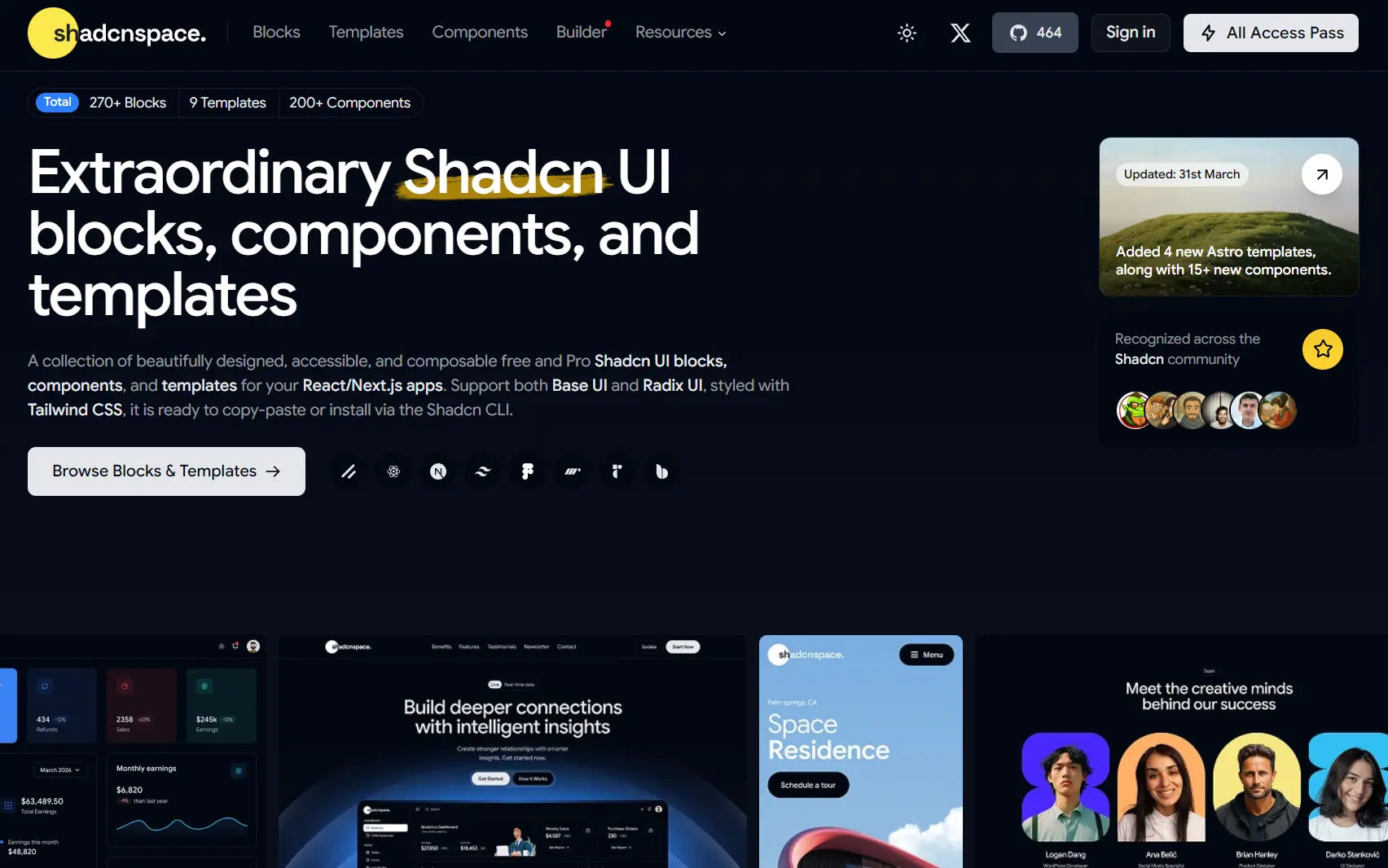
Shadcn Space is a Shadcn UI component registry that provides 200+ open-source, copy-paste React components and 40+ UI blocks built on shadcn/ui and Base UI primitives.
You can install the components and blocks with the Shadcn CLI or copy the source code directly into your project. Then you tune the structure, variants, and styling inside the code you own.
Features
🎨 Clean Component Design: Balanced spacing and consistent visual structure across all components, blocks, and templates.
🏗️ System-First Architecture: Components, blocks, templates, and dashboards share a unified structure and naming convention.
🧱 Base UI and Radix UI Support: Base UI primitives back interaction logic, keyboard behavior, and predictable component states across the library.
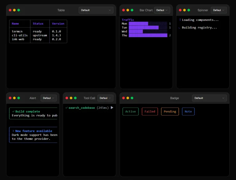
📦 200+ Free Components: Accordion, Button, Card, Calendar, Combobox, Dialog, Input, Navbar, Sidebar, Table, Tabs, Tooltip, and dozens more, all built for real application logic.
🔲 40+ Reusable UI Blocks: Pre-built sections for hero areas, feature showcases, dashboard widgets, and marketing layouts.
📐 3+ Templates and Dashboard Kits: Full layouts for SaaS products, admin panels, onboarding flows, and internal tools.
🎨 Tailwind CSS with CVA: Utility-first styling with variant control through Class Variance Authority.
🎞️ Motion Support: Framer Motion variants handle animated interactions at the component level.
How to Use It
1. Run the shadcn init command first if the project does not yet have a shadcn/ui base:
npx shadcn@latest init2. Install UI components using the Shadcn CLI:
npx shadcn@latest add @shadcn-space/button-063. For teams that prefer selective adoption, copy any component directly from the GitHub repository or the Shadcn Space website.
- Copy the full component source.
- Paste it into the project’s component directory.
- Update import paths to match the project structure.
- Adjust Tailwind classes or variant definitions as needed.
4. Blocks are pre-built page sections that combine multiple core components. Add a block the same way as a component:
npx shadcn@latest add @shadcn-space/hero-01
npx shadcn@latest add @shadcn-space/dashboard-section-02
Related Resources
- Framer Motion: Animation library integrated as an optional motion layer in interactive components.
- shadcn/ui: The base component system that Shadcn Space extends with additional variants, blocks, and templates.
- Base UI: Unstyled, accessible React primitives that back the interaction layer across Shadcn Space components.
- Tailwind CSS: Utility-first CSS framework used for all component styling in the distribution.
FAQs
Q: Does Shadcn Space replace shadcn/ui?
A: No. Shadcn Space extends shadcn/ui with more variants, blocks, and templates. The existing shadcn/ui configuration stays in place.
Q: Can I use Shadcn Space alongside existing Radix UI components?
A: Yes. The distribution supports both Radix UI and Base UI primitives. Any existing Radix-backed components continue to work alongside Shadcn Space additions.
Q: Do I need to install a separate npm package?
A: No npm package is required. Components copy directly into the project as source files through the CLI or via manual copy from the repository.
Q: Is the full component library free?
A: The free tier includes 110+ components, 40+ blocks, and 3+ templates. A Pro tier exists with additional components and layouts beyond the free set.
Q: Do Shadcn Space components work with Next.js App Router?
A: Yes. The components are standard React components compatible with both the Pages Router and the App Router in Next.js 13 and later.