The Future of Web Dev
The Future of Web Dev
Gauge UI: Composable SVG Gauges for React & shadcn/ui
Build speedometers, dials, zone meters, nested gauges, and radial controls from editable React source installed through shadcn.
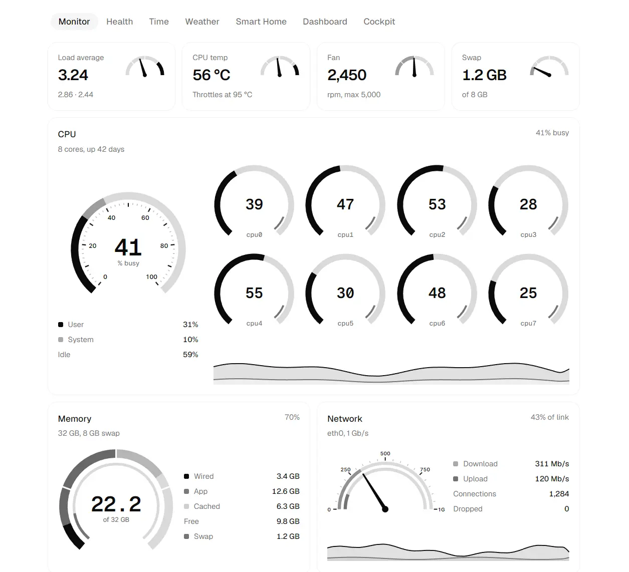
Gauge UI is a React gauge component library that creates SVG speedometers, dials, progress gauges, and radial controls from composable primitives.
You can use its Studio to generate code for a gauge composition, and the shadcn registry installs editable TypeScript source into components/gauge/.
The root Gauge defines the numeric domain and geometry. Tracks, arcs, zones, ticks, labels, needles, values, nested dials, and controls read that gauge state through React context.
Features
- SVG primitives for tracks, arcs, stacks, zones, ticks, marks, labels, needles, values, and text.
GaugeInsetfor nested dials and concentric instruments.GaugeControlfor pointer and keyboard value input.- Spring and tween transitions with reduced-motion handling.
- Gauge Studio for assembling dials and copying generated code.
- Local TypeScript source installed through the shadcn registry.
Use Cases
- Vehicle and telemetry dashboards with speed, RPM, fuel, temperature, or pressure dials.
- Monitoring panels with threshold zones, tick marks, and an active-value arc.
- Thermostats, dimmers, volume controls, and other radial inputs.
- Instrument panels with a main dial and smaller nested gauges.
How To Use Gauge UI
Initialize shadcn if needed
Run the shadcn initializer when your project does not already have components.json:
npx shadcn@latest initInstall Gauge UI
Install the registry item directly from Gauge UI:
npx shadcn@latest add https://gauge-ui.dev/r/gauge.jsonOptional Namespace Setup
Add the Gauge UI namespace to components.json when you want name-based registry commands:
{
  "registries": {
    "@gauge-ui": "https://gauge-ui.dev/r/{name}.json"
  }
}
npx shadcn@latest add @gauge-ui/gaugeBasic Usage
Set the value domain on Gauge, then compose the SVG parts needed for the dial:
import {
  Gauge,
  GaugeArc,
  GaugeHub,
  GaugeNeedle,
  GaugeTickLabels,
  GaugeTicks,
  GaugeTrack,
  GaugeValue,
  GaugeZones,
  zoneColor,
} from "@/components/gauge"
const loadZones = [
  { to: 60, color: "#22c55e" },
  { to: 80, color: "#f59e0b" },
  { to: 100, color: "#ef4444" },
]
export function ServerLoadGauge({ value }: { value: number }) {
  return (
    <div className="size-72">
      <Gauge
        value={value}
        min={0}
        max={100}
        startAngle={40}
        endAngle={320}
        transition
      >
        <GaugeTrack width={14} />
        <GaugeZones zones={loadZones} width={14} />
        <GaugeArc
          width={14}
          color={zoneColor(loadZones, value, "currentColor")}
        />
        <GaugeTicks count={10} />
        <GaugeTickLabels count={5} />
        <GaugeNeedle style="pointer" />
        <GaugeHub />
        <GaugeValue decimals={0} />
      </Gauge>
    </div>
  )
}
Gauge Primitives
| Primitive | Purpose |
|---|---|
GaugeTrack | Background arc across the gauge sweep |
GaugeArc | Current-value or fixed-range arc |
GaugeStack | Value arc divided by weights or fixed cutoffs |
GaugeZones | Colored bands based on numeric cutoffs |
GaugeTicks | Evenly spaced tick marks |
GaugeMarks | Marks at chosen values or equal domain cuts |
GaugeTickLabels | Numeric or formatted labels around the arc |
GaugeNeedle | Line, pointer, compass, or arrow needle |
GaugeHub | Center cap for a needle |
GaugeDot | Dot that follows the active value around the arc |
GaugeValue | Formatted current numeric value |
GaugeText | Positioned SVG text for titles, units, or labels |
GaugeInset | Gauge nested inside another gauge |
GaugeControl | Radial slider wrapper for pointer and keyboard input |
Gauge Configuration
| Prop | Default | Purpose |
|---|---|---|
value | Required | Numeric value rendered by the gauge |
min | 0 | Lower domain boundary |
max | 100 | Upper domain boundary |
startAngle | 40 | Start of the clockwise sweep |
endAngle | 320 | End of the clockwise sweep |
radius | 200 | Reference radius in SVG units |
padding | 48 | Extra SVG room for strokes, ticks, and labels |
fit | "square" | Uses the full circle box or the rendered arc bounds |
transition | Off | Spring or tween animation for value changes |
initialValue | Not set | Starting value for an animated mount |
Animate Gauge Values
Set transition to use the default spring, pass spring parameters, or select a timed tween:
// Default spring
<Gauge value={value} transition />
// Spring tuned by duration and bounce
<Gauge
  value={value}
  transition={{
    type: "spring",
    visualDuration: 0.4,
    bounce: 0.25,
  }}
/>
// Spring tuned with physics values
<Gauge
  value={value}
  transition={{
    type: "spring",
    stiffness: 120,
    damping: 14,
    mass: 1,
  }}
/>
// Timed tween
<Gauge
  value={value}
  transition={{
    type: "tween",
    duration: 0.6,
    ease: "easeOut",
  }}
/>| Option | Applies To | Default |
|---|---|---|
visualDuration | Spring | 0.5 seconds |
bounce | Spring | 0.1 |
stiffness, damping, mass | Spring physics | 100, 10, 1 when any physics value is set |
duration | Tween | 0.5 seconds |
ease | Tween | "easeInOut" |
Turn the Gauge Into a Radial Input
GaugeControl wraps a square gauge with role="slider". It accepts pointer input around the dial and keyboard input through Arrow keys, Page Up, Page Down, Home, and End. Set knob for relative drag changes across the dial face. The required label prop supplies its accessible name.
"use client"
import { useState } from "react"
import {
  Gauge,
  GaugeArc,
  GaugeControl,
  GaugeHub,
  GaugeNeedle,
  GaugeTrack,
  GaugeValue,
} from "@/components/gauge"
export function ThermostatDial() {
  const [temperature, setTemperature] = useState(72)
  return (
    <GaugeControl
      className="size-72"
      value={temperature}
      onChange={setTemperature}
      min={50}
      max={90}
      step={1}
      startAngle={40}
      endAngle={320}
      label="Thermostat temperature"
      valueText={`${temperature} degrees Fahrenheit`}
      knob
    >
      <Gauge
        value={temperature}
        min={50}
        max={90}
        startAngle={40}
        endAngle={320}
        transition
      >
        <GaugeTrack width={18} />
        <GaugeArc width={18} color="#0ea5e9" />
        <GaugeNeedle style="pointer" length={0.72} />
        <GaugeHub />
        <GaugeValue
          y={72}
          format={(value) => `${Math.round(value)}°`}
        />
      </Gauge>
    </GaugeControl>
  )
}| Prop | Purpose |
|---|---|
value | Controlled numeric value |
onChange | Receives the next value from pointer or keyboard input |
label | Required accessible name |
valueText | Spoken text for the current value |
min, max | Input boundaries |
step | Drag and Arrow-key increment |
startAngle, endAngle | Input sweep matched to the rendered gauge |
knob | Uses relative drag changes from the dial face |
onPress | Handles a center press, Enter, or Space |
disabled | Disables pointer and keyboard changes |
Nest Gauges Inside a Dial
GaugeInset creates another gauge context inside the host SVG. Its x, y, and scale props position the nested dial. The inset keeps its own value, domain, angles, and transition.
<Gauge value={speed} min={0} max={240} startAngle={40} endAngle={320}>
  <GaugeTicks count={12} />
  <GaugeNeedle style="pointer" />
  <GaugeHub />
  <GaugeInset
    value={fuel}
    y={144}
    scale={0.28}
    min={0}
    max={100}
    startAngle={90}
    endAngle={270}
  >
    <GaugeTrack width={26} />
    <GaugeArc width={26} />
  </GaugeInset>
</Gauge>
Studio, Files, and Customization
- Build a composition in the Gauge UI Studio and copy the generated React code.
- Edit the installed TypeScript files directly in
components/gauge/. - Use
fit="content"when the SVG box should follow the rendered arc bounds. Increasepaddingwhen thick strokes or labels extend past the reference circle. - Use
width,color,opacity,cap, andoffseton arc-style primitives for stroke styling. - Use
formatonGaugeValueandGaugeTickLabelsfor custom text. - Use
zoneColor,zoneCutoffs,compassLabel,clockLabel,clockTime,durationLabel, andfadeColorfrom the gauge module for generated or custom compositions.
Alternatives and Related Resources