The Future of Web Dev
The Future of Web Dev
Hugeicons Animated: Motion Icons for React & shadcn/ui
Copy animated Hugeicons into your project through the shadcn registry. Each icon comes with editable SVG geometry and hand-tuned Motion variants.
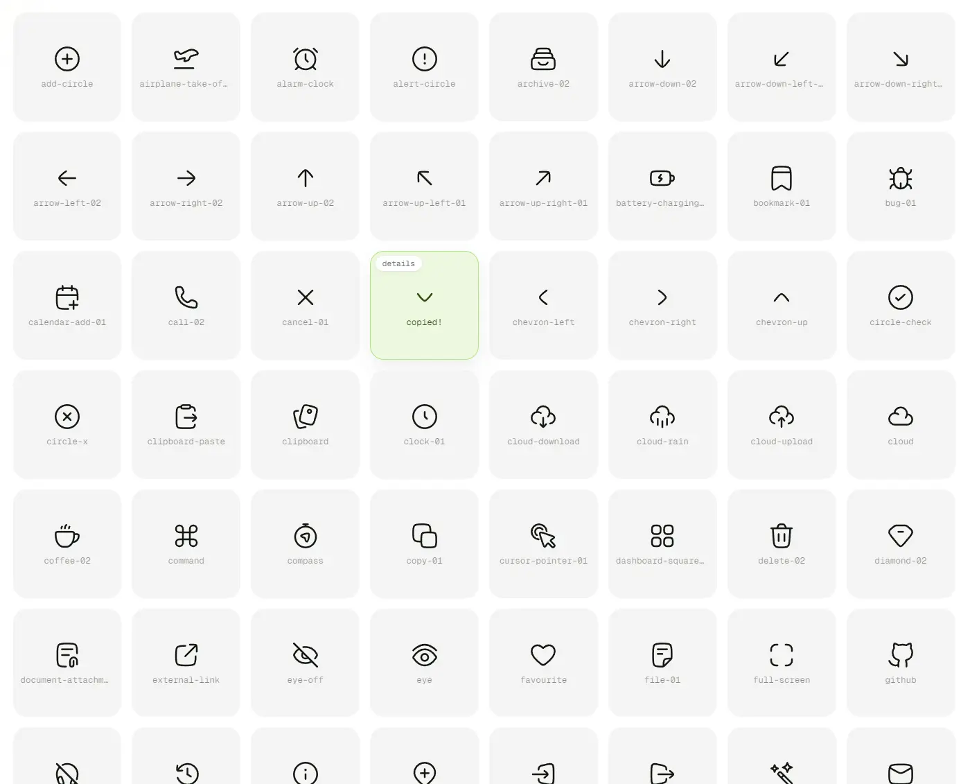
Hugeicons Animated is a React icon collection that adds hand-authored Motion gestures to SVGs from the free Hugeicons set.
The animated icons are installed through the shadcn CLI as editable TypeScript source, with automatic hover animation and optional playback control through React refs.
Features
- Icon-specific SVG gestures, including bell swings, checkmark drawing, and loader rotation.
- Individual shadcn registry installs with local
.tsxfiles and a shared animation helper. - Finite gestures that finish their cycle and looping gestures that stop and return to rest.
startAnimation()andstopAnimation()methods.- Configurable SVG size,
currentColorstrokes, and Tailwind styling on the wrapper. - Automatic
prefers-reduced-motionhandling.
Available Animated Icons
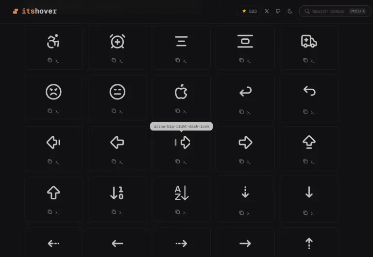
Choose an icon from the live gallery, where you can preview its gesture and copy the installation command.
| UI Category | Available Icons | Common Placement |
|---|---|---|
| Navigation | arrow-left-02, arrow-down-02, chevron-down, external-link, menu-01 | Navigation bars and menus |
| Notifications and feedback | notification-03, alert-circle, circle-check, information-circle, sparkles | Notifications, alerts, and status messages |
| Actions | copy-01, clipboard-paste, delete-02, download-01, share-08 | Toolbars and action menus |
| Application controls | refresh, loading-03, search-01, settings-01, play, pause | Refresh, loading, search, and playback |
| Accounts and communication | user-add-01, login-01, logout-01, mail-01, message-01 | Account controls and messaging |
How To Use It
1. Install an Animated Icon
Run the shadcn CLI from your React or Next.js project root. If the project has not been initialized for shadcn, create its components.json configuration and @/lib/utils helper first:
npx shadcn@latest initInstall the animated notification bell. The registry installs motion when needed and writes the icon and its shared animation helper using your configured shadcn aliases:
npx shadcn@latest add @hugeicons-animated/notification-03With default aliases, the installed source files are:
components/
└── ui/
    └── notification-03.tsx
lib/
└── use-icon-animation.ts
2. Basic Usage
Import the installed icon and render it in JSX. The hover trigger belongs to the icon’s wrapper, and the SVG inherits the surrounding text color.
import { Notification03Icon } from "@/components/ui/notification-03";
export function NotificationLabel() {
  return (
    <div className="inline-flex items-center gap-2 text-slate-700">
      <Notification03Icon size={24} aria-hidden />
      <span>Notifications</span>
    </div>
  );
}
3. Control a Loading Animation from React State
loading-03 has a continuous rotation that responds to startAnimation() and stopAnimation(). Install it before connecting playback to the loading state of your app:
npx shadcn@latest add @hugeicons-animated/loading-03"use client";
import { useEffect, useRef } from "react";
import {
Loading03Icon,
type Loading03IconHandle,
} from "@/components/ui/loading-03";
type InventorySyncStatusProps = {
isSyncing: boolean;
};
export function InventorySyncStatus({ isSyncing }: InventorySyncStatusProps) {
const loadingIcon = useRef<Loading03IconHandle>(null);
useEffect(() => {
if (isSyncing) {
loadingIcon.current?.startAnimation();
} else {
loadingIcon.current?.stopAnimation();
}
}, [isSyncing]);
return (
<div role="status" className="inline-flex items-center gap-2">
<Loading03Icon
ref={loadingIcon}
size={20}
aria-hidden
className={isSyncing ? "opacity-100" : "opacity-0"}
/>
<span>{isSyncing ? "Syncing inventory..." : "Inventory up to date"}</span>
</div>
);
}Component Props and Animation Methods
The animated icons share a small public API. className, standard div event handlers, and ARIA attributes apply to the outer wrapper, not the nested SVG.
| Prop | Type | Behavior |
|---|---|---|
size | number | SVG width and height in pixels; defaults to 28 |
className | string | Classes applied to the wrapper div |
ref | Icon-specific handle | Enables controlled animation and turns off automatic hover playback |
| Other DOM props | HTMLAttributes<HTMLDivElement> | Attributes and event handlers forwarded to the wrapper |
| Ref Method | Behavior |
|---|---|
startAnimation() | Starts the gesture unless reduced motion is active or playback is already running |
stopAnimation() | Stops a looping gesture and returns it to rest; does not interrupt a finite gesture |
Styling and Local Customization
Set size={20} to change SVG dimensions. Use className="text-indigo-600" or a CSS color value to change the currentColor strokes on the SVG. Tailwind width and height utilities applied through className resize the outer div, not the SVG itself.
Edit the installed icon’s .tsx file to change its stroke width, transform origin, keyframes, or Motion transitions. Those values live in the source code. They are not documented as shared strokeWidth, duration, or color props. Check the @/lib/use-icon-animation and @/lib/utils imports after changing project aliases.
Alternatives and Related Resources
- Animated Icon Components for React and Next.js – Its Hover
- Keyline Icons: 580+ SVG Icons for React and shadcn/ui
- 300+ Motion Animated Heroicons for React
- 100+ Animated, Customizable SVG Icons for React & Next.js
- Doodle Icons: Animated Hand-Drawn React SVG Icons
FAQs
Q: Do I need to install @hugeicons/core-free-icons?
A: No. The shadcn registry copies the icon’s SVG geometry into your project. Its installed runtime dependency is Motion, along with the shadcn helper imports.
Q: Why does automatic hover stop after adding a React ref?
A: A ref switches the icon to controlled playback. Call startAnimation() from the parent control’s pointer, focus, or application-state handler.
Q: Why doesn’t stopAnimation() immediately stop the refresh icon?
A: refresh performs a finite rotation. Finite animations finish their current cycle. Use loading-03 for a continuous rotation that stops when stopAnimation() runs.
Q: Can I set a custom duration or stroke width through props?
A: The shared component API does not expose those props. Edit the Motion variants and SVG paths in the local .tsx file.