Shadcn/UI Kanban Board is a modern, accessible task management component built for React applications using the Shadcn/UI design system.
You can use it to manage workflows, track tasks, or organize content pipelines within your application.
Features
⚡ Performance optimization with useJsLoaded hook and skeleton loading
🔍 Full accessibility support with keyboard controls and screen reader announcements
🎨 Automatic theming integration with Shadcn/UI color schemes
🔄 Framework flexibility – works with local state, React Router, or Next.js Server Actions
🧩 Extensible API with custom DnD monitors and announcement handlers
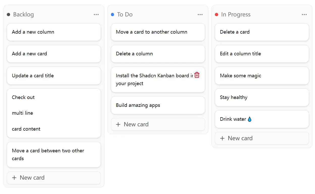
✨ Inline editing capabilities for columns and cards
🎯 Auto-scroll functionality to keep new content visible
🔧 Built-in CRUD operations for adding, editing, and deleting items
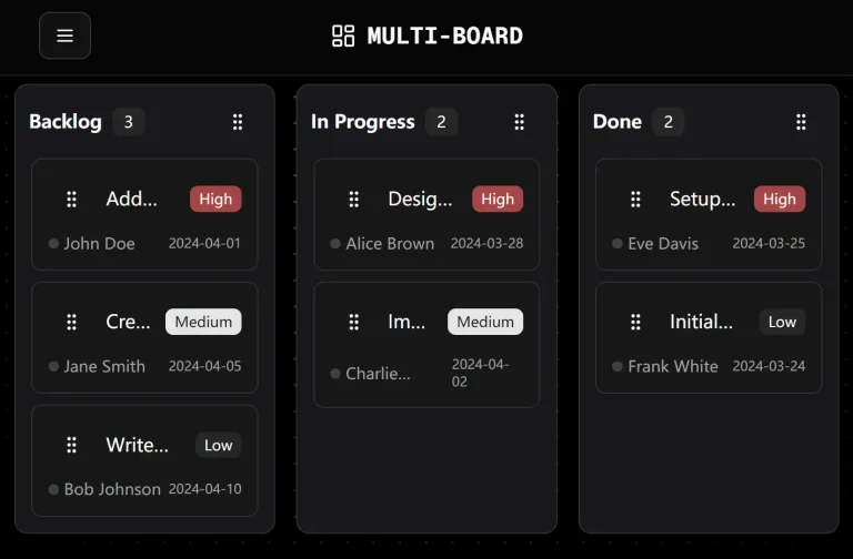
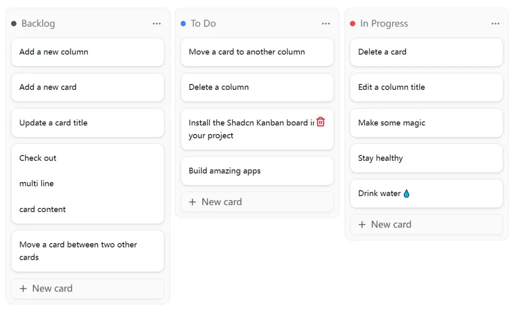
Preview
Use Cases
- Project Management Dashboards – Create task boards for agile development teams with customizable columns for different project stages like “To Do,” “In Progress,” and “Done”
- Content Management Systems – Build editorial workflows where content pieces move through stages like “Draft,” “Review,” “Approved,” and “Published”
- Customer Support Tools – Organize support tickets by priority or status, allowing team members to track and manage customer requests visually
- Sales Pipeline Management – Track leads and opportunities through different stages of the sales process, from “Prospecting” to “Closed Won”
- Bug Tracking Systems – Manage software bugs and feature requests with columns representing different resolution states and priority levels
How To Use It
1. Install the component using the Shadcn CLI with your preferred package manager:
npm:
npx shadcn@latest add https://shadcn-kanban-board.com/r/kanban.json
npx shadcn@latest add https://shadcn-kanban-board.com/r/use-js-loaded.json
yarn:
yarn dlx shadcn@latest add https://shadcn-kanban-board.com/r/kanban.json
yarn dlx shadcn@latest add https://shadcn-kanban-board.com/r/use-js-loaded.json
pnpm:
pnpm dlx shadcn@latest add https://shadcn-kanban-board.com/r/kanban.json
pnpm dlx shadcn@latest add https://shadcn-kanban-board.com/r/use-js-loaded.json
bun:
bunx shadcn@latest add https://shadcn-kanban-board.com/r/kanban.json
bunx shadcn@latest add https://shadcn-kanban-board.com/r/use-js-loaded.json
2. The component requires wrapping your application in the KanbanBoardProvider and setting up the basic board structure:
import { KanbanBoardProvider, KanbanBoard } from '@/components/ui/kanban'
import { useJsLoaded } from '@/hooks/use-js-loaded'
function MyKanbanApp() {
  const jsLoaded = useJsLoaded()
  if (!jsLoaded) {
    return <KanbanBoardColumnSkeleton />
  }
  return (
    <KanbanBoardProvider>
      <KanbanBoard>
        {/* Your columns and cards go here */}
      </KanbanBoard>
    </KanbanBoardProvider>
  )
}
3. Create columns and cards with unique IDs and manage state:
import { createId } from '@paralleldrive/cuid2'
const [columns, setColumns] = useState([
  {
    id: createId(),
    title: 'To Do',
    cards: [
      { id: createId(), title: 'Task 1' },
      { id: createId(), title: 'Task 2' }
    ]
  }
])
4. The component supports drag-and-drop operations through the useDndEvents hook, which handles both mouse and keyboard interactions. Cards can be moved between columns, and columns can be reordered within the board.
Related Resources
- Shadcn/UI Documentation – https://ui.shadcn.com – Official documentation for the Shadcn/UI component library and design system
- Lucide React – https://lucide.dev – Icon library used in the component for UI elements and actions
FAQs
Q: Can I customize the appearance of the Kanban board?
A: Yes, the component automatically adapts to your Shadcn/UI theme. You can customize colors, spacing, and other visual elements through your existing CSS variables and theme configuration.
Q: Does the component support touch devices and mobile screens?
A: Yes, the Kanban board is fully responsive and supports touch-based drag-and-drop interactions on mobile devices and tablets.
Q: How do I persist the board state when users make changes?
A: The component is framework-agnostic and works with any state management solution. You can integrate it with local storage, databases, or server actions depending on your application needs.
Q: Can I add custom actions or menus to columns and cards?
A: Yes, the component supports custom dropdown menus, tooltips, and actions. You can extend the basic functionality with your own components and event handlers.