The Future of Web Dev
The Future of Web Dev
Shark UI: 90+ React Components for Tailwind CSS
Get 90+ editable React components built on Ark UI, installed through the shadcn CLI and styled with Tailwind CSS 4.
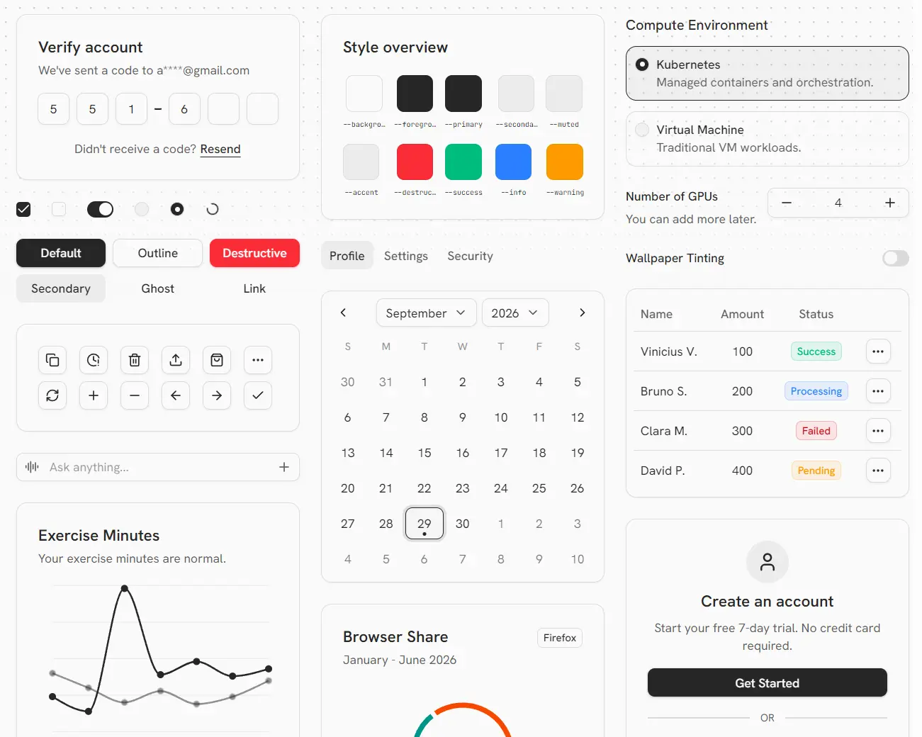
Shark UI is a React component library that packages Ark UI primitives as editable Tailwind CSS components for the shadcn CLI.
The component library currently contains standard controls alongside Color Picker, Image Cropper, Tour, Tree View, Signature Pad, JSON Tree View, charts, and date inputs.
Features
- 90+ React UI components and utilities.
- Ark UI primitives for WAI-ARIA patterns, keyboard interaction, and focus management.
- shadcn CLI installs for individual registry items or the full UI bundle.
- Editable TypeScript source stored in the project.
- Light and dark theme tokens plus
success,warning, andinfostates.
Available Components
| Category | Components |
|---|---|
| Forms and input | Autocomplete, Checkbox, Combobox, Date Input, Date Picker, Field, File Upload, Input, Input OTP, Number Input, Password Input, Select, Tags Input, Textarea |
| Overlays | Alert Dialog, Context Menu, Dialog, Drawer, Floating Panel, Hover Card, Menu, Popover, Sheet, Tooltip |
| Navigation and layout | Accordion, Bottom Navigation, Breadcrumb, Carousel, Collapsible, Pagination, Resizable, Scroll Area, Sidebar, Steps, Tabs, Tour |
| Data and content | Avatar, Badge, Card, Chart, Data List, Image Cropper, JSON Tree View, QR Code, Table, Tree View |
| Feedback and utilities | Alert, Circular Progress, Clipboard, Highlight, Progress, Skeleton, Spinner, Status, Timer, Toast |
How To Use Shark UI
New Next.js Project
Initialize a new Next.js project with the Shark preset:
npx shadcn@latest init @shark/style -t nextExisting Next.js Project
For an existing Next.js app, confirm Tailwind CSS v4 and the @/* alias before running:
npx shadcn@latest init @shark/styleAdd a Component
Install Button:
npx shadcn@latest add @shark/buttonBasic Usage
import { Button } from "@/components/ui/button";
export default function Home() {
  return (
    <main className="flex min-h-svh items-center justify-center">
      <Button>Save changes</Button>
    </main>
  );
}
Install the Full Registry
npx shadcn@latest add @shark/uiImport Aliases
Shark UI follows the aliases configured by components.json. A default Next.js project maps @/* to the project root. Projects created with --src-dir map that alias to ./src/*.
Dialog Example
Install Dialog:
npx shadcn@latest add @shark/dialogimport { Button } from "@/components/ui/button";
import {
Dialog,
DialogBody,
DialogClose,
DialogContent,
DialogFooter,
DialogHeader,
DialogTrigger,
} from "@/components/ui/dialog";
export function AccountDialog() {
return (
<Dialog>
<DialogTrigger asChild>
<Button variant="outline">Edit account</Button>
</DialogTrigger>
<DialogContent size="lg">
<DialogHeader
title="Account settings"
description="Review your account details."
/>
<DialogBody>
<p className="text-sm text-muted-foreground">
Account settings go here.
</p>
</DialogBody>
<DialogFooter>
<DialogClose asChild>
<Button>Done</Button>
</DialogClose>
</DialogFooter>
</DialogContent>
</Dialog>
);
}Theme and Styling
Shark UI follows shadcn theme tokens and defines success, warning, and info color pairs. The preset maps --radius to a radius scale. Override existing values in :root and .dark:
:root {
  --radius: 0.75rem;
  --primary: oklch(0.62 0.18 250);
  --primary-foreground: oklch(0.98 0.01 250);
}
.dark {
  --primary: oklch(0.72 0.14 250);
  --primary-foreground: oklch(0.16 0.02 250);
}
Component Source and Updates
Edit installed .tsx files directly when you need new variants, classes, or markup. Before applying an upstream registry version over local changes, inspect it with the shadcn CLI:
npx shadcn@latest add @shark/dialog --dry-run
npx shadcn@latest add @shark/dialog --diff
Alternatives and Related Resources