The Future of Web Dev
The Future of Web Dev
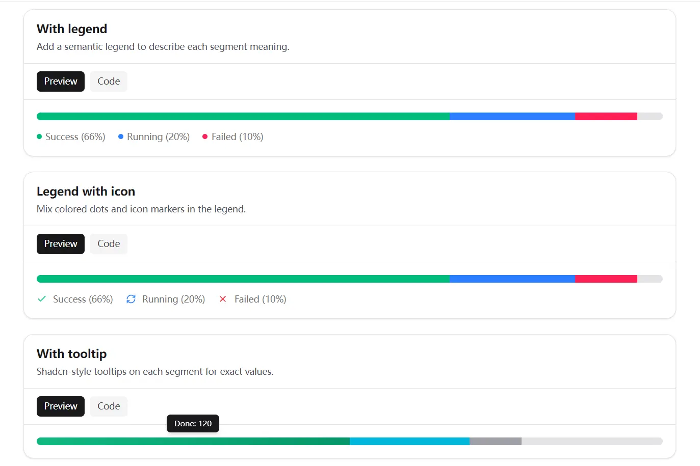
Stacked Progress Bar Component for shadcn/ui and React
Add multi-status progress tracking to shadcn/ui apps with segment values, Tailwind styling, legends, ARIA semantics, and tooltips.
shadcn-stacked-progress-bar is a React component built for shadcn/ui that creates a stacked progress bar with multiple segments, each representing a status category or sequential step.
It’s designed for dashboards, pipelines, and any interface that needs to show a breakdown of progress inside a single track.
Features
- Combines categorical or sequential status segments in one horizontal track.
- Calculates each segment width from its
valueand the providermax. - Adds
progressbarsemantics to the aggregate progress element. - Keeps individual segments hidden from screen readers by default.
- Connects one legend to the progress track through generated IDs.
- Supports Tailwind classes and inline styles for segment appearance.
- Includes dot and icon variants for legend markers.
- Clamps invalid segment and total values to safe numeric bounds.
Use Cases
- Release pipeline dashboards show passed, running, and blocked jobs in one compact status row.
- Capacity reports compare completed work, review work, and unallocated points against a sprint total.
- Data-import screens distinguish validated, queued, and rejected records before an operator opens the details table.
- Metered billing views show included, consumed, and overage units in a labeled usage bar.
- Content-review queues summarize approved, pending, and returned submissions above a large list.
How To Use It
Table Of Contents
Installation
Use a React project with shadcn/ui, Tailwind CSS, and a working @/lib/utils utility. The component imports cn from that path and uses class-variance-authority for legend dot variants.
npx shadcn@latest add https://raw.githubusercontent.com/JoachimBrasier/shadcn-stacked-progress-bar/main/stacked-progress-bar.jsonCheck the generated file location before adding imports. Most shadcn/ui projects place it under components/ui, but your components.json aliases control the final path.
For manual installation, copy src/stacked-progress-bar.tsx into your UI component directory. Install class-variance-authority if it is not already part of the project:
npm install class-variance-authorityBasic Usage
"use client"
import {
  StackedProgressBar,
  StackedProgressBarProvider,
  StackedProgressBarSegment,
} from "@/components/ui/stacked-progress-bar"
export function DeploymentProgress() {
  return (
    <StackedProgressBarProvider max={20}>
      <StackedProgressBar
        value={17}
        aria-label="Deployment jobs"
        aria-valuetext="17 of 20 deployment jobs have started or finished"
      >
        <StackedProgressBarSegment value={11} className="bg-emerald-500" />
        <StackedProgressBarSegment value={4} className="bg-sky-500" />
        <StackedProgressBarSegment value={2} className="bg-rose-500" />
      </StackedProgressBar>
    </StackedProgressBarProvider>
  )
}
Pass the aggregate total through value. The component does not derive that number by adding child segment values.
Add a Legend
Use the legend primitives when segment colors need text labels.
"use client"
import {
  StackedProgressBar,
  StackedProgressBarLegend,
  StackedProgressBarLegendDot,
  StackedProgressBarLegendItem,
  StackedProgressBarLegendLabel,
  StackedProgressBarProvider,
  StackedProgressBarSegment,
} from "@/components/ui/stacked-progress-bar"
export function ReviewQueueStatus() {
  return (
    <StackedProgressBarProvider max={60}>
      <StackedProgressBar
        value={52}
        aria-label="Review queue status"
        aria-valuetext="52 of 60 submissions have been processed"
      >
        <StackedProgressBarSegment value={32} className="bg-emerald-500" />
        <StackedProgressBarSegment value={12} className="bg-amber-500" />
        <StackedProgressBarSegment value={8} className="bg-rose-500" />
      </StackedProgressBar>
      <StackedProgressBarLegend className="mt-3">
        <StackedProgressBarLegendItem>
          <StackedProgressBarLegendDot className="bg-emerald-500" />
          <StackedProgressBarLegendLabel>
            Approved: 32
          </StackedProgressBarLegendLabel>
        </StackedProgressBarLegendItem>
        <StackedProgressBarLegendItem>
          <StackedProgressBarLegendDot className="bg-amber-500" />
          <StackedProgressBarLegendLabel>
            Pending: 12
          </StackedProgressBarLegendLabel>
        </StackedProgressBarLegendItem>
        <StackedProgressBarLegendItem>
          <StackedProgressBarLegendDot className="bg-rose-500" />
          <StackedProgressBarLegendLabel>
            Returned: 8
          </StackedProgressBarLegendLabel>
        </StackedProgressBarLegendItem>
      </StackedProgressBarLegend>
    </StackedProgressBarProvider>
  )
}
Show Segment Details With Tooltips
Install the base shadcn/ui tooltip component before adding segment-level detail.
npx shadcn@latest add tooltip"use client"
import {
Tooltip,
TooltipContent,
TooltipProvider,
TooltipTrigger,
} from "@/components/ui/tooltip"
import {
StackedProgressBar,
StackedProgressBarProvider,
StackedProgressBarSegment,
} from "@/components/ui/stacked-progress-bar"
export function ImportProgress() {
return (
<TooltipProvider delayDuration={150}>
<StackedProgressBarProvider max={240}>
<StackedProgressBar
value={186}
aria-label="Customer import status"
aria-valuetext="186 of 240 customer records processed"
>
<Tooltip>
<TooltipTrigger asChild>
<StackedProgressBarSegment
value={120}
tabIndex={0}
className="cursor-help bg-emerald-500"
/>
</TooltipTrigger>
<TooltipContent>Validated: 120 records</TooltipContent>
</Tooltip>
<Tooltip>
<TooltipTrigger asChild>
<StackedProgressBarSegment
value={46}
tabIndex={0}
className="cursor-help bg-sky-500"
/>
</TooltipTrigger>
<TooltipContent>Queued for import: 46 records</TooltipContent>
</Tooltip>
<Tooltip>
<TooltipTrigger asChild>
<StackedProgressBarSegment
value={20}
tabIndex={0}
className="cursor-help bg-zinc-400"
/>
</TooltipTrigger>
<TooltipContent>Needs attention: 20 records</TooltipContent>
</Tooltip>
</StackedProgressBar>
</StackedProgressBarProvider>
</TooltipProvider>
)
}Set tabIndex={0} on interactive segments so keyboard users can reach the tooltip trigger. shadcn/ui tooltips support hover and keyboard focus interactions.
Component API
<StackedProgressBarProvider />
max?: numbersets the scale used for segment width calculations.maxdefaults to100.- Invalid values such as
0, negative numbers, or non-finite values fall back to100. - Wrap the bar and its optional legend in the same provider.
<StackedProgressBar />
value?: numbersets the aggregate progress value announced througharia-valuenow.- Values outside the provider range are clamped between
0andmax. roledefaults toprogressbar.aria-labeldefaults toProgressunlessaria-labelledbyis present.aria-valuemindefaults to0.aria-valuemaxdefaults to the providermax.aria-describedbyconnects to the legend ID when a legend exists.- Accepts standard
<div>attributes and Tailwind classes.
<StackedProgressBarSegment />
value: numbersets the segment’s proportional width.- Segment width follows
(value / max) * 100. aria-hiddendefaults totrue.- Accepts standard
<div>attributes,className, andstyle.
<StackedProgressBarLegend />
id?: stringsets a custom legend ID.- The component generates an ID when
idis omitted. roledefaults tolist.- Use only one legend inside each provider.
- Accepts standard
<div>attributes and Tailwind classes.
<StackedProgressBarLegendItem />
roledefaults tolistitem.- Accepts standard element attributes and
className.
<StackedProgressBarLegendDot />
variant?: "default" | "icon"controls the marker style.variant="default"renders a small rounded marker.variant="icon"accepts an SVG icon or another visual marker.aria-hiddendefaults totrue.- Accepts standard
<span>attributes andclassName.
<StackedProgressBarLegendLabel />
- Renders the text associated with a legend item.
- Uses
text-muted-foregroundby default. - Accepts
classNameand standard element attributes.
Alternatives and Related Resources
- ProgressButton for shadcn/ui
- Modern Drag-and-Drop File Uploader with shadcn/ui
- 10 Best Progress Bar Components For React & React Native
- 10 Best Progress Bar (Linear) Components In JavaScript & CSS
- Progress Component for shadcn/ui
- React Progress Bar Components
FAQs
Q: Does this component calculate the total progress from its segments?
A: No. Pass the aggregate value through the value prop on StackedProgressBar. Keep that value synchronized with the segment values in your application state.
Q: Why does Next.js require a Client Component for this progress bar?
A: The component uses React context, state, effects, generated IDs, and React.use. Import it through a component file that begins with "use client".
Q: How do I add tooltips to individual segments?
A: Install shadcn/ui Tooltip, wrap each segment in TooltipTrigger asChild, and add tabIndex={0} to the segment for keyboard access.
Q: Why is my legend not connected to the progress bar?
A: Place the bar and legend inside the same StackedProgressBarProvider. Keep only one legend within that provider.
Q: Can I use values other than percentages?
A: Yes. Set max to the total number of jobs, records, points, credits, or storage units. Pass matching numeric values to each segment and the aggregate bar.
