The Future of Web Dev
The Future of Web Dev
Warren UI: 48+ UI Components for Ops Dashboards
48+ UI components for operations dashboards: agent traces, uptime strips, incident timelines, charts, and editable shadcn source.
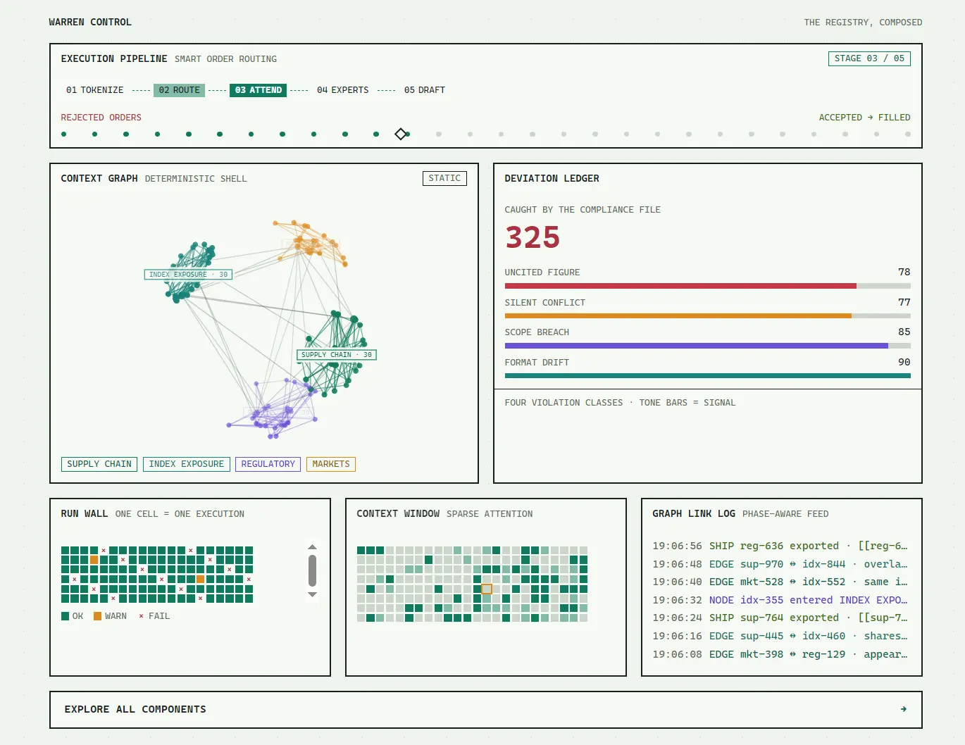
Warren UI is a UI component library for building dense operations dashboards with monitoring charts, status grids, logs, and agent-execution controls.
It uses square borders, compact uppercase labels, monospace numbers, and semantic signal colors. Components install through the shadcn CLI as editable source files for Tailwind CSS projects.
Features
- 48+ UI components for metric displays, monitoring charts, operational controls, and standard form UI.
- Agent-execution span tree with selection, an inspector, and an optional duration timeline.
- Human-approval checkpoints with risk tiers and audit fields.
- Five themes: light, dark, jade, green-neon, and dracula.
- Controlled query chips, keyboard-accessible selection, and a raw-query mode in Filter Bar.
- CSS-first Tailwind CSS tokens for colors, fonts, borders, and other theme values.
- Shadcn registry distribution with locally editable TypeScript component files.
Use Cases
- Service health dashboards: Put request rates, latency, uptime history, and incident milestones on one operations screen.
- AI agent debugging: Inspect parent and child execution spans, tool failures, token counts, and timing details for an individual run.
- Deployment monitoring: Show each execution result in a run-wall grid and track stages across a release pipeline.
- Approval workflows: Present risky production actions, their input arguments, and the review state before execution.
Available UI Components
| Category | Components |
|---|---|
| Panels and metrics | Panel, Badge, Stat, Stepper, Progress Rail, Ledger, Cell Grid, Log List |
| Charts and monitoring | Sparkline, Bar Chart, Heatmap, Graph, State Timeline, Band Chart, Uptime Strip, Bullet Bar, Meter Cluster, Incident Timeline, World Map |
| Operations and AI | Filter Bar, Empty, Approval Gate, Agent Trace |
| Forms and inputs | Button, Input, Textarea, Label, Field, Switch, Checkbox, Native Select, Select |
| Navigation and overlays | Tabs, Floating Panel, Sheet, Tooltip, Popover, Dialog, Command |
| Data and feedback | Separator, Skeleton, Spinner, Progress, Table, Alert, Kbd, Toast |
| Themes | Theme Select |
How to Use Warren UI
1. Initialize shadcn
Start in an existing React project with Tailwind CSS. Initialize shadcn first if your project does not already have a components.json.
Check that the generated configuration has working @/components and @/lib aliases before installing Warren components.
npx shadcn@latest init2. Install the base theme
Install warren-base before the UI components. It supplies the CSS variables and Tailwind CSS 4 @theme mappings used throughout the library.
npx shadcn@latest add https://warren.eduard3v.com/r/warren-base.json3. Install the dashboard components
npx shadcn@latest add https://warren.eduard3v.com/r/panel.json
npx shadcn@latest add https://warren.eduard3v.com/r/stat.json
npx shadcn@latest add https://warren.eduard3v.com/r/badge.json
4. Basic Usage: API Health Panel
Place this example in app/operations/page.tsx in a Next.js App Router project, or adapt the component to an existing React page. Replace the illustrative numbers with your application data.
import { Panel } from "@/components/ui/panel"
import { Stat } from "@/components/ui/stat"
import { Badge } from "@/components/ui/badge"
export default function OperationsPage() {
  return (
    <main className="p-6">
      <Panel
        title="API Health"
        subtitle="LAST 15 MINUTES"
        actions={<Badge variant="success" dot>HEALTHY</Badge>}
        footer="METRICS SNAPSHOT"
      >
        <div className="grid grid-cols-1 gap-4 sm:grid-cols-3">
          <Stat label="Requests/min" value="4,210" tone="primary" />
          <Stat label="Success rate" value="99.8%" delta="+0.3%" tone="success" />
          <Stat label="P95 latency" value="185ms" delta="-21ms" tone="teal" />
        </div>
      </Panel>
    </main>
  )
}
5. Optional: Install by registry name
For repeated installs, merge the registries entry into your existing components.json. Retain its other fields and aliases.
{
  "registries": {
    "@warren": "https://warren.eduard3v.com/r/{name}.json"
  }
}
npx shadcn@latest add @warren/panel
npx shadcn@latest add @warren/agent-trace
npx shadcn@latest add @warren/world-mapAdvanced Example: Controlled Log Filters
Install the Filter Bar component for log or trace queries:
npx shadcn@latest add @warren/filter-bar// components/log-filters.tsx
"use client"
import { useState } from "react"
import {
FilterBar,
type FilterChip,
} from "@/components/ui/filter-bar"
export function LogFilters() {
const [chips, setChips] = useState<FilterChip[]>([
{ key: "service", op: "=", value: "billing-api" },
{ key: "latency_ms", op: ">", value: "300", tone: "warning" },
])
const [rawQuery, setRawQuery] = useState('{service="billing-api"}')
return (
<FilterBar
chips={chips}
onChange={setChips}
suggestions={{
service: ["billing-api", "checkout-api"],
region: ["us-east-1", "eu-west-1"],
}}
rawValue={rawQuery}
onRawChange={setRawQuery}
placeholder="ADD FILTER"
/>
)
}Styling and Theming
Warren’s five built-in palettes use CSS variables applied through the data-theme attribute on the document root. The light theme is the default :root palette. Set data-theme="dracula" on <html> to select that palette directly.
| Theme | Palette |
|---|---|
light | Warm parchment and dark ink |
dark | Dark canvas |
jade | Jade palette |
green-neon | Neon-green palette |
dracula | Dracula-inspired dark palette |
Set the theme directly on the root element or install the selector:
npx shadcn@latest add @warren/theme-select// components/dashboard-theme.tsx
"use client"
import { ThemeSelect } from "@/components/ui/theme-select"
export function DashboardTheme() {
return <ThemeSelect />
}Restore the Theme in Next.js
ThemeSelect writes to data-theme on <html> and persists the choice as warren-theme in localStorage. Restore the stored theme before hydration to prevent an initial light-theme flash. Place the script in the App Router root layout:
// app/layout.tsx
import Script from "next/script"
import "./globals.css"
export default function RootLayout({
  children,
}: Readonly<{ children: React.ReactNode }>) {
  return (
    <html lang="en" suppressHydrationWarning>
      <body>
        <Script id="restore-warren-theme" strategy="beforeInteractive">
          {`
            try {
              var theme = localStorage.getItem("warren-theme");
              if (theme) document.documentElement.setAttribute("data-theme", theme);
            } catch (e) {}
          `}
        </Script>
        {children}
      </body>
    </html>
  )
}
Custom Theme Menus
For a custom theme menu, set themes to an array of { value, label } objects. Back each custom value with a matching [data-theme="..."] CSS token block. For an isolated menu, set both target={null} and storageKey={null} to avoid changing the document theme or writing to localStorage.
Alternatives and Related Resources