The Future of Web Dev
The Future of Web Dev
Apply Outer-rounded Corners To Tailwind CSS Elements
Add outside rounded corners to Tailwind CSS elements with ease using Tailwind Rounded Out plugin.

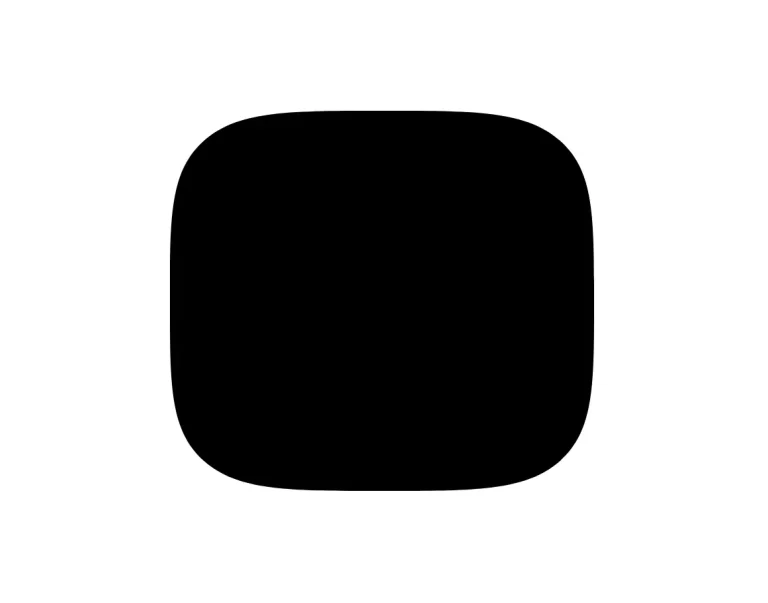
Rounded Out is a Tailwind CSS plugin that allows you to add visually distinct “outside” rounded corners to elements.
The plugin uses CSS pseudo-elements and masks to generate the rounded corner effect while maintaining background inheritance.
You can apply outside rounded corners to any combination of corners with standard Tailwind sizes or custom values.
Features
🎨 Background Inheritance: Maintains the original background color, gradients, and images of the element.
✨ Arbitrary Value Support: Define custom rounding values beyond the standard Tailwind sizes.
📦 Zero Dependencies: Requires only Tailwind CSS, ensuring a lightweight integration.
📐 Independent Corner Control: Apply rounding to any combination of corners and sides.
🎛️ Tailwind Size Compatibility: Integrates seamlessly with Tailwind’s existing border-radius sizes (sm, md, lg, xl, 2xl, 3xl).
Use Cases
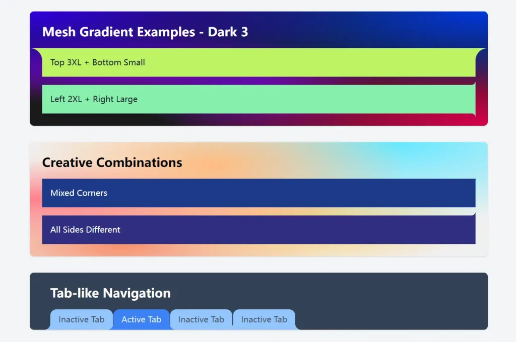
- Tabbed Navigation: Create visually clear and distinct tabs where the bottom corners extend outward, signifying the active or inactive state. This addresses the need for clear visual cues in navigation.
- Unique Card Designs: Design cards with a protruding bottom or side, offering a fresh alternative to standard rectangular cards and attracting user attention to specific content. This helps overcome the monotony of typical card layouts.
- Messaging Bubbles: Develop chat interfaces with message bubbles that have distinct bottom corners, enhancing the visual flow and differentiating between sender and receiver messages. This helps in creating more engaging and intuitive conversational interfaces.
- Interactive Buttons: Craft buttons with subtle outward rounded corners to give them a unique tactile feel, encouraging user interaction. This offers a way to make buttons more visually appealing and inviting.
- Creative UI Elements: Experiment with unconventional shapes and corner styles to add a unique flair to various website sections or components, making your design stand out. This allows for pushing the boundaries of standard web design conventions.
Installation
Install Tailwind Rounded Out using npm:
npm install tailwind-rounded-outUsage
Add the plugin to your tailwind.config.js file:
module.exports = {
  content: [
    // ...
  ],
  theme: {
    // Optionally customize default sizes
    roundedOut: {
      sm: "0.125rem",
      // ... other sizes
    },
  },
  plugins: [require("tailwind-rounded-out")],
};
Here are some basic usage examples in your HTML:
<div class="bg-blue-500 text-white p-4 relative rounded-out">Default</div>
<div class="bg-blue-500 text-white p-4 relative rounded-out-sm">Small (sm)</div>
<div class="bg-blue-500 text-white p-4 relative rounded-out-md">Medium (md)</div>
<div class="bg-blue-500 text-white p-4 relative rounded-out-lg">Large (lg)</div>
<div class="bg-blue-500 text-white p-4 relative rounded-out-xl">Extra Large (xl)</div>
<div class="bg-blue-500 text-white p-4 relative rounded-out-2xl">2XL</div>
<div class="bg-blue-500 text-white p-4 relative rounded-out-3xl">3XL</div>
Notice that only the bottom corners are rounded out, this is because there’s only two psuedo elements available to create the corners. If you want to round out all sides, you can nest the element rounded-out-lg inside another rounded-out-lg element:
<div class="rounded-out-lg">
  <div class="rounded-out-lg">
    Outer rounded corners!
  </div>
</div>
Preview