The Future of Web Dev
The Future of Web Dev
tw-fade: Tailwind CSS Scroll Edge Fades
Use tw-fade for top, bottom, left, and right scroll fades in Tailwind CSS. Add visual scroll cues with CSS masks and no runtime JavaScript.
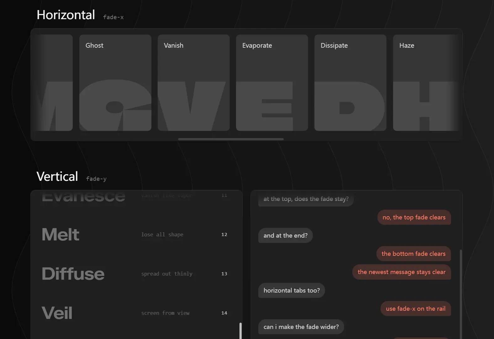
tw-fade is a Tailwind CSS utility set that masks the edges of a scroll container so content fades into the surface behind it as you scroll.
Add a class such as fade-y or fade-x to any element with overflow-auto, overflow-y-auto, or overflow-x-auto, and the top, bottom, left, or right edge dissolves once content scrolls past it.
Features
- Shows fades only after content moves beyond a selected edge.
- Supports top, bottom, left, right, vertical, horizontal, and four-edge masks.
- Uses CSS
mask-imageand scroll-driven animations with no runtime JavaScript. - Composes individual edge classes such as
fade-t fade-r. - Adjusts fade thickness and reveal distance with utility classes.
- Reserves clear space for sticky headers and footers.
- Falls back to a permanent selected fade when scroll timelines are unavailable.
How To Use It
Table Of Contents
Installation
Install the package in a Tailwind CSS project:
npm install tw-fadeImport it after Tailwind in your global stylesheet:
/* app/globals.css */
@import "tailwindcss";
@import "tw-fade";
In a Next.js App Router project, place the import in the global stylesheet loaded by the root layout. The classes work in Server Components because the effect runs through generated CSS rather than React state.
For plain HTML, Vite, React, Vue, Nuxt, Astro, or another build setup that does not use Tailwind CSS v4, import the prebuilt stylesheet:
import "tw-fade/css";The prebuilt path includes named utilities such as fade-size-lg and fade-range-xl. It does not generate arbitrary bracket values such as fade-size-[72px].
Basic Usage
Put fade-y on the element with overflow-y-auto.
const projectFilters = [
  "Assigned to me",
  "Needs review",
  "Due this week",
  "Blocked tasks",
  "Recently updated",
  "Archived projects",
  "Customer requests",
  "Design feedback",
]
export function ProjectFilters() {
  return (
    <div className="rounded-xl bg-slate-950 p-1">
      {/* This div owns the scroll position and the mask. */}
      <div className="fade-y h-64 overflow-y-auto px-4 py-3 text-sm text-slate-100">
        <ul className="space-y-3">
          {projectFilters.map((filter) => (
            <li key={filter}>
              <label className="flex cursor-pointer items-center gap-3">
                <input type="checkbox" />
                <span>{filter}</span>
              </label>
            </li>
          ))}
        </ul>
      </div>
    </div>
  )
}
The outer wrapper supplies the surface revealed by the mask. Keep the scrollable element transparent or match it carefully to the surrounding surface.
More Examples
Fade a Horizontal Team Member Rail
Use fade-x for a row that extends beyond the available width.
const members = [
  { name: "Maya Chen", role: "Design" },
  { name: "Jordan Lee", role: "Engineering" },
  { name: "Avery Patel", role: "Product" },
  { name: "Noah Kim", role: "Support" },
  { name: "Emma Ross", role: "Marketing" },
]
export function TeamMemberRail() {
  return (
    <div className="rounded-2xl bg-slate-100 p-2">
      <div className="fade-x flex gap-3 overflow-x-auto px-4 py-3">
        {members.map((member) => (
          <article
            key={member.name}
            className="min-w-48 rounded-xl border border-slate-200 bg-white p-4"
          >
            <p className="font-medium text-slate-900">{member.name}</p>
            <p className="mt-1 text-sm text-slate-500">{member.role}</p>
          </article>
        ))}
      </div>
    </div>
  )
}
Keep a Sticky Toolbar Clear Above an Activity Log
Match the clear zone to the sticky toolbar height.
const auditEntries = [
  "API key rotated",
  "Billing address updated",
  "New workspace member invited",
  "Export completed",
  "Role changed to administrator",
  "Security policy updated",
]
export function AuditLog() {
  return (
    <div className="rounded-xl bg-slate-950 p-1 text-slate-100">
      <section className="fade-y fade-clear-t-14 h-96 overflow-y-auto bg-transparent">
        {/* h-14 and fade-clear-t-14 both resolve to 3.5rem. */}
        <header className="sticky top-0 z-10 flex h-14 items-center border-b border-slate-800 bg-slate-950 px-4 font-medium">
          Workspace activity
        </header>
        <ul className="divide-y divide-slate-800 px-4">
          {auditEntries.map((entry) => (
            <li key={entry} className="py-5 text-sm">
              {entry}
            </li>
          ))}
        </ul>
      </section>
    </div>
  )
}
Use fade-clear-t-var when the toolbar height comes from runtime layout measurements:
<div
  className="fade-t fade-clear-t-var h-80 overflow-y-auto"
  style={{ "--fade-clear-t": "56px" } as React.CSSProperties}
>
  {/* Scroll content */}
</div>
Utility Reference
Direction Classes
| Utility | Masked edge or behavior |
|---|---|
fade-t | Top edge. |
fade-b | Bottom edge. |
fade-l | Left edge. |
fade-r | Right edge. |
fade-y | Top and bottom edges. |
fade-x | Left and right edges. |
fade-xy | All four edges. |
fade-static | Pins selected fades on and disables scroll-driven reveal. |
Pair fade-static with a direction class. For example, fade-y fade-static renders permanent top and bottom fades.
Size, Range, and Clearance Classes
| Utility pattern | Purpose |
|---|---|
fade-size-* | Sets fade thickness for all edges. |
fade-size-t-*, fade-size-b-*, fade-size-l-*, fade-size-r-* | Sets fade thickness for one edge. |
fade-size-y-*, fade-size-x-* | Sets fade thickness for an axis. |
fade-range-* | Sets the scroll distance used to reveal or retract a fade. |
fade-clear-t-*, fade-clear-b-*, fade-clear-l-*, fade-clear-r-* | Creates an opaque clearance area at one edge. |
fade-clear-y-*, fade-clear-x-*, fade-clear-xy-* | Creates clearance areas across an axis or all edges. |
fade-clear-t-var through fade-clear-xy-var | Reads clearance from a matching CSS custom property. |
The named size scale includes xs, sm, md, lg, xl, 2xl, 3xl, and 4xl. The default md size and range resolve to 3rem. Source-path installations also accept bracket values such as fade-size-[72px], fade-range-[96px], and fade-clear-t-[56px].
Fade-size precedence runs from the most specific rule to the least specific rule:
edge-specific → axis → global → default
fade-size-t-* → fade-size-y-* → fade-size-* → fade-size-md
Implementation Notes
- Put fade classes on the actual scroll container. A parent wrapper with no
overflow-autodoes not receive a working scroll timeline. - Give the element a constrained height or width. An axis that cannot overflow has no fade activity on that axis.
- A CSS mask reveals the surface behind the element. Put the intended background on an outer wrapper,
<html>, or another visible layer. - Stable Firefox uses the permanent static-fade fallback because scroll-driven animations are not enabled by default. Safari versions below 26 also receive the fallback.
- Horizontal classes use physical left and right edges. Set
dir="ltr"on an order-neutral horizontal rail inside an RTL interface. - Keep fade bands modest around important text. Use a clear zone when a sticky control needs full contrast near an edge.
Alternatives and Related Resources
- Fluid Tailwind CSS: Responsive Design Made Easy
- Fade In/Out Elements On Scroll – ScrollFade.js
- Fade & Scroll In Elements On Scroll – Scrolls.js
- tailwindcss-fade: Gradient Edge Fades for Tailwind CSS
FAQs
Q: Does tw-fade require a Client Component in Next.js?
A: No. The package adds CSS utilities and does not need React state or browser event handlers.
Q: Why does the fade not appear?
A: Confirm that the fade class sits on the element with overflow-auto or overflow-scroll. The element also needs enough content to overflow on the selected axis.
Q: How do I keep a sticky header from fading?
A: Match its height with a fade-clear-t-* utility. Use fade-clear-t-var and --fade-clear-t when the height changes at runtime.
Q: What happens in Firefox?
A: The mask renders, but stable Firefox uses the static selected fade because scroll-driven animation support remains disabled by default.
Q: Do I need Tailwind CSS to use tw-fade?
A: No. The prebuilt dist/tw-fade.css works in any project without a build step. Include it via a <link> or import tw-fade/css.
Q: Can I use arbitrary values like fade-size-[6rem] without Tailwind?
A: No. Arbitrary bracket values require Tailwind’s JIT compiler and are available only when importing the source file via @import "tw-fade" in a Tailwind v4 build. The prebuilt drop-in includes only the named scale utilities.