The Future of Web Dev
The Future of Web Dev
Starting Point UI: Shadcn/ui-Style Tailwind Components
Add shadcn/ui-style components to any Tailwind project through semantic classes, theme variables, and optional vanilla JS.
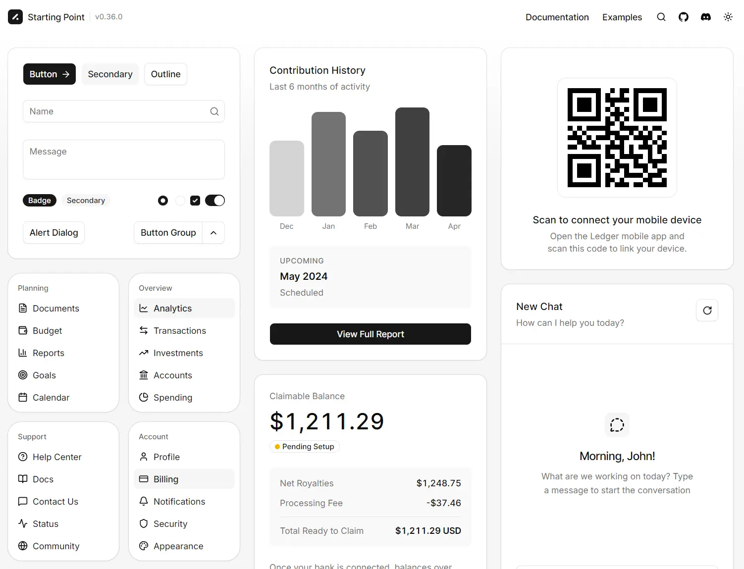
Starting Point UI is an open-source Tailwind CSS v4+ component library that adds the shadcn/ui design system to React, Vue, Angular, Laravel, Rails, Django, and plain HTML.
Its semantic classes define the UI, and a small vanilla JavaScript module handles interactive components.
Features
- WAI-ARIA patterns, keyboard navigation, and focus management for interactive controls.
- shadcn/ui-compatible CSS variables for colors, radius, and typography.
- Light and dark color schemes.
- RTL behavior across the component library.
- Component-level styling through Tailwind utilities and custom
@utilityrules.
UI Components Included
| Category | Components |
|---|---|
| Actions | Button, Button Group |
| Forms and inputs | Calendar, Checkbox, Combobox, Date Picker, Field, Forms, Input, Input Group, Label, Radio Group, Select, Slider, Switch, Textarea |
| Navigation and commands | Breadcrumb, Command, Context Menu, Dropdown, Pagination, Sidebar, Tabs |
| Overlays and disclosure | Accordion, Collapsible, Dialog, Drawer, Popover, Sheet, Tooltip |
| Feedback and status | Alert, Badge, Empty, Progress, Shimmer, Skeleton, Toast |
| Content and data | Avatar, Bubble, Card, Item, Kbd, Marker, Message, Message Scroller, Table |
| Layout and scrolling | Carousel, Resizable, Scroll Fade, Scrollbar, Separator |
How to Use Starting Point UI
Install the Package
npm install starting-point-uiImport the Styles
Add Starting Point UI after Tailwind in the main stylesheet:
@import "tailwindcss";
@import "starting-point-ui";
Add a Static Component
Static components need no JavaScript.
<button class="btn btn-primary" type="button">
  Save changes
</button>
Load JavaScript for Interactive Components
For a bundler:
import "starting-point-ui";For a browser module:
<script
  src="https://cdn.jsdelivr.net/npm/starting-point-ui"
  type="module"
></script>
Next.js App Router Setup
Run the component JavaScript on the client after the DOM is ready:
"use client";
import { useEffect } from "react";
export function StartingPointUI() {
  useEffect(() => {
    import("starting-point-ui");
  }, []);
  return null;
}
Mount the loader from the root layout:
import { StartingPointUI } from "@/components/starting-point-ui";
export default function RootLayout({ children }) {
  return (
    <html>
      <body>
        {children}
        <StartingPointUI />
      </body>
    </html>
  );
}
Basic Usage: Dialog Component
<button
  id="settings-trigger"
  class="btn btn-outline"
  type="button"
>
  Open settings
</button>
<dialog
  id="settings-dialog"
  class="dialog"
  data-sp-toggle="#settings-trigger"
>
  <div class="dialog-panel">
    <div class="dialog-header">
      <h2 class="dialog-title">Account settings</h2>
      <p class="dialog-description">
        Update your account preferences.
      </p>
    </div>
    <div class="dialog-content">
      <div class="field">
        <label class="label" for="display-name">
          Display name
        </label>
        <input
          class="input"
          id="display-name"
          name="display-name"
        />
      </div>
    </div>
    <div class="dialog-footer">
      <button
        class="btn btn-outline"
        type="button"
        data-sp-dismiss
      >
        Cancel
      </button>
      <button
        class="btn"
        type="button"
        data-sp-dismiss
      >
        Save
      </button>
    </div>
  </div>
</dialog>
Styling and Theming
Starting Point UI uses the CSS variables from shadcn/ui themes. You can override theme values after the library import:
@import "tailwindcss";
@import "starting-point-ui";
:root {
  --primary: oklch(0.55 0.2 250);
  --primary-foreground: oklch(1 0 0);
  --ring: oklch(0.55 0.2 250);
}
Change an individual instance with normal Tailwind utilities:
<button class="btn rounded-full">
  Rounded Button
</button>
Restyle a component class throughout the project:
@utility btn {
  @apply rounded-full;
}
RTL
Set dir="rtl" on the root element or an individual container:
<html dir="rtl">Inline Component Events
Experimental data-sp-on-* attributes run JavaScript when Starting Point UI component events fire:
<dialog
  class="dialog"
  data-sp-toggle="#settings-trigger"
  data-sp-on-shown="console.log('Dialog opened')"
>
  ...
</dialog>
The attribute receives event and el, and the global sp API is available inside the expression.
Inline event expressions use the JavaScript Function constructor. A strict Content Security Policy requires unsafe-eval in script-src for these attributes. Never interpolate untrusted data into a data-sp-on-* value.
Related Resources