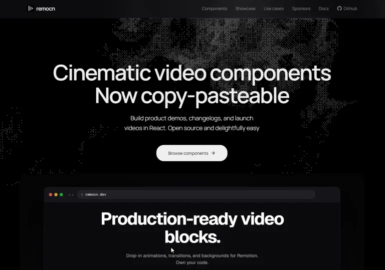
The Future of Web Dev
The Future of Web Dev
Plug-n-Play UI Component Library for TailwindCSS & Alpine – Penguin UI
A ready-to-use component library built for Tailwind CSS and Alpine JS. It provides pre-designed UI elements that can be directly copied into projects without installation.
Penguin UI is a UI component library that enables you to quickly implement professionally designed, accessible, and responsive UI elements in your Alpine.js and TailwindCSS projects.
The library covers a wide range of common UI components, from basic buttons and inputs to more complex items like carousels and modals. It also includes components designed for AI application interfaces.
Features
🔌 Plug & Play: No installation or npm package is required. Copy component code directly into your project.
🌙 Dark Mode Support: Components and themes include built-in dark mode compatibility with customizable dark theme palettes.
📱 Responsiveness: UI elements adapt automatically to different screen sizes and devices.
🌐 Browser Support: Works consistently across modern browsers like Google Chrome, Microsoft Edge, Safari, and Firefox.
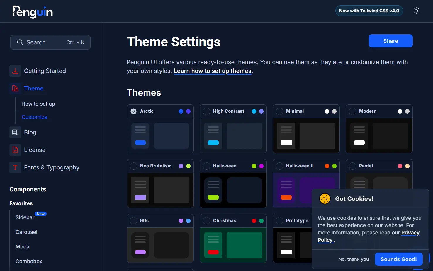
🎨 Customizable Themes: Access various pre-built themes (Arctic, Modern, Neo Brutalism, etc.) and modify colors and styles to fit your brand.
♿ Accessibility: Components are designed with accessibility considerations. A color contrast checker tool is available to assist with theme customization.
🤖 AI Components: Includes specific UI elements for building AI application interfaces, such as prompt inputs and output displays.
Use Cases
- Rapid Prototyping: Quickly build functional prototypes or MVPs using pre-made components.
- Admin Dashboards: Assemble data-rich interfaces using components like tables, charts (if available or integrated), forms, and navigation elements.
- Marketing Websites: Create visually consistent landing pages or small websites using cards, banners, accordions, and carousels.
- AI Application Interfaces: Develop front-ends for AI tools needing specific interaction patterns like prompt inputs, output displays, and option selectors.
- Adding Features to Existing Tailwind/Alpine Projects: Easily integrate new UI components like modals, toasts, or sidebars into applications already using Tailwind CSS and Alpine JS.
Installation
Penguin UI does not require a direct installation process like typical npm packages. You use components by copying their HTML and associated classes/scripts directly from the Penguin UI website.
Usage
- Visit the Penguin UI website and browse the component library.
- Select the component you need (e.g., a button, modal, or card).
- Copy the provided HTML code snippet for that component.
- Paste the code directly into your project’s HTML file where you want the component to appear.
- Ensure Tailwind CSS and Alpine JS (plus any required plugins) are correctly set up in your project for the component to render and function properly.
- Customize the component using Tailwind utility classes or by modifying the theme settings as needed.
Related Resources
- Tailwind CSS Documentation: The official source for installing and using the Tailwind CSS framework. https://tailwindcss.com/docs
- Alpine JS Documentation: Learn about Alpine JS installation, directives, plugins, and core concepts. https://alpinejs.dev/
Preview