The Future of Web Dev
The Future of Web Dev
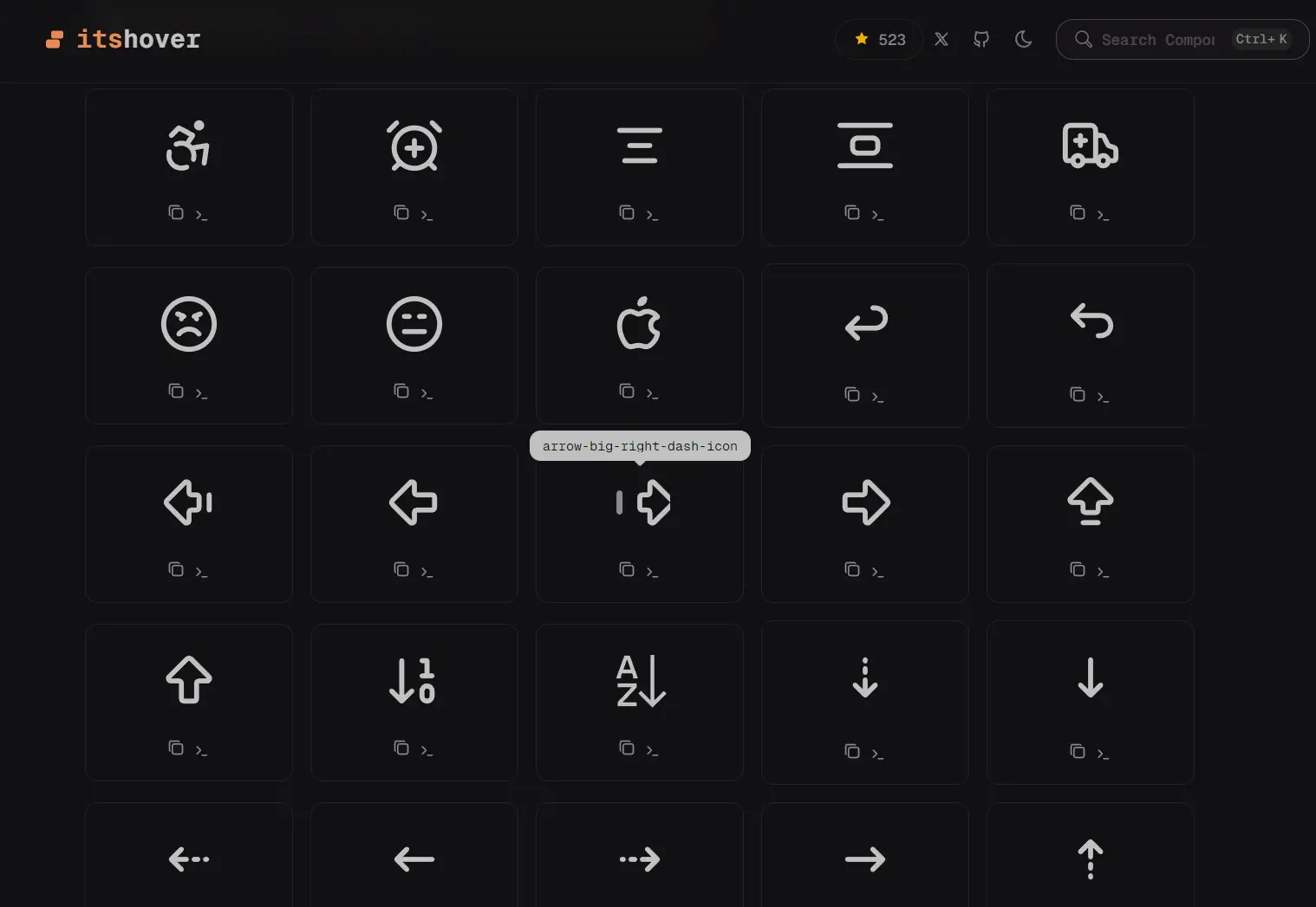
Animated Icon Components for React and Next.js – Its Hover
A collection of animated icon component powered by Motion. Copy and paste source code directly into your Next.js or shadcn/ui project.
Its Hover is an animated icon library that allows you to add motion-driven icons as components to your Next.js/React projects.
It implements the motion library under the hood to handle all animation logic. Each icon responds to user interaction through choreographed motion sequences rather than static transitions.
Features
🎯 Motion-Driven: Each icon includes pre-built animation sequences triggered by hover and click events using Framer Motion/React.
⚛️ React Component: Drop components directly into JSX with standard props and className support.
🎨 Full Source Access: Copy any component and modify animation timing, stroke properties, or color values.
📦 CLI Installation: Install icons through the shadcn/ui CLI with automatic dependency resolution.
How to Use It
Browse all icons at Its Hover’s official website and locate the icon you want.
Install via shadcn/ui CLI
Install individual icons through the shadcn CLI command. It handles dependency installation automatically.
$npx shadcn@latest add https://itshover.com/r/apple-brand-logo.json
$pnpm dlx shadcn@latest add https://itshover.com/r/apple-brand-logo.json
$yarn shadcn@latest add https://itshover.com/r/apple-brand-logo.json
$bunx --bun shadcn@latest add https://itshover.com/r/apple-brand-logo.json
Replace apple-brand-logo with any icon name. The CLI downloads the component file and installs motion as a dependency if needed.
Manual Installation
1. Install the motion library:
npm install motion2. Copy the component source code from the icons directory into your project structure.
3. Create a new file in your components or icons directory:
// apple-brand-logo.tsx
"use client";
import { forwardRef, useImperativeHandle } from "react";
import { AnimatedIconProps } from "./types";
import { motion, useAnimate } from "motion/react";
export type AppleBrandLogoHandle = {
  startAnimation: () => void;
  stopAnimation: () => void;
};
const AppleBrandLogo = forwardRef<AppleBrandLogoHandle, AnimatedIconProps>(
  (
    { size = 24, color = "currentColor", strokeWidth = 2, className = "" },
    ref,
  ) => {
    const [scope, animate] = useAnimate();
    const start = async () => {
      animate(
        ".apple-leaf",
        {
          rotate: [0, -15, 10, -5, 0],
          scale: [1, 1.1, 1],
        },
        {
          duration: 0.6,
          ease: "easeInOut",
        },
      );
      await animate(
        ".apple-body",
        {
          scale: [1, 1.05, 1],
        },
        {
          duration: 0.4,
          ease: "easeOut",
        },
      );
    };
    const stop = async () => {
      animate(
        ".apple-leaf",
        {
          rotate: 0,
          scale: 1,
        },
        {
          duration: 0.3,
          ease: "easeInOut",
        },
      );
      animate(
        ".apple-body",
        {
          scale: 1,
        },
        {
          duration: 0.2,
          ease: "easeOut",
        },
      );
    };
    useImperativeHandle(ref, () => {
      return {
        startAnimation: start,
        stopAnimation: stop,
      };
    });
    const handleHoverStart = () => {
      start();
    };
    const handleHoverEnd = () => {
      stop();
    };
    return (
      <motion.svg
        ref={scope}
        xmlns="http://www.w3.org/2000/svg"
        width={size}
        height={size}
        viewBox="0 0 24 24"
        fill="none"
        stroke={color}
        strokeWidth={strokeWidth}
        strokeLinecap="round"
        strokeLinejoin="round"
        className={`cursor-pointer ${className}`}
        onHoverStart={handleHoverStart}
        onHoverEnd={handleHoverEnd}
      >
        <path stroke="none" d="M0 0h24v24H0z" fill="none" />
        <motion.path
          d="M8.286 7.008c-3.216 0 -4.286 3.23 -4.286 5.92c0 3.229 2.143 8.072 4.286 8.072c1.165 -.05 1.799 -.538 3.214 -.538c1.406 0 1.607 .538 3.214 .538s4.286 -3.229 4.286 -5.381c-.03 -.011 -2.649 -.434 -2.679 -3.23c-.02 -2.335 2.589 -3.179 2.679 -3.228c-1.096 -1.606 -3.162 -2.113 -3.75 -2.153c-1.535 -.12 -3.032 1.077 -3.75 1.077c-.729 0 -2.036 -1.077 -3.214 -1.077z"
          className="apple-body"
          style={{ transformOrigin: "50% 50%" }}
        />
        <motion.path
          d="M12 4a2 2 0 0 0 2 -2a2 2 0 0 0 -2 2"
          className="apple-leaf"
          style={{ transformOrigin: "50% 100%" }}
        />
      </motion.svg>
    );
  },
);
AppleBrandLogo.displayName = "AppleBrandLogo";
export default AppleBrandLogo;
4. Import and render the icon in your Next.js/React components:
import AppleBrandLogo "@/icons/apple-brand-logo.tsx";
export default function Example() {
  return <AppleBrandLogo className="h-6 w-6" />;
}
Available Icons
- UI Essentials: arrows, chevrons, check marks, close icons, menu bars, search icons
- Social Platforms: GitHub, Twitter, Discord, LinkedIn, Facebook, Instagram
- Tech Logos: Docker, Node.js, Python, TypeScript, JavaScript, React
- User Actions: copy, send, download, upload, trash, settings, edit
- Currency: Bitcoin, Ethereum, Dollar, Euro, Rupee, Yen
- Status Indicators: alerts, notifications, loading spinners, success states, error states
Related Resources
- Motion: The animation library that powers the interaction logic for these icons.
- Lucide React: A standard icon library often used alongside shadcn/ui.
FAQs
Q: Does Its Hover require framer-motion as a dependency?
A: No. The library uses the motion package, which is the modern successor to framer-motion with a smaller bundle size.
Q: Can I use these icons in commercial projects?
A: Yes. The Apache 2.0 license permits commercial use, modification, and distribution without royalty payments or attribution requirements.
Q: How do I customize the animation timing?
A: Pass a transition prop to any icon component with duration and easing values. You can also edit the source component file directly to change default animation behavior.
Q: Do the icons work with server components in Next.js?
A: The icons require client-side JavaScript for animation. Add the “use client” directive at the top of any component file that imports an animated icon.
