The Future of Web Dev
The Future of Web Dev
Animated UI Components for Next.js and Vanilla JavaScript – Atlas UI
Motion-based component library for Next.js and vanilla JavaScript. Atlas UI offers scroll animations, mouse effects, text reveals, and more.
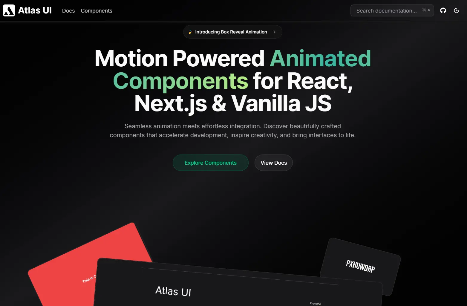
Atlas UI is an open-source component library that provides a collection of animated UI components for React, Next.js, and Vanilla JavaScript.
The architecture splits into two tracks. React and Next.js components use TypeScript for type safety and Tailwind CSS for styling. Vanilla JavaScript components run on plain JavaScript with standard CSS. Both tracks rely on Motion for animation logic.
Features
🎬 Motion-Driven Animations: All components use Motion as the animation engine. The library handles transitions, transforms, and timing curves through Motion’s API.
⚛️ Multi-Framework Support: React and Next.js components ship with TypeScript definitions and Tailwind styling. Vanilla JavaScript versions work in any HTML environment.
📋 Copy-Paste Implementation: Components install through CLI commands that add files directly to your project structure. You modify the source code in your own repository.
🎨 Tailwind CSS: React components use Tailwind utility classes. You can adjust colors, spacing, and layout through your Tailwind configuration.
Use Cases
- Marketing Landing Pages: Implement scroll-based text reveals and parallax sections to capture user attention immediately.
- Interactive Portfolios: Use mouse trailers and project galleries to display creative work with fluid transitions.
- SaaS Dashboards: Apply reveal effects and shiny buttons to highlight key actions or data points without cluttering the UI.
- Static Websites: Enhance standard HTML sites with Vanilla JS animated components to add interactivity without a heavy framework.
How to Use It
1. Initialize your Next.js project with the shadcn configuration:
pnpm dlx shadcn@latest init
npx shadcn@latest init
yarn shadcn@latest init
bunx --bun shadcn@latest init
2. Install the necessary Motion library:
pnpm add motion
npm install motion
yarn add motion
bun add motion
3. Install components through the shadcn CLI by pointing to the Atlas UI registry. Here’s how to add the Reveal Effect component:
pnpm dlx shadcn@latest add https://atlasui.vercel.app/r/reveal-effect.json
npx shadcn@latest add https://atlasui.vercel.app/r/reveal-effect.json
yarn shadcn@latest add https://atlasui.vercel.app/r/reveal-effect.json
bunx --bun shadcn@latest add https://atlasui.vercel.app/r/reveal-effect.json
4. The command downloads the component file into your components directory. You can now import and use it:
import { RevealEffect } from "@/components/reveal-effect";
export const Hero = () => {
  return (
    <div className="flex flex-col items-center space-y-2">
      <RevealEffect>
        <h1 className="font-bold text-5xl">Atlas UI</h1>
      </RevealEffect>
      <RevealEffect delay={0.2} translateY={15}>
        <p className="font-semibold text-xl text-center">
          Animated components for modern interfaces
        </p>
      </RevealEffect>
    </div>
  );
};
5. For non-React projects, Atlas UI includes vanilla JavaScript versions. These components use standard HTML, CSS, and JavaScript with Motion loaded from a CDN. You copy the HTML structure and CSS into your project, then initialize the component with JavaScript.
All UI Components Included
Animated Mobile Navbar
Blend Mouse Trailer
Blob Mouse Trailer
Box Reveal
Dot and Circle Mouse Trailer
Hacker Text
Loki Text Effect
Parallax Sections
Project Gallery
Reveal Effect
Scroll Based Character Reveal
Scroll Based Text Reveal
Scroll Based Word Reveal
Shiny Button
Related Resources
- Motion: The animation library that powers all Atlas UI components. Handles layout animations, gestures, and SVG path drawing.
- shadcn/ui: Component collection that inspired Atlas UI’s distribution model. Uses Radix UI primitives with Tailwind styling.
FAQs
Q: Can I use Atlas UI components in an existing Next.js project?
A: Yes. Run the shadcn init command in your project root, install Motion, then add components through the CLI.
Q: Do I need to install the entire library?
A: No. Atlas UI follows a copy-paste model. You install only the components you need through individual CLI commands. Each component file lands in your project where you can modify it.
Q: How do I customize animation timing and easing?
A: Edit the component files directly in your project. Most components expose props for duration and delay. For easing curves, modify the Motion transition objects in the component source code.
Q: Can I use Atlas UI without React?
A: Yes. The library includes vanilla JavaScript versions of components. These use plain HTML and CSS with Motion for animations. Check the documentation for vanilla implementation examples.
Q: Does Atlas UI work with other CSS frameworks besides Tailwind?
A: React components depend on Tailwind utility classes. For vanilla JavaScript components, you can replace the CSS with your preferred styling approach. The animation logic stays independent of the styling method.