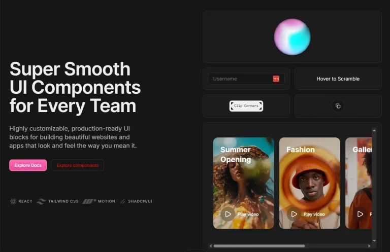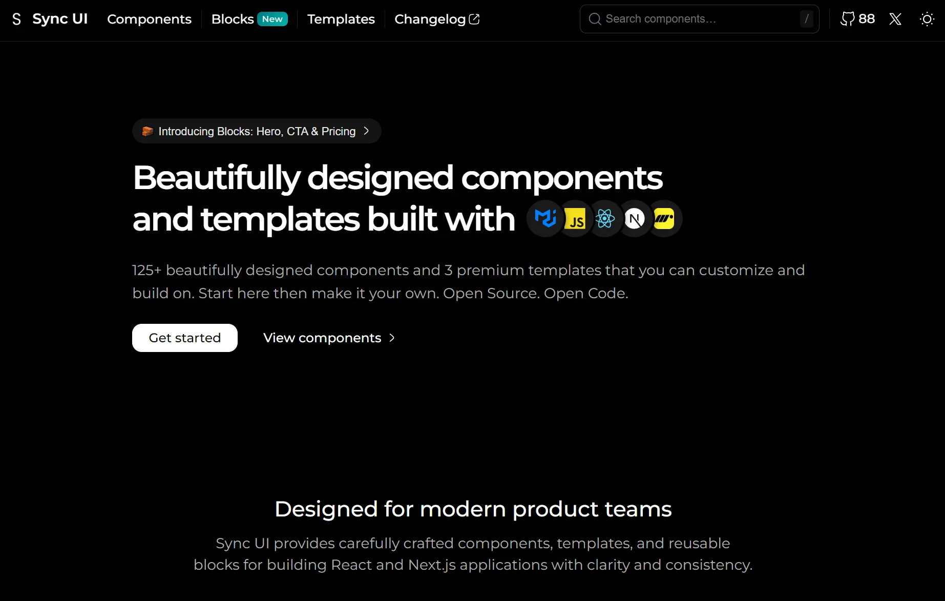
Sync UI is a modern UI component library that includes over 125 production-ready components and 10+ pre-built UI blocks for React/Next.js applications.
It builds interfaces with Material UI for styling and the Motion library for animations. The components connect to Next.js API routes for backend logic and include Umami Analytics for tracking.
Features
🧩 125+ Components and Variants: Accordions, autocompletes, avatars, buttons, cards, carousels, date pickers, dialogs, forms, loaders, pagination, skeletons, tables, tabs, and more.
🧱 10+ Blocks: Pre-built UI sections for landing pages, such as three hero block variants, four call-to-action blocks, and three pricing table layouts.
🎨 Material UI Styling: Uses the MUI component library and Emotion for CSS-in-JS styling.
⚡ Motion Animations: Integrates the motion/react library to handle component transitions and micro-interactions.
🚀 Next.js Optimization: Configures components for use within Next.js applications, including API route compatibility.
📊 Umami Analytics: Includes setup for the open-source Umami analytics platform to track page views.
Use Cases
- Landing Pages: Use the hero blocks, CTA sections, and pricing tables to build marketing pages.
- Dashboards: Combine tables, cards, and data visualization components to create admin panels and reporting tools.
- Form-Heavy Apps: Implement text fields, date pickers, time pickers, and autocompletes to build complex data entry interfaces.
- Animation-Rich Experiences: Add Motion-powered transitions to buttons, dialogs, and navigation elements for interactive web applications.
How to Use It
1. Create a new Next.js application. Run the Next.js creation command and navigate into your project directory.
npx create-next-app@latest my-app
cd my-app
2. Install the required dependencies for Sync UI. The library needs MUI core, Emotion styling packages, Motion for animations, and react-icons.
npm install @mui/material @emotion/react @emotion/styled motion react-icons3. Launch the development server and open your browser to localhost:3000 to verify the installation.
4. Visit the official documentation site to browse the component library. Each component/block page displays the code you can copy directly into your project. For example, to add an accordion component:
import React, { useState } from "react";
import {
Accordion,
AccordionSummary,
AccordionDetails,
Typography,
Box,
useTheme,
} from "@mui/material";
import { motion } from "motion/react";
import { RxChevronDown } from "react-icons/rx";

const BrutalistAccordion = () => {
const theme = useTheme();
const [expandedPanels, setExpandedPanels] = useState({});

const accordionData = [
  {
    id: "panel1",
    title: "Getting Started",
    content: "Quick introduction to our platform with essential setup steps.",
  },
  {
    id: "panel2",
    title: "Key Features",
    content: "Explore powerful tools designed to enhance your workflow.",
  },
  {
    id: "panel3",
    title: "Best Practices",
    content: "Learn proven strategies for optimal performance and results.",
  },
];

const handleChange = (panel) => (event, isExpanded) =>
  setExpandedPanels((prev) => ({ ...prev, [panel]: isExpanded }));

return (
  <Box sx={{ width: "100%", display: "flex", justifyContent: "center" }}>
    <Box sx={{ width: "100%", maxWidth: 700 }}>
      {accordionData.map((item) => (
        <Accordion
          key={item.id}
          expanded={expandedPanels[item.id] || false}
          onChange={handleChange(item.id)}
          disableGutters
          elevation={0}
          sx={{
            backgroundColor: theme.palette.mode === "dark" ? "#111" : "#FFF",
            border: "2px solid",
            borderColor: theme.palette.mode === "dark" ? "#FFF" : "#111",
            boxShadow: `3px 3px 0 ${
              theme.palette.mode === "dark" ? "#FFF" : "#111"
            }`,
            borderRadius: 0,
            mb: 2,
            "&::before": { display: "none" },
          }}
        >
          <AccordionSummary
            expandIcon={
              <motion.div
                animate={{ rotate: expandedPanels[item.id] ? 180 : 0 }}
                transition={{ duration: 0.15 }}
              >
                <RxChevronDown
                  size={20}
                  color={theme.palette.mode === "dark" ? "#FFF" : "#111"}
                />
              </motion.div>
            }
            sx={{
              color: theme.palette.mode === "dark" ? "#FFF" : "#111",
            }}
          >
            <Typography variant="h6">{item.title}</Typography>
          </AccordionSummary>
          <AccordionDetails
            sx={{
              borderTop: "1px solid",
              borderColor: theme.palette.mode === "dark" ? "#FFF" : "#111",
            }}
          >
            <Typography variant="body2">{item.content}</Typography>
          </AccordionDetails>
        </Accordion>
      ))}
    </Box>
  </Box>
);
};

export default BrutalistAccordion;
Related Resources
- Material UI: React component library that implements Material Design with extensive theming and customization options.
- Motion: Animation library for React that handles gestures, variants, and layout animations through declarative syntax.
- React Icons: A library that includes popular icon sets like the RxChevronDown used in the examples.
FAQs
Q: Can I use Sync UI components without Next.js?
A: Yes. The components work in any React application.
Q: Does the library support TypeScript?
A: MUI and Motion both include TypeScript definitions. You can add types to your component props when using Sync UI components in TypeScript projects.
Q: Can I mix Sync UI components with other component libraries?
A: Yes. Sync UI uses MUI as its foundation, so it works well alongside other MUI-based libraries.
Q: How do I implement dark mode across all components?
A: Wrap your application in MUI’s ThemeProvider and toggle the palette.mode property between “light” and “dark”.