The Future of Web Dev
The Future of Web Dev
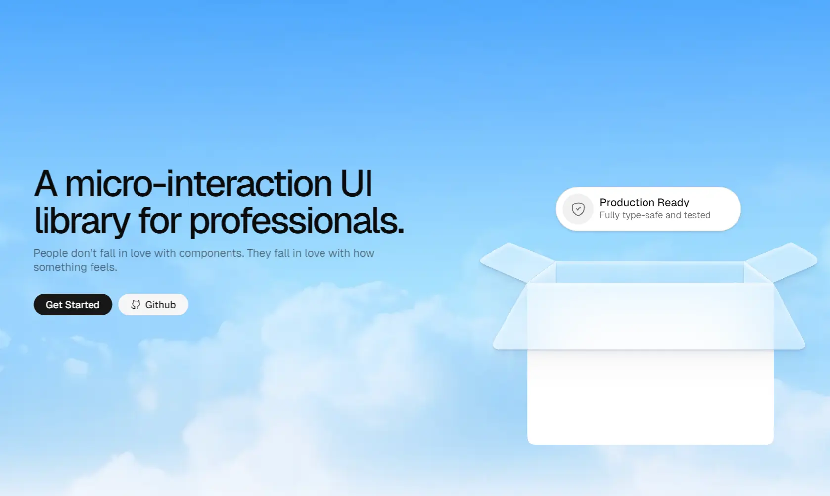
25+ UI Components & Micro-Interactions for Next.js – uselayouts
A React UI library with 25+ animated components built on Motion and Tailwind CSS. Copy and paste into any Next.js project.
uselayouts is a component library for React/Next.js that provides a set of animated UI components and micro-interactions built on Motion and Tailwind CSS.
The animations run on the Motion library that handles transitions, direction-aware hover effects, magnetic button behavior, and scroll-driven sequences.
Class management works through a cn() helper that merges clsx and tailwind-merge.
Features
🎬 Motion-Powered Animations: Transitions and micro-interactions run through the Motion library for fluid, frame-rate-consistent results.
🎨 Tailwind CSS Styling: Every component accepts Tailwind class overrides.
📋 Copy-Paste: Components land in your codebase as editable source files.
🔗 Shadcn/ui: Compatible with shadcn/ui project structures.
🖼️ HugeIcons: Icon usage across components comes from the HugeIcons package.
🧩 25+ Components: Includes animated layouts, carousels, forms, galleries, toolbars, and navigation elements.
Use Cases
- Marketing landing pages that need animated hero sections and interactive testimonial cards.
- Portfolio or showcase sites where subtle micro‑interactions reinforce the visual experience.
- Dashboard interfaces that require compact, animated components like bottom menus or inline edit fields.
- Multi‑step forms that benefit from smooth transitions between steps and direction‑aware feedback.
How to Use It
1. Install Dependencies. The NPM command below installs Motion for animation, clsx and tailwind-merge for class string management, and the HugeIcons packages used across several components.
npm install motion clsx tailwind-merge @hugeicons/react @hugeicons/core-free-icons2. Create a file at lib/utils.ts in your project. The cn() function merges Tailwind class strings and resolves conflicts between conditional overrides. Several uselayouts components import it from this path, so the file location matters.
import { clsx, type ClassValue } from "clsx";
import { twMerge } from "tailwind-merge";
export function cn(...inputs: ClassValue[]) {
  return twMerge(clsx(inputs));
}
3. Browse the component gallery at Uselayouts’ official document. Each component page gives you the full source code to copy directly, or you can pull it via the shadcn CLI.
npx shadcn@latest add "https://uselayouts.com/r/3d-book.json"The CLI copies the component file into your components/ directory as an editable source file. Each component URL follows the same pattern. Replace 3d-book with the component slug from the gallery.
4. Importing and rendering the component:
import InteractiveBook from "@/components/3d-book";
export default function Page() {
  return (
    <div className="h-[500px] w-full">
      <InteractiveBook />
    </div>
  );
}
5. All available UI components:
| Component | Description |
|---|---|
| 3D Book | Renders an interactive three-dimensional book element. |
| Animated Collection | Displays a group of items with staggered motion. |
| Bento Card | Creates a modular grid-based layout container. |
| Bottom Menu | Places a navigation bar at the lower screen edge. |
| Bucket | Shows a stylized container for holding items. |
| Day Picker | Selects dates from a calendar interface. |
| Delete Button | Triggers removal actions with visual feedback. |
| Discover Button | Encourages user exploration through animated states. |
| Discrete Tabs | Switches content views with minimal visual noise. |
| Dynamic Toolbar | Adapts action buttons based on user context. |
| Empty Testimonial | Displays a placeholder for user reviews. |
| Expandable Gallery | Enlarges image thumbnails upon user interaction. |
| Feature Carousel | Cycles through product highlights horizontally. |
| Fluid Expanding Grid | Rearranges items smoothly upon resizing. |
| Folder Interaction | Simulates opening and closing a file directory. |
| Inline Edit | Modifies text directly within its display context. |
| Filter Interaction | Sorts data categories with animated transitions. |
| Magnified Bento | Zooms into specific grid sections on hover. |
| Morphing Input | Changes shape dynamically during text entry. |
| Multi Step Form | Breaks complex inputs into sequential screens. |
| Pricing Card | Lists subscription tiers and features clearly. |
| Shake Testimonial Card | Draws attention to reviews via motion. |
| Smooth Dropdown | Reveals hidden menu options with a slide effect. |
| Stacked List | Arranges items vertically with overlapping layers. |
| Status Button | Communicates current system states visually. |
| Vertical Tabs | Navigates content sections via a side menu. |
Related Resources
- Motion: The animation library that provides transitions and micro-interactions.
- shadcn UI: The component distribution model and base UI system.
- Tailwind CSS: The utility-first CSS framework used for all component styling.
- HugeIcons: The icon library installed as a dependency across multiple components.
FAQs
Q: Does uselayouts work with Vite or Create React App?
A: The library recommends Next.js, but the components are standard React code. A Vite project with Tailwind CSS and Motion configured can run them without issues. Adjust import paths to match your directory structure.
Q: Do I need a full shadcn UI setup before using uselayouts?
A: No. The shadcn CLI is one option for pulling components. You can copy the source directly from the gallery and paste it into your React project.
Q: How do I update a component after adding it?
A: Re-run the shadcn CLI command for that component, or update the source file manually from the gallery.
Q: Does uselayouts work with TypeScript?
A: Yes. The utility helper uses the .ts extension and TypeScript types from the clsx package. Components from the gallery are authored in TypeScript.


