The Future of Web Dev
The Future of Web Dev
Modern Landing Page Components & Templates for Next.js – Page UI
Build modern, high-converting landing pages fast with Page UI components and templates.
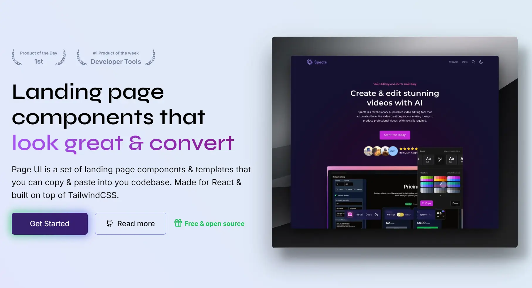
Page UI is a collection of production-ready, copy-paste Next.js/React components and templates for building modern, high-converting landing pages.
Unlike traditional UI component libraries that require installation as dependencies, Page UI follows the same model as shadcn/ui.
You copy only the components you need, and they become part of your own codebase.
This gives you full control over styling, structure, and behavior without adding external runtime dependencies.
Features
🎯 Landing Page Focused – Components designed for conversion-optimized marketing pages.
🎨 Tailwind CSS Styling – Modern utility-first CSS framework integration.
🔧 Fully Customizable – Complete code ownership allows unlimited modifications.
🚀 Production Ready – Battle-tested components used in real applications.
🎪 Rich Component Library – Over 40 landing page components available.
🌙 Dark Mode Support – Built-in dark theme compatibility.
Use Cases
- SaaS Product Launches: You can quickly assemble a professional landing page to showcase a new software product, including feature sections, pricing tiers, and call-to-action buttons.
- Marketing Campaign Pages: You can build dedicated pages for marketing initiatives, using components like testimonial grids and newsletter sign-up forms to drive conversions.
- Developer Portfolios: You can create a personal portfolio website to showcase your projects and skills, using components like product cards and about sections.
- Startup Websites: You can construct the initial web presence for a new company, combining various components to explain the business, introduce the team, and capture leads.
How to Use It
1. Create a new Next.js application if you do not have one.
npx create-next-app@latest my-app --typescript --tailwind --eslint2. Run the Page UI command-line wizard. This CLI will guide you through the setup process and add the necessary configuration to your project.
npx @page-ui/wizard@latest init3. Install the required dependencies for Page UI components. These packages provide form handling, typography, animations, and utility functions:
npm install @tailwindcss/forms @tailwindcss/typography tailwindcss-animate class-variance-authority clsx tailwind-merge lucide-react @radix-ui/react-accordion4. Add custom styles to your global.css file. These styles define CSS variables for theming, such as colors and shadows, and add utility classes for creating perspective effects and custom containers.
@tailwind base;
@tailwind components;
@tailwind utilities;

@layer base {
  :root {
    --hard-shadow: 0px 29px 52px 0px rgba(0, 0, 0, 0.4),
      22px 25px 16px 0px rgba(0, 0, 0, 0.2);
    --hard-shadow-left: 0px 29px 52px 0px rgba(0, 0, 0, 0.4),
      -22px 25px 16px 0px rgba(0, 0, 0, 0.2);
    /* If you use Shadcn UI already, you should already have these variables defined */
    --background: 0 0% 100%;
    --foreground: 240 10% 3.9%;
    --card: 0 0% 100%;
    --card-foreground: 240 10% 3.9%;
    --popover: 0 0% 100%;
    --popover-foreground: 240 10% 3.9%;
    --primary-foreground: 355.7 100% 97.3%;
    --secondary: 240 4.8% 95.9%;
    --secondary-foreground: 240 5.9% 10%;
    --muted: 240 4.8% 95.9%;
    --muted-foreground: 240 3.8% 46.1%;
    --accent: 240 4.8% 95.9%;
    --accent-foreground: 240 5.9% 10%;
    --destructive: 0 84.2% 60.2%;
    --destructive-foreground: 0 0% 98%;
    --border: 240 5.9% 90%;
    --input: 240 5.9% 90%;
    --radius: 0.5rem;
    --primary-lighter-hex: theme('colors.primary.200');
    --secondary-lighter-hex: theme('colors.secondary.200');
    --primary-dark-hex: theme('colors.primary.800');
    --secondary-dark-hex: theme('colors.secondary.800');
  }

  .dark {
    /* If you use Shadcn UI already, you can skip this block. */
    --background: 20 14.3% 4.1%;
    --foreground: 0 0% 95%;
    --card: 24 9.8% 10%;
    --card-foreground: 0 0% 95%;
    --popover: 0 0% 9%;
    --popover-foreground: 0 0% 95%;
    --primary-foreground: 144.9 80.4% 10%;
    --secondary: 240 3.7% 15.9%;
    --secondary-foreground: 0 0% 98%;
    --muted: 0 0% 15%;
    --muted-foreground: 240 5% 64.9%;
    --accent: 12 6.5% 15.1%;
    --accent-foreground: 0 0% 98%;
    --destructive: 0 62.8% 30.6%;
    --destructive-foreground: 0 85.7% 97.3%;
    --border: 240 3.7% 15.9%;
    --input: 240 3.7% 15.9%;
  }

  body {
    font-family: Arial, Helvetica, sans-serif;
  }

  *,
  ::before,
  ::after {
    @apply border-gray-100 dark:border-neutral-800;
  }

  * {
    @apply font-sans;
  }

  h1,
  h2,
  h3,
  h4,
  h5,
  h6 {
    @apply font-semibold font-display;
  }
}

@layer utilities {
  .text-balance {
    text-wrap: balance;
  }

  /**
   * Perspective (used for images etc.)
   */
  .perspective-none {
    transform: none;
  }

  .perspective-left {
    box-shadow: var(--hard-shadow);
    transform: perspective(400em) rotateY(-15deg) rotateX(6deg)
      skew(-8deg, 4deg) translate3d(-4%, -2%, 0) scale(0.8);
  }

  .perspective-right {
    box-shadow: var(--hard-shadow-left);
    transform: perspective(400em) rotateY(15deg) rotateX(6deg) skew(8deg, -4deg)
      translate3d(4%, -2%, 0) scale(0.8);
  }

  .perspective-bottom {
    box-shadow: var(--hard-shadow);
    transform: translateY(-4%) perspective(400em) rotateX(18deg) scale(0.9);
  }

  .perspective-bottom-lg {
    box-shadow: var(--hard-shadow);
    transform: perspective(400em) translate3d(0, -6%, 0) rotateX(34deg)
      scale(0.8);
  }

  .perspective-paper {
    box-shadow: var(--hard-shadow);
    transform: rotateX(40deg) rotate(40deg) scale(0.8);
  }

  .perspective-paper-left {
    box-shadow: var(--hard-shadow-left);
    transform: rotateX(40deg) rotate(-40deg) scale(0.8);
  }

  /**
   * Custom shadows
   */
  .hard-shadow {
    box-shadow: var(--hard-shadow);
  }

  .hard-shadow-left {
    box-shadow: var(--hard-shadow-left);
  }

  /**
   * Container utilities
   */
  .container-narrow {
    @apply max-w-4xl;
  }

  .container-wide {
    @apply xl:max-w-6xl;
  }

  .container-ultrawide {
    @apply xl:max-w-7xl;
  }
}
4. After completing the setup, visit the Page UI documentation to browse available components and templates. Each component page provides the complete source code that you can copy directly into your project.
Related Resources
- Tailwind UI: Premium component library from Tailwind CSS creators with marketing and application components.
- Next.js Documentation: Official guide to building React applications with Next.js framework.
- Landing Page: Discover the best landing page templates built with modern web dev tech like Next.js, shadcn/ui, TailwindCSS, and more.
FAQs
Q: Can I customize the components?
A: Yes. Since the code becomes part of your project, you have full control to modify the components as needed. They are themeable using Tailwind CSS.
Q: How do I update components when Page UI releases new versions?
A: You manually copy updated component code when needed. This gives you control over when and which updates to apply to your project.