The Future of Web Dev
The Future of Web Dev
40+ Apple Liquid Glass-inspired UI Components for Next.js – glass-ui
Add Apple Liquid Glass-style UI to Next.js apps with glass-ui. Supports light/dark themes and custom glass effects.
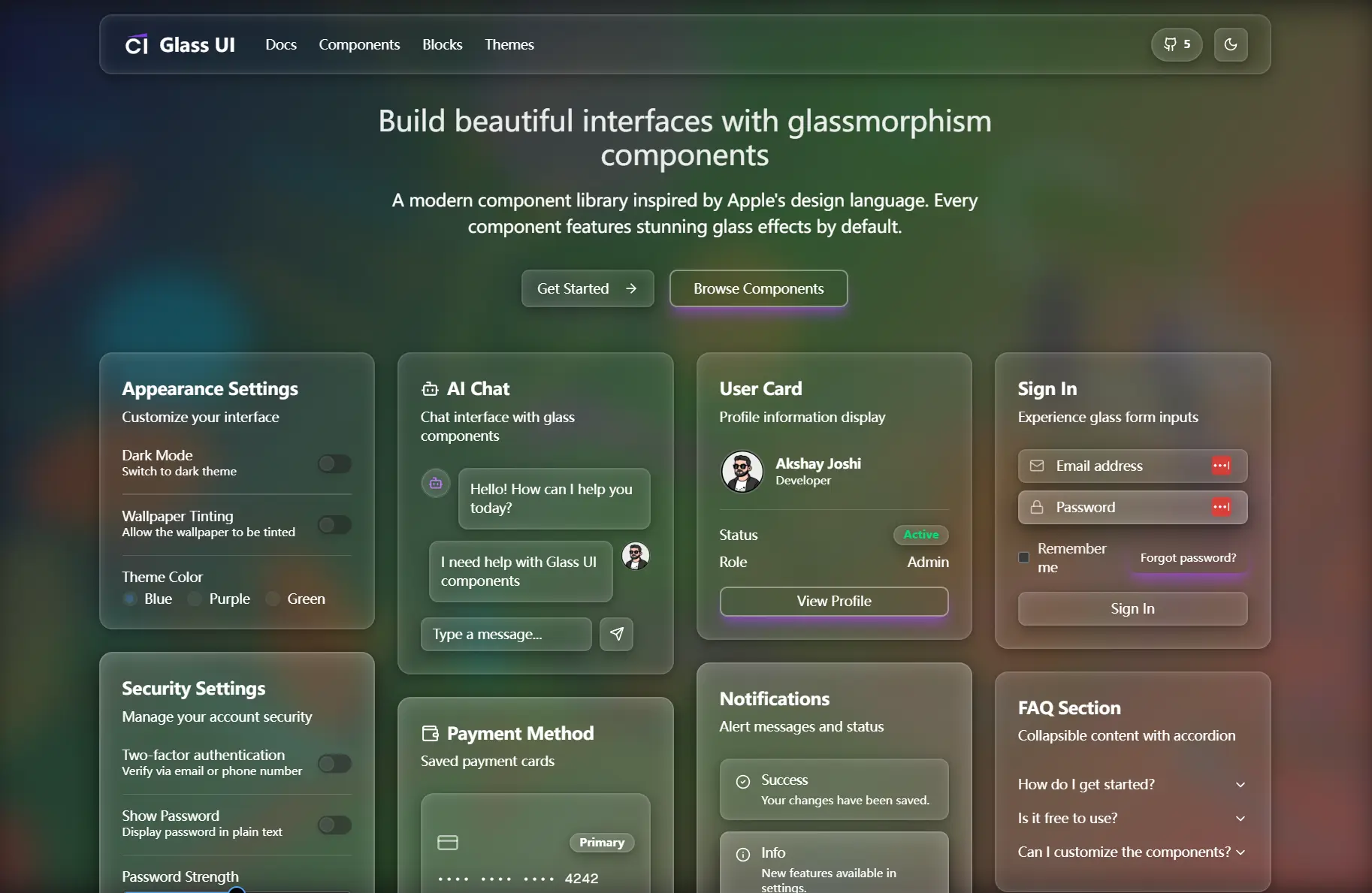
glass-ui is a UI component library that delivers Apple Liquid Glass-style glassmorphic UI elements for Next.js applications through the shadcn/ui registry system.
The library packages over 40 pre-styled components with Apple-style glass effects, backdrop blur, and animated overlays.
Each component installs individually through the shadcn CLI and arrives fully typed with TypeScript definitions built on Radix UI primitives.
Features
🎨 Component Collection: Access 40+ UI components including buttons, cards, dialogs, navigation menus, tables, and form controls, all enhanced with glass effects.
🌓 Theme System: Switch between light and dark modes with automatic CSS variable adjustments that maintain glass effect visibility across color schemes.
✨ Animation Library: Apply glow, shimmer, ripple, and gradient animations to components through prop-based configuration.
🎛️ Configuration Flexibility: Modify glass appearance through global CSS variables or per-component props that control transparency, blur, border color, and shadow depth.
📦 CLI Installation: Install components individually using shadcn CLI with support for pnpm, yarn, npm, and bun package managers.
🔤 TypeScript Support: Work with fully typed component APIs and props definitions that provide autocomplete and type checking during development.
♿ Accessibility Foundation: Use components built on Radix UI primitives that include keyboard navigation, screen reader support, and ARIA attributes.
🎨 Tailwind Integration: Style components using utility classes while glass effects remain controlled through CSS custom properties.
Use Cases
- Dashboard Interfaces: Create analytical dashboards with translucent data cards and controls.
- Portfolio Websites: Implement glassmorphic navigation elements and content sections.
- Application UIs: Build desktop‑style applications with frosted glass panels and menus.
- Mobile Web Apps: Develop touch‑friendly interfaces with ripple and glow feedback.
How to Use It
glass-ui components install through the shadcn/ui CLI. Each component requires a separate installation command that downloads the component source code into your project’s component directory.
1. Run the installation command with your preferred package manager. The examples below show button component installation, but you can replace @crenspire/button with any available component name.
pnpm dlx shadcn@latest add @crenspire/buttonFor yarn users:
yarn dlx shadcn@latest add @crenspire/buttonUsing npm:
npx shadcn@latest add @crenspire/buttonWith bun:
bunx shadcn@latest add @crenspire/buttonThe CLI installs components to @/components/ui/ by default. This path may differ if you modified your shadcn configuration during project setup.
2. Import installed components from your configured component directory.
import { Button } from "@/components/ui/button"
export function GlassButton() {
  return (
    <Button variant="glass" effect="glow">
      Get Started
    </Button>
  )
}
3. Glass appearance properties live in CSS custom properties. Modify these variables in your global stylesheet to change how all glass components render.
Open your globals.css file and add or modify the root variables:
:root {
  --glass-bg: rgba(255, 255, 255, 0.25);
  --glass-border: rgba(255, 255, 255, 0.18);
  --blur: 30px;
  --blur-sm: 15px;
  --blur-lg: 50px;
  --glass-shadow: 0 8px 32px rgba(0, 0, 0, 0.1), 0 2px 8px rgba(0, 0, 0, 0.06);
}
Dark mode uses separate variable definitions. The .dark class selector overrides light mode values:
.dark {
  --glass-bg: rgba(255, 255, 255, 0.1);
  --glass-border: rgba(255, 255, 255, 0.2);
  --blur: 30px;
  --glass-shadow: 0 8px 32px rgba(0, 0, 0, 0.4), 0 2px 8px rgba(0, 0, 0, 0.2);
}
Changes to these variables apply immediately across all components using glass variants. No component code modifications are required.
4. All global CSS Variables
- –glass-bg: Background color and opacity for glass surfaces. Accepts rgba values. Default light mode is
rgba(255, 255, 255, 0.25). Default dark mode isrgba(255, 255, 255, 0.1). - –glass-border: Border color and opacity for glass edges. Accepts rgba values. Default light mode is
rgba(255, 255, 255, 0.18). Default dark mode isrgba(255, 255, 255, 0.2). - –blur: Standard backdrop blur amount in pixels. Default is
30pxfor both light and dark modes. - –blur-sm: Small backdrop blur for subtle effects. Default is
15pxfor both light and dark modes. - –blur-lg: Large backdrop blur for strong effects. Default is
50pxfor both light and dark modes. - –glass-shadow: Standard shadow depth for glass components. Default light mode is
0 8px 32px rgba(0, 0, 0, 0.1), 0 2px 8px rgba(0, 0, 0, 0.06). Default dark mode is0 8px 32px rgba(0, 0, 0, 0.4), 0 2px 8px rgba(0, 0, 0, 0.2). - –glass-shadow-lg: Large shadow for elevated glass surfaces. Default light mode is
0 12px 48px rgba(0, 0, 0, 0.15), 0 4px 16px rgba(0, 0, 0, 0.1). Default dark mode is0 12px 48px rgba(0, 0, 0, 0.5), 0 4px 16px rgba(0, 0, 0, 0.3). - –glass-shadow-sm: Small shadow for subtle glass elevation. Default light mode is
0 4px 16px rgba(0, 0, 0, 0.08), 0 1px 4px rgba(0, 0, 0, 0.04). Default dark mode is0 4px 16px rgba(0, 0, 0, 0.3), 0 1px 4px rgba(0, 0, 0, 0.15).
5. All available UI components:
Accordion, Alert, Alert Dialog, Avatar, Badge, Breadcrumb, Button, Calendar, Card, Chart, Checkbox, Collapsible, Command, Cropper, Dialog, Drawer, Dropdown Menu, Hover Card, Input, Input OTP, Label, Mode Toggle, Navigation Menu, Pagination, Popover, Radio Group, Scroll Area, Select, Separator, Sheet, Sidebar, Skeleton, Slider, Sonner, Switch, Table, Tabs, Textarea, Toggle, Toggle Group, Tooltip.
Related Resources
- shadcn-ui: The component framework that glass-ui extends with glassmorphic styling and additional variants.
- Radix UI: Unstyled accessible component primitives that form the foundation of glass-ui components.
- Tailwind CSS: Utility-first CSS framework used for component styling alongside glass effects.
- Next.js: React framework recommended for building applications with glass-ui components.
FAQs
Q: Can I use glass-ui components without Next.js?
A: glass-ui components work in any React environment that supports Tailwind CSS and CSS custom properties. Next.js is recommended but not required. You need a build system that handles CSS modules and supports the shadcn CLI installation process.
Q: Do glass effects impact application performance?
A: Backdrop blur filters can affect rendering performance on lower-end devices. The browser must apply blur calculations during each paint cycle. Test your implementation across target devices and consider reducing blur amounts or disabling glass effects on mobile devices if performance issues occur.
Q: Can I combine glass variants with other shadcn-ui variants?
A: glass-ui components replace standard shadcn-ui variants. You cannot combine variant="glass" with other variant options like variant="outline" on the same component instance. Choose glass variants when you want glassmorphic styling or use standard variants for conventional appearances.
