The Future of Web Dev
The Future of Web Dev
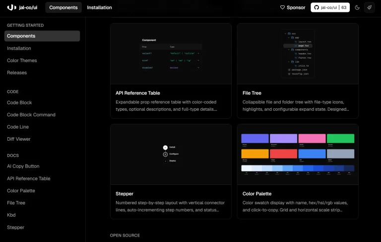
100+ Animated React/Next.js Components for Modern UIs – uilayouts
Build modern UIs with uilayouts component library. Features 100+ animated cards, drawers, galleries, and 3D components for React and Next.js projects.
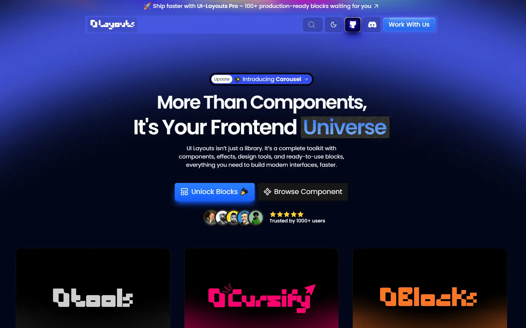
uilayouts is a component library that includes 100+ animated, interactive UI components built for React and Next.js applications.
The library uses Tailwind CSS for styling, Motion library for animations, React Three Fiber for 3D elements, and GSAP for advanced motion effects.
Each component includes multiple style variations and positional examples that you can copy directly into your codebase.
Features
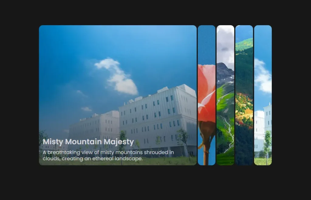
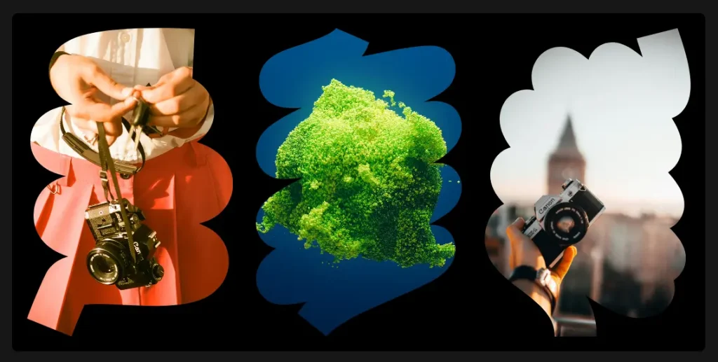
🎨 100+ Component Variants: The library contains visual effects like liquid glass, blur vignette, spotlight cards, and image reveal blocks.
🎭 Advanced Animations: Uses Motion for drag interactions, timeline animations, scroll-triggered effects, and text marquees.
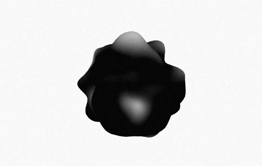
🎯 3D Integration: Three.js-based components include globe visualizations, ripple effects, and mesh gradients through React Three Fiber.
🎬 Motion Drawers & Modals: Multiple drawer and modal variants with directional animations and motion effects.
📋 Form Components: Complete form elements including color pickers, range sliders, datetime pickers, multi-selectors, and file upload interfaces.
🖼️ Gallery & Carousel Systems: Progressive carousels, framer carousels, and standard carousel implementations with masking support.
🔄 Scroll Effects: Smooth scroll, sticky scroll, horizontal scroll, and stacking card animations.
⚡ Copy-Paste Ready: All components include complete code examples that you can integrate immediately.
Use Cases
- Landing Pages: Build animated hero sections with liquid gradients, spotlight cards, and scroll-triggered animations for marketing sites
- Dashboard Interfaces: Implement responsive headers, grid layouts, and interactive data visualizations with 3D elements
- Portfolio Sites: Create image galleries with masking effects, progressive carousels, and hover card interactions
- SaaS Applications: Add modal systems, form components, and navigation tabs for web application interfaces
How to Use It
1. Install the required dependencies in your React or Next.js project:
You must have Tailwind CSS configured in your project. If you haven’t set it up yet, follow the official Tailwind CSS installation guide for your framework.
npm install motion clsx tailwind-merge2. Create a utils.ts file in your project’s utility directory. This function merges Tailwind class names and handles conditional classes correctly.
import { type ClassValue, clsx } from 'clsx'
import { twMerge } from 'tailwind-merge'
export function cn(...inputs: ClassValue[]) {
  return twMerge(clsx(inputs))
}
3. Create a use-media-query.tsx file in your hooks directory. This hook enables responsive behavior across components.
import { useEffect, useState } from 'react'
export function useMediaQuery(query: string) {
  const [value, setValue] = useState(false)
  useEffect(() => {
    function onChange(event: MediaQueryListEvent) {
      setValue(event.matches)
    }
    const result = matchMedia(query)
    result.addEventListener('change', onChange)
    setValue(result.matches)
    return () => result.removeEventListener('change', onChange)
  }, [query])
  return value
}
4. Visit the uilayouts official website and browse through the component categories. Each component page displays multiple style variations and code examples. Select the component variant you want, copy the complete code, and paste it into your project.
All UI Components Included:
Visual Effects: Liquid glass, noise effects, blur vignette, liquid gradients, spotlight cards, image reveal, blocks, and animated beams
Animation & Motion: Swapy drag, drag items, timeline animation, scroll animation, scroll text, text marquee, randomized text, image mousetrail, horizontal scroll, stacking cards, smooth scroll, sticky scroll, sparkles, sparkles title, marquee, and infinity brand
Overlays: Dialog, media modal, linear modal, gallery modal, responsive modal, directional drawer, and motion drawer
Forms: Color picker, buttons, motion number, range slider, password input, YouTube tags, phone input, datetime picker, multi-selector, and file upload
3D & Visuals: Globe, image ripple effect, R3F blob, and mesh gradients
Layout: Footers, responsive header, grid, and masonry
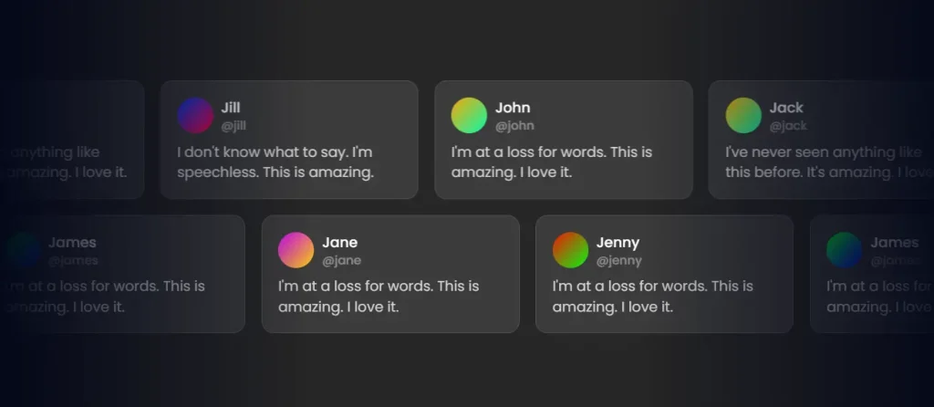
Cards & Highlights: Buy me a coffee, hover cards, product cards, and gradient border
Media & Galleries: Clip-path, image masking, video masking, progressive carousel, carousel, and framer carousel
Navigation: Tabs, image tabs, and magnified doc
Disclosure: Accordion, FAQs, and image accordion
Featured UI Components

Related Resources
- Tailwind CSS: A utility-first CSS framework for rapid UI development.
- Framer Motion: A production-ready motion library for React.
- React Three Fiber: A React renderer for Three.js that handles 3D scenes.
- GSAP: A standard JavaScript animation library for high-performance animations.
FAQs
Q: Do I need to install uilayouts as a dependency?
A: No, you do not install it via npm. You copy the specific component code you need directly into your project files.
Q: Can I customize the component styles?
A: Yes. All components use Tailwind CSS classes, so you can modify styles by changing the class names or extending your Tailwind configuration with custom colors, spacing, or animations.
Q: How do I handle responsive behavior?
A: The included useMediaQuery hook handles responsive breakpoints. Components use this hook internally, and you can also use it in your custom implementations to adapt behavior based on screen size.