The Future of Web Dev
The Future of Web Dev
Responsive Sidebar Component for Next.js
Get a free, fully responsive sidebar component for your Next.js project. Built with Tailwind CSS and ShadCN for easy customization.

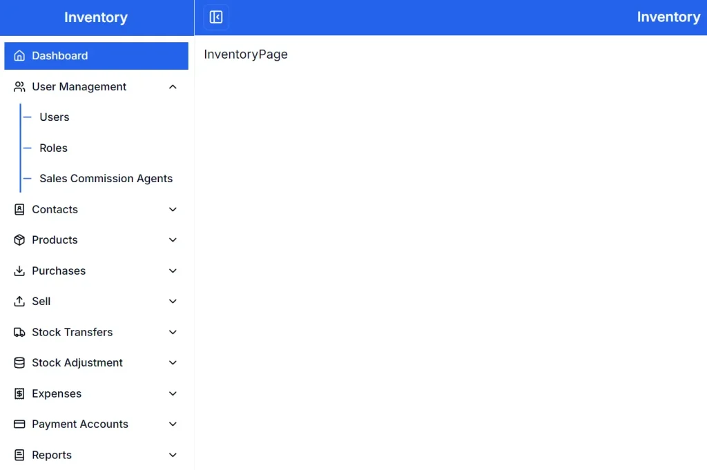
This is a modern, fully responsive sidebar component built with Next.js, TypeScript, Tailwind CSS, shadcn/ui, and Lucide Icons.
You can use it for projects that require a main navigation menu, such as admin panels, dashboards, or content-heavy websites.
Features
📱 Responsive Design – Automatically adapts to different screen sizes
✨ Smooth Animations – CSS transitions for polished user interactions
⚡ Next.js – Built with modern development practices and strong typing
🎨 ShadCN/UI – Uses pre-built components for consistent design language
🔧 Lucide Icons – Lightweight icon library with extensive symbol collection
🔄 Toggle Functionality – Hide and show sidebar with built-in toggle button
✨ Smooth Animations – CSS transitions for polished user interactions
🛠️ Highly Customizable – Easy to modify colors, width, and content structure
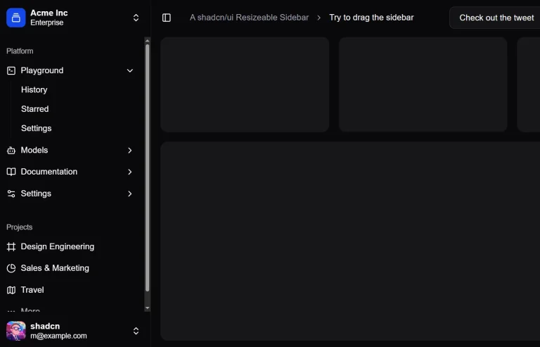
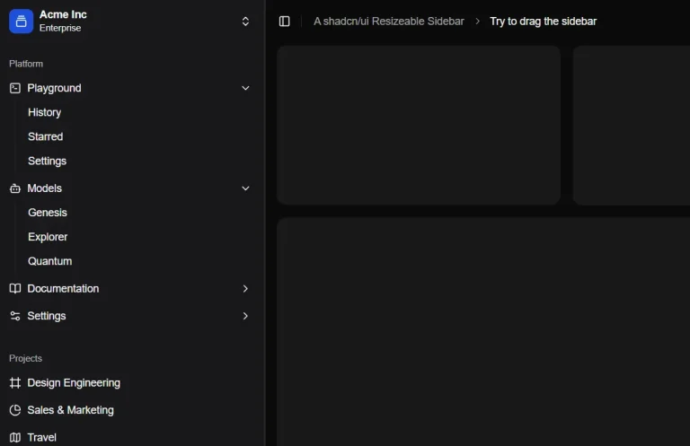
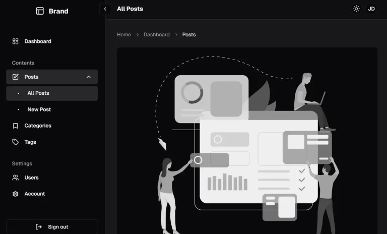
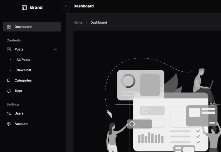
Preview
Use Cases
- Admin Dashboards: Implement a primary navigation for users to move between different sections like analytics, user management, and settings.
- E-commerce Applications: Use the sidebar for category navigation, filtering options, or customer account menus.
- Documentation Sites: Organize guides, API references, and tutorials in a structured and accessible manner.
- Content Management Systems (CMS): Provide editors and administrators with a clear navigation structure for managing content, media, and site configurations.
Installation
1. Clone the repository and navigate to the project directory
git clone https://github.com/sulaimanbiswas/fully-responsive-sidebar.gitcd fully-responsive-sidebar2. Install dependencies:
npm install3. Run the development server. You can then view the component by opening http://localhost:3000 in your browser.
npm run devUsage
You can customize the sidebar by editing the component files directly.
To change the visual appearance, you can modify the Tailwind CSS utility classes within the component files. For example, you can adjust colors or the sidebar’s width (w-64, w-1/4, etc.).
To add or remove navigation items, you need to edit the JSX structure in the Next.js components. Icons can be replaced by importing different ones from the Lucide Icons library and placing them within your menu items.
Related Resources
- ShadCN UI – Component library used for UI elements. Access documentation at https://ui.shadcn.com for additional components and styling options.
- Tailwind CSS – Utility-first CSS framework powering the component styling. Visit https://tailwindcss.com for comprehensive styling documentation.
- Lucide React – Icon library providing the sidebar icons. Browse available icons at https://lucide.dev for additional symbol options.
- Next.js Documentation – Framework documentation for advanced routing and optimization features. Reference https://nextjs.org/docs for implementation guidance.
FAQs
Q: How do I customize the sidebar width for different screen sizes?
A: Modify the Tailwind CSS width classes in the component files. Use responsive prefixes like w-64 md:w-72 lg:w-80 to set different widths for various breakpoints.
Q: Does the sidebar support nested menu items?
A: The current implementation shows single-level navigation. You can extend the component by adding conditional rendering logic for submenu items and updating the state management.
Q: Can I integrate this with authentication systems?
A: Yes, you can add authentication logic to control menu item visibility. Wrap menu items in conditional statements based on user roles or authentication status.
Q: How do I change the icons used in the sidebar?
A: Replace the imported Lucide icons with different ones from the Lucide library. Import new icons and update the JSX to use your preferred symbols.