The Future of Web Dev
The Future of Web Dev
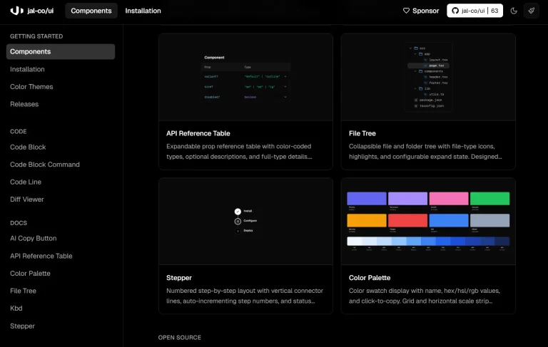
60+ Animated, Customizable UI Components for Next.js – ScrollX-UI
Open-source component library with 60+ animated UI components. Compatible with Next.js, TypeScript, and Tailwind CSS for modern web apps.
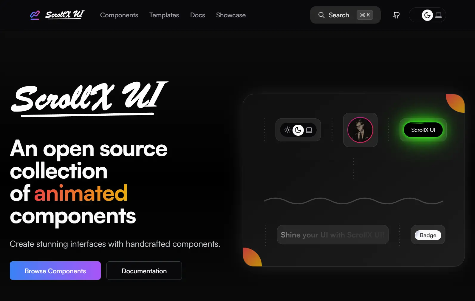
ScrollX-UI is an open-source, modern UI component library built using Next.js, TypeScript, Tailwind CSS, and Framer Motion.
It features over 60+ animated, customizable UI components that combine beautiful design with accessibility standards. Each component follows a clean Root/Trigger/Content pattern.
You can use these components for prototyping new ideas or for scaling large enterprise applications. They are also structured for easy parsing and regeneration by AI-assisted coding tools.
Features
🔓 Open Source and Customizable. Every component is open-source. You can fork, modify, or extend components to fit your project’s requirements.
🧱 Composable Component Structure. Components follow a consistent Root, Trigger, and Content pattern, which promotes a developer-friendly experience across your application.
📦 Direct File-Based Distribution. You can use components directly from flat files. This plug-and-play approach avoids lock-ins and complex bundling.
✨ Modern and Accessible by Default. Each component incorporates modern design principles and is built to be accessible with minimal configuration.
How to Use It
1. Create a new Next.js application using your preferred package manager. Run the create command and follow the configuration prompts:
npx create-next-app@latest
pnpm create next-app@latest
bun x --bun create-next-app@latest
During installation, configure your project with TypeScript, ESLint, Tailwind CSS, App Router, and custom import alias support. These settings provide the foundation for ScrollX UI components.
2. Add the core dependencies that ScrollX UI components require for proper functionality:
npm install class-variance-authority clsx tailwind-merge lucide-react tw-animate-css3. Update your tsconfig.json file to support the import alias structure used throughout the component library:
{
  "compilerOptions": {
    "baseUrl": ".",
    "paths": {
      "@/*": ["./*"]
    }
  }
}
4. Create or update your global CSS file to include Tailwind directives and CSS custom properties for theming:
@tailwind base;
@tailwind components;
@tailwind utilities;

:root {
--font-satoshi: "Satoshi", var(--font-geist-sans), sans-serif;
--background: 0 0% 100%;
--foreground: 240 10% 3.9%;
--card: 0 0% 100%;
--card-foreground: 240 10% 3.9%;
--popover: 0 0% 100%;
--popover-foreground: 240 10% 3.9%;
--primary: 240 5.9% 10%;
--primary-foreground: 0 0% 98%;
--secondary: 240 4.8% 95.9%;
--secondary-foreground: 240 5.9% 10%;
--muted: 240 4.8% 95.9%;
--muted-foreground: 240 3.8% 46.1%;
--accent: 240 4.8% 95.9%;
--accent-foreground: 240 5.9% 10%;
--destructive: 0 84.2% 60.2%;
--destructive-foreground: 0 0% 98%;
--border: 240 5.9% 90%;
--input: 240 5.9% 90%;
--ring: 240 5.9% 10%;
--radius: 0.5rem;
--chart-1: 12 76% 61%;
--chart-2: 173 58% 39%;
--chart-3: 197 37% 24%;
--chart-4: 43 74% 66%;
--chart-5: 27 87% 67%;
}

.dark {
--background: 240 10% 3.9%;
--foreground: 0 0% 98%;
--card: 240 10% 3.9%;
--card-foreground: 0 0% 98%;
--popover: 240 10% 3.9%;
--popover-foreground: 0 0% 98%;
--primary: 0 0% 98%;
--primary-foreground: 240 5.9% 10%;
--secondary: 240 3.7% 15.9%;
--secondary-foreground: 0 0% 98%;
--muted: 240 3.7% 15.9%;
--muted-foreground: 240 5% 64.9%;
--accent: 240 3.7% 15.9%;
--accent-foreground: 0 0% 98%;
--destructive: 0 62.8% 30.6%;
--destructive-foreground: 0 0% 98%;
--border: 240 3.7% 15.9%;
--input: 240 3.7% 15.9%;
--ring: 240 4.9% 83.9%;
--chart-1: 220 70% 50%;
--chart-2: 160 60% 45%;
--chart-3: 30 80% 55%;
--chart-4: 280 65% 60%;
--chart-5: 340 75% 55%;
}

* {
@apply border-border;
}


html,
body {
@apply transition-colors duration-500 bg-background text-foreground;
@apply bg-background text-foreground;
}
5. Add the utility function that combines class names for conditional styling:
// lib/utils.ts
import { ClassValue, clsx } from "clsx";
import { twMerge } from "tailwind-merge";
export function cn(...inputs: ClassValue[]) {
  return twMerge(clsx(inputs));
}
6. Create a components.json file in your project root to define the component structure and aliases:
{
  "$schema": "https://ui.shadcn.com/schema.json",
  "style": "new-york",
  "rsc": false,
  "tsx": true,
  "tailwind": {
    "config": "",
    "css": "src/styles/globals.css",
    "baseColor": "neutral",
    "cssVariables": true,
    "prefix": ""
  },
  "aliases": {
    "components": "@/components",
    "utils": "@/lib/utils",
    "ui": "@/components/ui"
  },
  "iconLibrary": "lucide"
}
7. For components requiring additional dependencies like Radix UI primitives, install them before copying component code:
npm install @radix-ui/react-accordionCopy the component code into your project structure, typically in the components/ui directory. Each component includes TypeScript definitions and follows the established naming conventions.
8. Extend your Tailwind config with custom animations and keyframes used by ScrollX UI components:
module.exports = {
  theme: {
    extend: {
      keyframes: {
        "accordion-down": {
          from: { height: "0" },
          to: { height: "var(--radix-accordion-content-height)" },
        },
        "shake-smooth": {
          '0%': { transform: 'translateX(0)' },
          '50%': { transform: 'translateX(-6px)' },
          '100%': { transform: 'translateX(0)' },
        }
      },
      animation: {
        "accordion-down": "accordion-down 0.2s ease-out",
        "shake-smooth": "shake-smooth 0.5s ease-in-out",
      }
    }
  }
};
9. Import and use components (accordion component in this example):
import {
  Accordion,
  AccordionContent,
  AccordionItem,
  AccordionTrigger,
} from "@/components/ui/accordion";
export default function MyPage() {
  return (
    <Accordion type="single" collapsible>
      <AccordionItem value="item-1">
        <AccordionTrigger>What is ScrollX UI?</AccordionTrigger>
        <AccordionContent>
          ScrollX UI is a modern component library for React applications.
        </AccordionContent>
      </AccordionItem>
    </Accordion>
  );
}
10. You can also use the shadcn/ui CLI for simplified component installation:
npx shadcn@latest init
npx shadcn@latest add https://scrollxui.dev/registry/accordion.json
This method automatically handles dependencies and file placement for supported components.
UI Components
- Accordion: A component for creating vertically stacked, collapsible content panels.
- Alert Dialog: A modal window that requires user interaction to proceed.
- Animated Button: A button with integrated animations for user interactions.
- Animated Tabs: A tabbed interface with smooth transitions between content panels.
- Animated Testimonials: A component for displaying testimonials with engaging animations.
- Animated TextGenerate: Creates text with a typewriter or other animated effects.
- Aspect Ratio: A container that maintains a fixed aspect ratio for its content.
- Avatar: Displays a user’s image or initials.
- Background Meteors: An animated background effect that simulates meteors.
- Background Paths: Creates animated SVG-based path patterns for backgrounds.
- Badge: A small element for displaying status indicators or counts.
- Button: A standard clickable button with various styling options.
- Card: A container for displaying content in a structured format.
- Carousel: A slideshow for cycling through images or other content.
- CodeBlock: A formatted container for displaying code snippets.
- Cursor ImageTrail: An effect where a trail of images follows the cursor.
- Dropdown: A menu that displays a list of options upon interaction.
- Expandable Dock: A navigation dock that expands to show more options on hover.
- FlipStack: A component that displays a stack of cards that flip to reveal content.
- Follow Cursor: An element that smoothly follows the user’s cursor.
- GlowingBorderCard: A card with an animated, glowing border effect.
- Globe: An interactive 3D globe visualization.
- Gravity: A component that applies a gravitational effect to child elements.
- Hero Sections: Pre-designed banner sections for the top of a webpage.
- Input OTP: A form input designed for one-time passwords.
- Interactive Input: A text input with enhanced visual feedback and animations.
- Kinetic Testimonials: A testimonial display that uses motion-based animations.
- Lamphome: A unique homepage layout component.
- Light Trail: An animated effect that creates a trail of light following the cursor.
- Loader: An indicator for a loading or processing state.
- lustre Text: Text with a shimmering or lustrous visual effect.
- Magic Dock: An interactive dock where icons magnify on hover.
- MotionCards: Cards that animate on scroll or user interaction.
- MorphoText Flip: Text that animates by flipping and morphing between words.
- Navbar Flow: A navigation bar with fluid, animated transitions.
- Not Found: A pre-designed component for 404 error pages.
- Pagination: A component for navigating between pages of content.
- Particles: An animated background featuring moving particles.
- Parallax Cards: Cards that move at different speeds on scroll for a 3D effect.
- Profile Card: A card designed to display user profile information.
- Radial Flow: A component that arranges elements in a circular pattern.
- Radial Socials: Social media links arranged in a radial layout.
- Side Sheet: A panel that slides in from the side of the screen.
- Stats Count: A component that animates numbers counting up to a final value.
- Stats Carousel: A carousel designed to display a series of statistics.
- Splitter: A draggable divider for resizing adjacent panels.
- Spotlight Card: A card with a spotlight effect that follows the cursor.
- Seperator Pro: An advanced divider with customization options.
- ScrollArea Pro: An enhanced scrollable container with custom styling.
- Text Highlighter: A component that highlights text with an animation.
- Theme Switch: A toggle for switching between light and dark themes.
- Top Sheet: A panel that slides down from the top of the screen.
- Toast: A non-intrusive notification that appears briefly.
- Toggle Vault: A switch component with a unique animation.
- Type Animation: A component for creating animated typing effects.
- Venom Beam: A visual effect that creates an animated beam of light.
- Whitestripes: A background or layout component featuring a striped pattern.
Related Resources
- shadcn/ui – The foundational component library that inspired ScrollX UI’s architecture and CLI integration approach.
- Radix UI – Provides the accessible primitive components that form the foundation for many ScrollX UI components.
- Framer Motion – The animation library powering the smooth transitions and interactive effects in ScrollX UI components.
- Tailwind CSS – The utility-first CSS framework used for styling all components with consistent design tokens.
FAQs
Q: Can I use ScrollX UI with existing React projects?
A: Yes, ScrollX UI components work with any React application. You need to install the required dependencies and configure Tailwind CSS.
Q: Are ScrollX UI components compatible with server-side rendering?
A: ScrollX UI supports Next.js with App Router and server-side rendering. Components that require client-side interactions use the “use client” directive appropriately.
Q: What is the main difference between ScrollX-UI and shadcn/ui?
A: ScrollX-UI is built upon the same principles as shadcn/ui but offers a different collection of components with a specific focus on animations and interactive elements.
Q: What is the benefit of the flat file structure?
A: This structure lets you copy components between projects easily. It avoids complex bundling and lock in.