The Future of Web Dev
The Future of Web Dev
Lightweight Star Rating Component for Next.js – next-flex-rating
A flexible next.js/React rating component supporting custom icons, decimal values, and keyboard navigation. Perfect for review systems and feedback forms.
next-flex-rating is a tiny rating component library that enables you to implement customizable star ratings in React and Next.js applications.
It supports fractional rating values, custom icons, and full keyboard accessibility. Ideal for developers building review systems, feedback forms, or any interface requiring rating functionality.
Features
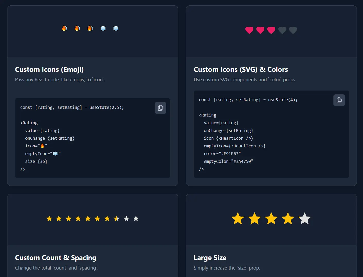
⭐ Fractional Rating Support: Displays precise decimal values like 3.7 or 4.5 instead of rounding to whole numbers.
🎨 Custom Icon Integration: Accepts any React node as icons, including SVG components, emoji characters, or custom React elements.
🎯 Fully Customizable: Controls size, spacing, and color through props without requiring CSS overrides.
⌨️ Keyboard Navigation: Implements arrow key controls and ARIA attributes for accessible user interactions.
📦 Zero Dependencies: Ships as a standalone package with no external runtime requirements.
🔄 Dual Modes: Functions as both a controlled input component with onChange callbacks and a read-only display element.
Use Cases
- E-commerce Product Reviews: Display aggregate customer ratings on product listings and allow users to submit their own ratings through review forms.
- Content Rating Systems: Implement rating mechanisms for blog posts, videos, or user-generated content.
- Feedback Collection: Build survey forms and feedback widgets that capture user satisfaction scores with visual rating interfaces.
- Multi-Criteria Evaluation: Develop detailed review systems that allow users to rate different aspects of a service or product using multiple rating components.
How to Use It
1. Install the package through npm or yarn.
npm install next-flex-ratingOr using yarn:
yarn add next-flex-rating2. Import the Rating component into your React or Next.js file. The simplest implementation displays a read-only rating value.
import { Rating } from 'next-flex-rating';
function ProductDisplay() {
  return (
    <div>
      <h3>Customer Rating</h3>
      <Rating value={4.3} readOnly={true} />
    </div>
  );
}
3. Create a controlled component by managing the rating value in your component state. Pass an onChange handler to capture user selections.
import React, { useState } from 'react';
import { Rating } from 'next-flex-rating';
function ReviewForm() {
  const [userRating, setUserRating] = useState(0);
  return (
    <div>
      <h3>Rate This Product</h3>
      <Rating
        value={userRating}
        onChange={setUserRating}
      />
      <p>Current rating: {userRating}</p>
    </div>
  );
}
Users can click on stars to set ratings. The component also responds to keyboard input using the left and right arrow keys.
4. Replace default star icons with emoji or custom components. The icon prop sets the filled state appearance, and emptyIcon defines the unfilled state.
import { Rating } from 'next-flex-rating';
function CustomEmojiRating() {
  return (
    <Rating
      value={4.5}
      icon="❤️"
      emptyIcon="🤍"
      size={32}
      spacing={8}
      readOnly={true}
    />
  );
}
5. For more control, pass SVG components as icons. Define your icon component and pass it to the Rating component.
import { Rating } from 'next-flex-rating';
const ThumbIcon = () => (
  <svg xmlns="http://www.w3.org/2000/svg" viewBox="0 0 24 24" fill="currentColor">
    <path d="M1 21h4V9H1v12zm22-11c0-1.1-.9-2-2-2h-6.31l.95-4.57.03-.32c0-.41-.17-.79-.44-1.06L14.17 1 7.59 7.59C7.22 7.95 7 8.45 7 9v10c0 1.1.9 2 2 2h9c.83 0 1.54-.5 1.84-1.22l3.02-7.05c.09-.23.14-.47.14-.73v-2z"/>
  </svg>
);
function ThumbRating() {
  return (
    <Rating
      value={3}
      icon={<ThumbIcon />}
      emptyIcon={<ThumbIcon />}
      color="#2196F3"
      emptyColor="#BDBDBD"
      size={28}
    />
  );
}
The color prop applies to filled icons, and emptyColor applies to empty icons.
6. Change the total number of rating units by modifying the count prop. The default is 5, but you can use any positive integer.
import { Rating } from 'next-flex-rating';
function TenStarRating() {
  return (
    <Rating
      value={7.8}
      count={10}
      readOnly={true}
    />
  );
}
This creates a 10-star rating system instead of the standard 5-star scale.
7. Control the visual appearance through size and spacing props. The size prop sets both width and height of each icon, and spacing determines the gap between icons.
import { Rating } from 'next-flex-rating';
function LargeRating() {
  return (
    <Rating
      value={4}
      size={48}
      spacing={12}
      color="#FF9800"
      emptyColor="#CFD8DC"
    />
  );
}
Both size and spacing accept numbers (interpreted as pixels) or CSS string values.
8. All component props.
value: The current rating value, which can be a fractional number.onChange: A callback function that executes when a user selects a new rating.readOnly: A boolean that disables all user interactions when set totrue.count: The total number of icons to be displayed in the rating component.icon: The React node used for the filled state of the rating icon.emptyIcon: The React node for the empty state of the rating icon; it defaults to theiconprop if not set.color: The CSS color for the filled icon.emptyColor: The CSS color for the empty icon.size: The width and height of each icon.spacing: The space between each icon.
FAQs
Q: Can I use this component with form libraries like React Hook Form or Formik?
A: Yes. Treat the Rating component as a controlled input by passing the form library’s value and onChange handler. For React Hook Form, use the Controller component to wrap the Rating component and connect it to your form state.
Q: How do I handle half-star or quarter-star increments?
A: The component accepts any decimal value through the value prop. For user input, you can round the selected value in your onChange handler to your preferred increment, such as 0.5 for half stars or 0.25 for quarter stars.
Q: Does this library work with server-side rendering in Next.js?
A: Yes. The component is fully compatible with Next.js server-side rendering and does not rely on browser-specific APIs that would cause hydration issues.
Q: Can I use different icons for each rating level?
A: The current implementation uses the same icon for all rating units. You would need to render multiple single-unit Rating components with different icons to achieve varied icon designs across rating levels.
Q: How do I change the rating increment when users click on stars?
A: The component registers clicks at the icon level by default. You can implement custom increment logic by handling the onChange callback and rounding the received value to your preferred step size before updating your state.
