The Future of Web Dev
The Future of Web Dev
Accessible Shadcn Chat Input for React Apps
Production-ready chat input for shadcn/ui projects. Includes keyboard shortcuts, loading states, and mobile support.
The Shadcn Chat Input Component is a React component designed for modern AI chatbot applications. It provides a customizable and accessible chat input interface using the shadcn/ui design system
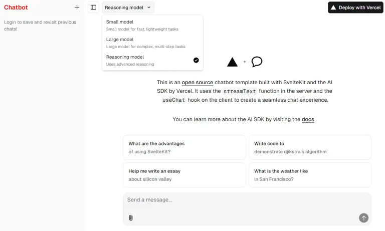
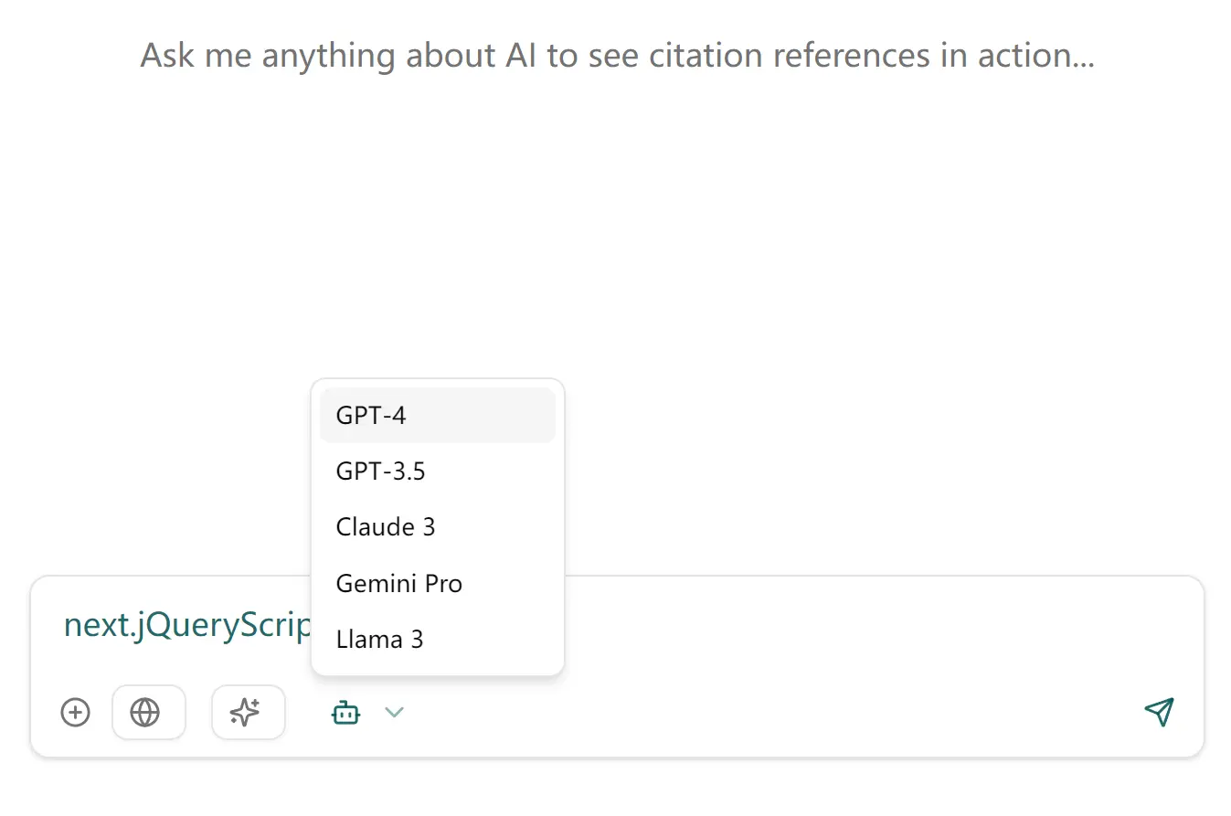
This component handles common chat input functionalities. It includes an auto-resizing textarea, support for toggleable tools, keyboard shortcuts, and loading states.
Features
💬 Modern Interface: Auto-resizing textarea that adjusts as you type.
⌨️ Keyboard Shortcuts: Use Enter to send messages and Shift+Enter for a new line.
📱 Responsive: Mobile-friendly user interface.
🛠️ Customizable Tools: Toggleable tools/actions for added functionality.
🔄 Loading State: Includes a stop generation button during loading.
🎨 Fully Customizable: Uses Tailwind CSS for easy styling.
Use Cases
- Customer Support Chat: Integrate the component into a customer service platform. Support agents can communicate with customers in real-time.
- Team Collaboration: Add it to a project management tool. Team members can discuss tasks and share updates instantly.
- Social Media Messaging: Use it in a social networking app. Users can send direct messages or participate in group chats.
- Live Event Interaction: Implement it during live streams or webinars. Viewers can interact with hosts and other participants.
- In-App Feedback: Place it in a mobile app for user feedback. Users can quickly send comments or report issues.
Installation
- Copy the
chat-input.tsxfile. - Place it in your project’s
/components/ui/directory aschat-input.tsx.
Usage
import { ChatInput } from "@/components/ui/chat-input";
import { FileText, Code, ImageIcon } from "lucide-react";
export default function ChatPage() {
  const handleSendMessage = (message) => {
    console.log("Message sent:", message);
    // Process the message here
  };
  const handleStopGeneration = () => {
    console.log("Generation stopped");
    // Handle stopping the generation
  };
  const tools = [
    {
      id: "files",
      label: "Files",
      icon: <FileText size={14} />,
    },
    {
      id: "code",
      label: "Code",
      icon: <Code size={14} />,
    },
    {
      id: "images",
      label: "Images",
      icon: <ImageIcon size={14} />,
    },
  ];
  return (
    <div className="max-w-2xl mx-auto">
      <ChatInput
        onSend={handleSendMessage}
        onStopGeneration={handleStopGeneration}
        isLoading={false}
        placeholder="Type your message..."
        tools={tools}
      />
    </div>
  );
}
This code shows how to import the component, set up event handlers, and define tools. The ChatInput component is then rendered with these configurations.
Related Resources
- shadcn/ui: A collection of reusable components built using Radix UI and Tailwind CSS. Offers a wide range of components to build modern web applications.
- Tailwind CSS: A utility-first CSS framework. It provides low-level utility classes to build custom designs easily.
FAQs
Q: Can I customize the appearance of the Chat Input Component?
A: Yes, the component uses Tailwind CSS and can be customized using the className prop or by modifying the component’s styling directly.
Q: Is the Chat Input Component accessible?
A: Yes, the component follows accessibility best practices, including proper keyboard navigation, screen reader-friendly elements, focus management, and high contrast visual indicators.
Q: How do I handle message sending?
A: You need to provide an onSend prop, which is a function that gets alled when a message is sent. You can implement the message-handling logic inside this function.
Preview