The Future of Web Dev
The Future of Web Dev
14+ Advanced Copy-Paste UI Components for shadcn/ui – Expansions
Expand shadcn/ui with 14+ advanced components including multi-select, infinite scroll, autosize textarea. Copy-paste, TypeScript, accessible.

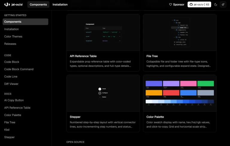
shadcn-ui expansions is a collection of open-source, copy-paste UI components built on top of the popular shadcn/ui library.
It provides a set of additional, customizable, and accessible UI components that are not available in the core shadcn/ui.
Features
♿ Built-in accessibility features following WCAG guidelines.
🎯 Copy-paste integration with no external package dependencies.
🔧 Highly customizable components that match shadcn/ui styling patterns.
⚡ Performance-optimized components with minimal bundle impact.
🎪 Advanced form controls including multi-select and datetime pickers.
📊 Interactive components like dual range sliders and progress indicators.
🔄 Dynamic components such as infinite scroll and typewriter effects.
🛠️ Developer utilities including rate limiting and responsive modals.
Use Cases
- Building complex forms: Use the multiple selector and datetime picker to create more advanced and user-friendly forms.
- Enhancing user experience: Implement the loading button and infinite scroll to provide better feedback and a smoother browsing experience.
- Creating dynamic content: Utilize the typewriter effect to add a dynamic and engaging element to your web pages.
- Improving text input: The autosize textarea can be used in comment sections or text editors to provide a more flexible input field.
- Developing interactive dashboards: The dual range slider is useful for creating interactive data visualizations and filtering options.
How To Use It
1. You need to have shadcn-ui installed and configured in your project.
npx shadcn-ui@latest add command badge
2. Navigate to the official documentation website to browse all available components. Each component page provides complete implementation code and usage examples.
3. All available UI components:
- Autosize Textarea: A textarea that automatically adjusts its height to fit the content.
- Blockquote: A component for displaying text as a quotation.
- Datetime Picker: Allows users to select both a date and a time.
- Dual Range Slider: A slider that enables the selection of a range between two values.
- Floating Label Input: An input field where the placeholder label floats up when the user starts typing.
- Heading With Anchor: A heading element that includes an anchor link for easy section navigation.
- Infinite Scroll: Loads more content as the user scrolls down the page.
- Loading Button: A button that shows a loading state to indicate an action is in progress.
- Magic Back Button: A button that intelligently navigates the user back to the previous page in the application’s history.
- Multiple Selector: A component that allows users to select multiple options from a list.
- Progress With Value: A progress bar that displays the current percentage value.
- Responsive Modal: A dialog window that adapts its layout for different screen sizes.
- Spinner: A loading indicator to show that a process is ongoing.
- Typewriter: A component that displays text with a typewriter-style animation.
Related Resources
- shadcn/ui: The original component library that shadcn-ui expansions is built upon.
- Radix UI: The underlying headless UI library used by shadcn/ui.
- Tailwind CSS: The utility-first CSS framework used for styling the components.
FAQs
Q: Can I use these components without the base shadcn/ui installation?
A: No, shadcn/ui Expansions requires the base shadcn/ui setup as it depends on the core utilities and design tokens from the original library.
Q: Are these components compatible with Next.js App Router?
A: Yes, all components are built with Next.js compatibility in mind and include proper ‘use client’ directives where necessary for client-side functionality.
Q: How do I customize the styling of these components?
A: Components can be styled using Tailwind CSS classes through the className prop, and you can modify the source code directly since you own the copied code.
Q: Do these components support server-side rendering?
A: Most components support SSR, though some interactive components like the infinite scroll require client-side JavaScript and will hydrate properly on the client.