The Future of Web Dev
The Future of Web Dev
Build Modern AI Chatbots with Simple-AI UI Components
Build modern AI chatbot experiences with simple-ai. Get chat inputs, message areas, and Vercel AI SDK compatible components.
Simple-AI is a collection of UI components that enables you to build modern conversational AI applications like AI chatbots.
These components handle complex chat interactions like streaming responses, loading states, and message history management while maintaining performance even with extensive conversation threads.
Features
Chat-First Design: Components built specifically for conversational interfaces rather than adapted from general UI elements
Copy-Paste: Direct code ownership with no external dependencies to manage or version conflicts to resolve
Dark Mode Ready: Built-in dark mode support that adapts automatically to user preferences
Vercel AI SDK Compatible: Works directly with the Vercel AI SDK for handling streaming responses and loading states.
Modern UX Patterns: Implements interaction patterns from leading AI chat applications
React Flow Components: Specialized components for building visual AI workflows and node-based interfaces
How to Use It
1. To get started, you need a project with shadcn/ui already configured. simple-ai is an extension of shadcn/ui, not a standalone tool.
2. Each component has a dedicated command. For example, to add the chat-message component, you run:
## PNPM
pnpm dlx shadcn@latest add https://simple-ai.dev/r/chat-input.json
# NPM
npx shadcn@latest add https://simple-ai.dev/r/chat-input.json
# Yarn
npx shadcn@latest add https://simple-ai.dev/r/chat-input.json
# Bun
bunx --bun shadcn@latest add https://simple-ai.dev/r/chat-input.json
import { ChatInput, ChatInputTextArea, ChatInputSubmit } from "@/components/ui/chat-input"
<ChatInput variant="default">
<ChatInputTextArea placeholder="Type a message..." />
<ChatInputSubmit />
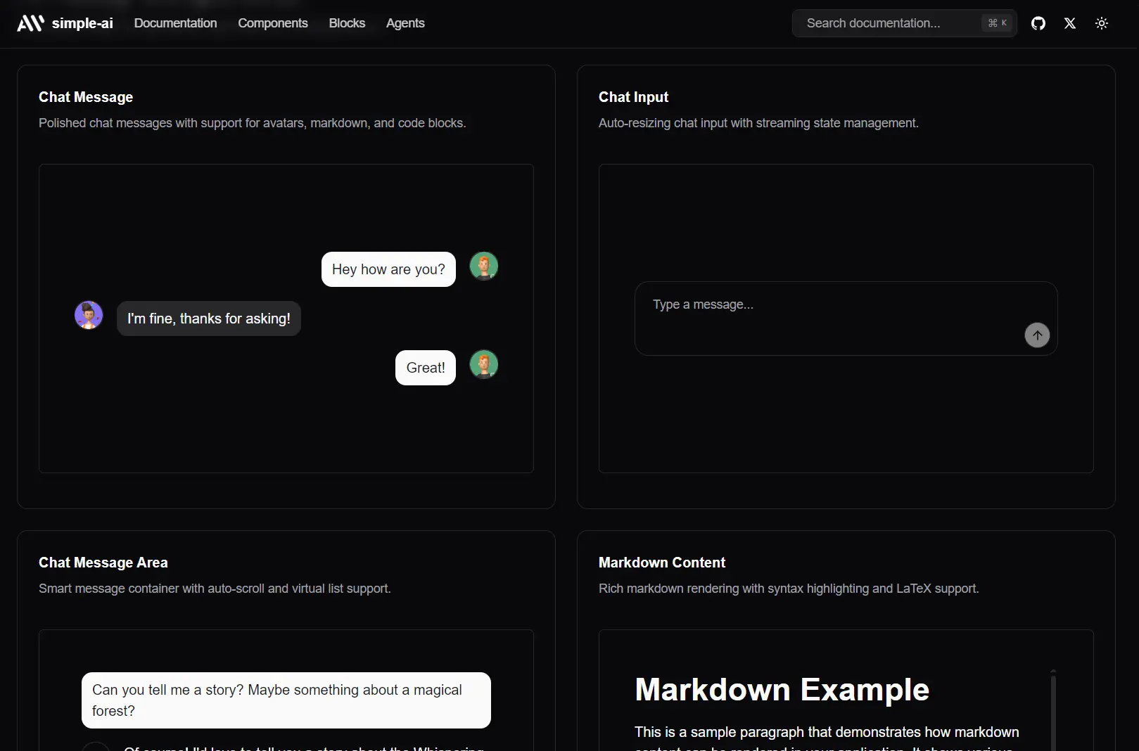
</ChatInput>UI Components Included
- Chat Input: The text area, send button, and attachment triggers.
- Chat Message: Renders a single message from either the user or the AI, including avatar and metadata.
- Chat Message Area: The scrollable container that holds the entire conversation history.
- JSX Renderer & Markdown Content: Components for safely rendering rich content like JSX or Markdown within a chat message.
- Model Selector: A pre-built dropdown for letting users switch between different AI models (e.g., GPT-4o, Claude 4, etc).
For more advanced UIs, these components integrate with React Flow:
- Editable Handle: A custom React Flow handle.
- Generate Text Node: A node for text generation workflows.
- Prompt Crafter Node: A specialized node for building prompts.
- Resizable Node: A generic, resizable node container.
- Status Edge: A custom edge that can display a status.
- Text Input Node & Visualize Text Node: Nodes for text input and display within a flow diagram.
FAQs
Q: Is this a component library like Material-UI or Chakra UI?
A: No. It is not a package you install from npm. It’s a collection of components whose source code you copy into your project using a CLI command. You own the code entirely.
Q: Can I use this without shadcn/ui?
A: No, simple-ai has a hard dependency on shadcn/ui. Its components are built using shadcn/ui‘s base components (like Button, Input, etc.) and assume its project structure and tooling are in place.
Q: How do I customize the components?
A: You edit the source file directly. After running the add command, the component (e.g., chat-input.tsx) will be in your components/ui directory. You can change the Tailwind classes, modify the JSX structure, or alter the component’s logic as you see fit.
Q: Can I use Simple-AI components without Vercel AI SDK?
A: Yes, the components work independently of any specific AI SDK. The Vercel AI SDK compatibility is a convenience feature, but you can integrate the components with OpenAI’s client library, Anthropic’s SDK, or any other AI service by implementing the appropriate callback handlers.


