The Future of Web Dev
The Future of Web Dev
ISO-Compliant Country Dropdown & Phone Input Components for shadcn/ui
Enhance your web forms with ISO-compliant country dropdown and phone input components using shadcn/ui.
Shadcn-country-dropdown is a versatile and ISO-compliant country dropdown and phone input component library built using shadcn/ui.
The library includes two main components: CountryDropdown and PhoneInput.
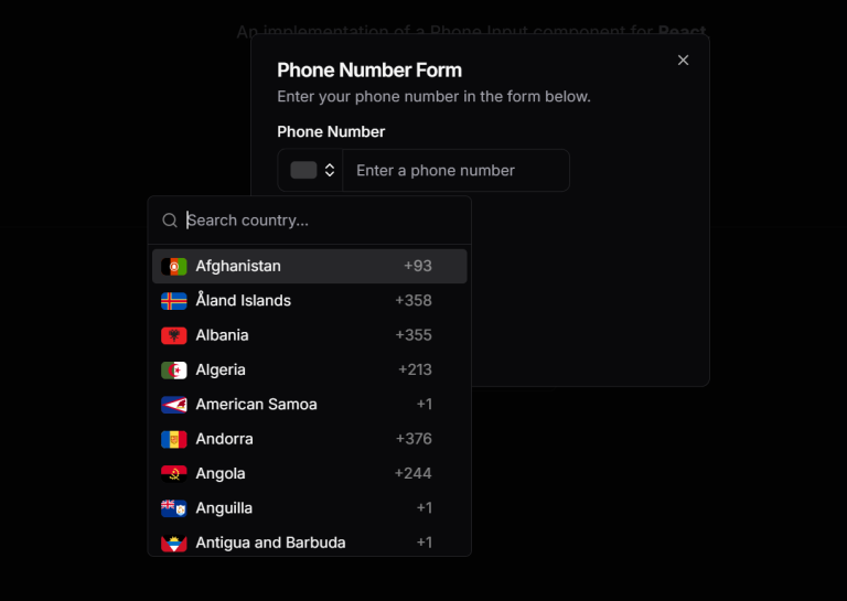
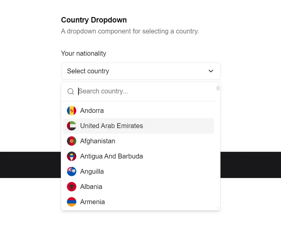
CountryDropdown allows users to select a country from a dropdown list, complete with country flags and ISO 3166 compliance.
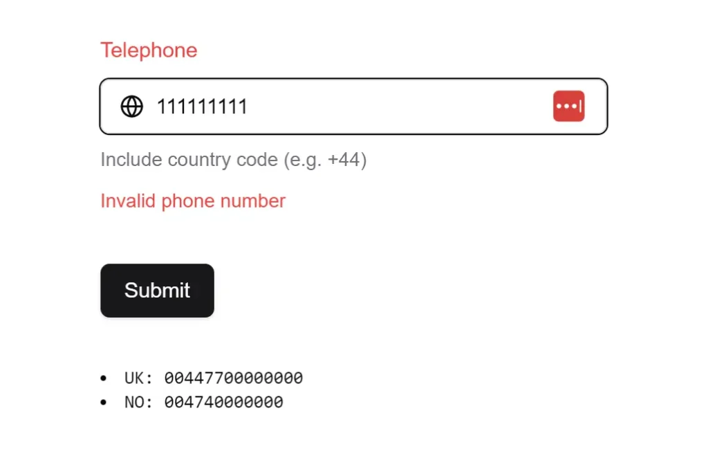
PhoneInput, on the other hand, facilitates the entry of phone numbers with international call prefixes, ensuring compliance with global standards.
These components can be used independently or together to enhance user experience and data accuracy in forms and other input scenarios.
More Features
🔄 Flexible Data Handling: Supports both ISO 3166-1 alpha-2 and alpha-3 country codes.
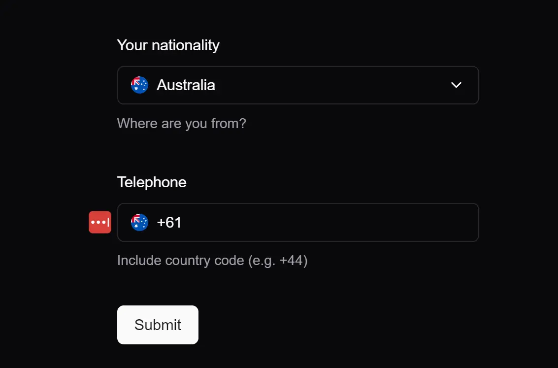
🔗 Connected Components: Enables linking the CountryDropdown with the PhoneInput for synchronized data entry.
🛡️ Zod Schema Integration: Built-in Zod schemas for validation.
🎨 Customizable Components: Allows for easy styling and customization to fit application themes.
🔄 Auto-formatting: Automatic phone number formatting based on country codes/
🎨 Slim Mode Option: Compact display showing only country flags
Use Cases
E-commerce Checkout Forms: Enhance international customer experience by providing accurate country and phone number fields.
User Registration: Simplify the signup process for global platforms by offering a standardized way to input country and phone details.
Contact Forms: Improve lead generation by making it easy for users from different countries to provide accurate contact information.
Event Registration: Manage attendees from various countries by accurately capturing their location and contact details.
International Service Platforms: Facilitate service delivery across borders by ensuring accurate collection of user location and phone numbers.
Installation
To integrate the country dropdown and phone input components into your project, first install the necessary dependencies using your preferred package manager:
pnpm add react-circle-flags country-data-list libphonenumber-jsNext, install the required shadcn/ui components if you plan to use the CountryDropdown:
npx shadcn@latest add button
npx shadcn@latest add command
npx shadcn@latest add popover
Finally, copy the country-dropdown.tsx and phone-input.tsx component files into your project’s components/ui directory.
Usage
To use the CountryDropdown component, import it into your React component and include it in your JSX:
import { CountryDropdown } from "@/components/ui/country-dropdown";
<CountryDropdown
  placeholder="Select country"
  defaultValue="USA"
  onChange={(country) => console.log(country)}
/>
For the PhoneInput component, import and use it similarly:
import { PhoneInput } from "@/components/ui/phone-input";
<PhoneInput
  placeholder="Enter phone number"
  defaultCountry="US"
  onChange={(e) => console.log(e.target.value)}
/>
To connect the CountryDropdown with the PhoneInput, manage the state of the selected country and update the PhoneInput’s defaultCountry prop accordingly:
const [selectedCountry, setSelectedCountry] = useState(null);
<CountryDropdown
  onChange={(country) => {
    setSelectedCountry(country);
  }}
/>
<PhoneInput defaultCountry={selectedCountry?.alpha2} />
Related Resources
- shadcn/ui: The core component library that shadcn-country-dropdown is built upon. shadcn/ui Documentation
- libphonenumber-js: The library used for phone number parsing and validation in PhoneInput. libphonenumber-js Documentation
- react-circle-flags: The library used for displaying country flags in CountryDropdown. react-circle-flags Documentation
- country-data-list: The library providing country data for both components. country-data-list Documentation
FAQs
Q: Can I customize the appearance of the dropdown and input fields?
A: Yes, both components are designed to be customizable. You can modify their styles using CSS or Tailwind CSS classes to match your application’s design.
Q: How do I handle form submission with these components?
A: You can integrate these components with form libraries like React Hook Form to manage form state and submission, using the onChange prop to capture user input.
Q: Is it possible to use the PhoneInput component without the CountryDropdown?
A: Yes, the PhoneInput component can be used independently. You can set the defaultCountry prop to specify the initial country for phone number formatting.
Q: Can I use these components in a Next.js application?
A: Yes, these components are compatible with Next.js and other React frameworks, as they are built with standard React practices.