shadcn-components-blocks is a component library that provides 100+ pre-built, production-ready UI components and blocks for modern React & Next.js applications.
You can easily install them into your existing projects through the shadcn CLI. Each component is fully customizable via the Tailwind CSS design system.
Features
🎨 Professional Design Quality: All components follow consistent design principles created by experienced designers rather than automated generation.
⚛️ React and TypeScript Support: Components ship with full TypeScript definitions and follow React best practices for composition and props.
🎯 shadcn/ui Native: Every component works as a direct extension of shadcn/ui without conflicting with your existing setup.
🎨 Tailwind CSS Styling: All styles use Tailwind utility classes that respect your project’s theme configuration and design tokens.
Use Cases
- Marketing Landing Pages: Build high-conversion pages using pre-made hero sections, pricing tables, and call-to-action blocks.
- SaaS Dashboards: Render complex data visualizations through charts, data tables, and sidebar navigation menus.
- E-commerce Storefronts: Implement product grids, cart drawers, and carousel sliders to display merchandise.
- Application Settings: Create detailed form layouts using input groups, switches, and select menus.
How to Use It
1. Visit the official documentation to view the available UI components and blocks. Identify the specific element you need for your current view.
2. Install UI components and blocks through shadcn/ui CLI. This will download the component code and place it directly into your project structure.
For npm:
npx shadcn@latest add https://shadcncomponents.dev/r/accordion-01.jsonFor pnpm:
pnpm dlx shadcn@latest add https://shadcncomponents.dev/r/accordion-01.jsonFor Bun:
bunx --bun shadcn@latest add https://shadcncomponents.dev/r/accordion-01.json3. Import the installed component into your page or layout file. You can then pass props to configure the content.
// page.tsx
import {
  Accordion,
  AccordionContent,
  AccordionItem,
  AccordionTrigger
} from "@/components/ui/accordion";
export default function FAQSection() {
  return (
    <div className="w-full max-w-2xl mx-auto p-4">
      <h2 className="text-2xl font-bold mb-4">Frequently Asked Questions</h2>
      <Accordion type="single" collapsible className="w-full" defaultValue="item-1">
        <AccordionItem value="item-1">
          <AccordionTrigger>How does the return policy work?</AccordionTrigger>
          <AccordionContent className="text-gray-600">
            <p>
              We accept returns within 30 days of purchase. The item must be in its
              original condition. We process refunds within 48 hours of receipt.
            </p>
          </AccordionContent>
        </AccordionItem>
        <AccordionItem value="item-2">
          <AccordionTrigger>Do you offer international shipping?</AccordionTrigger>
          <AccordionContent className="text-gray-600">
            <p>
              Yes, we ship to over 50 countries. Standard international delivery
              takes 7-14 business days depending on customs processing.
            </p>
          </AccordionContent>
        </AccordionItem>
      </Accordion>
    </div>
  );
}
All Available Components & Blocks
UI Components
Accordion
Alert
Alert Dialog
Avatar
Badge
Breadcrumb
Button
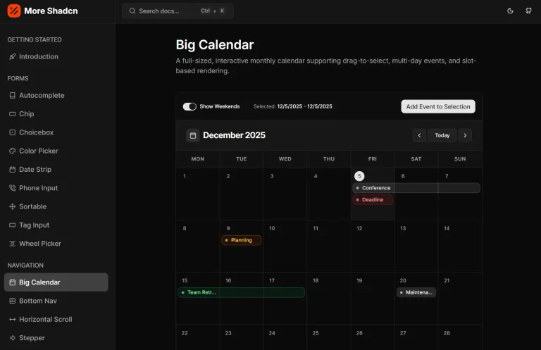
Calendar
Card
Carousel
Chart
Checkbox
Collapsible
Combobox
Command
Context Menu
Data Table
Date Picker
Dialog
Drawer
Dropdown Menu
Hover Card
Input
Input OTP
Menubar
Navigation Menu
Pagination
Popover
Progress
Radio Group
Select
Sheet
Skeleton
Sidebar
Slider
Switch
Tabs
Toggle Group
Tooltip
UI Blocks Included
Hero Sections
CTA Sections
Pricing Sections
Newsletter Sections
Testimonials
Blog Sections
Team Sections
Related Resources
- shadcn/ui: The foundational component library that shadcn-components-blocks extends with additional variants and complete sections.
- Radix UI: The headless component primitives that power shadcn/ui’s accessibility and behavior patterns.
- Tailwind CSS: The utility-first CSS framework used to style all components in the library.
FAQs
Q: Does this library conflict with standard shadcn/ui components?
A: No. The library extends shadcn/ui rather than replacing it. You can use both standard shadcn/ui components and shadcn-components-blocks components in the same project without conflicts.
Q: Can I modify the installed components?
A: Yes. The CLI copies component files directly into your project directory. You own the code after installation and can modify styles, behavior, or structure to match your requirements.
Q: Do I need to install all components at once?
A: No. Install only the components your project needs. Each component works independently and the CLI handles any internal dependencies automatically.
Q: Are the components accessible?
A: Yes. Components inherit accessibility features from Radix UI primitives and follow ARIA best practices for keyboard navigation and screen reader support.