The Future of Web Dev
The Future of Web Dev
Copy-Paste UI Components & Blocks for E-commerce – stackzero/commerce-ui
Speed up e-commerce development with stackzero/commerce-ui. Copy-paste UI components/blocks using Tailwind & shadcn/ui. Free & open-source.
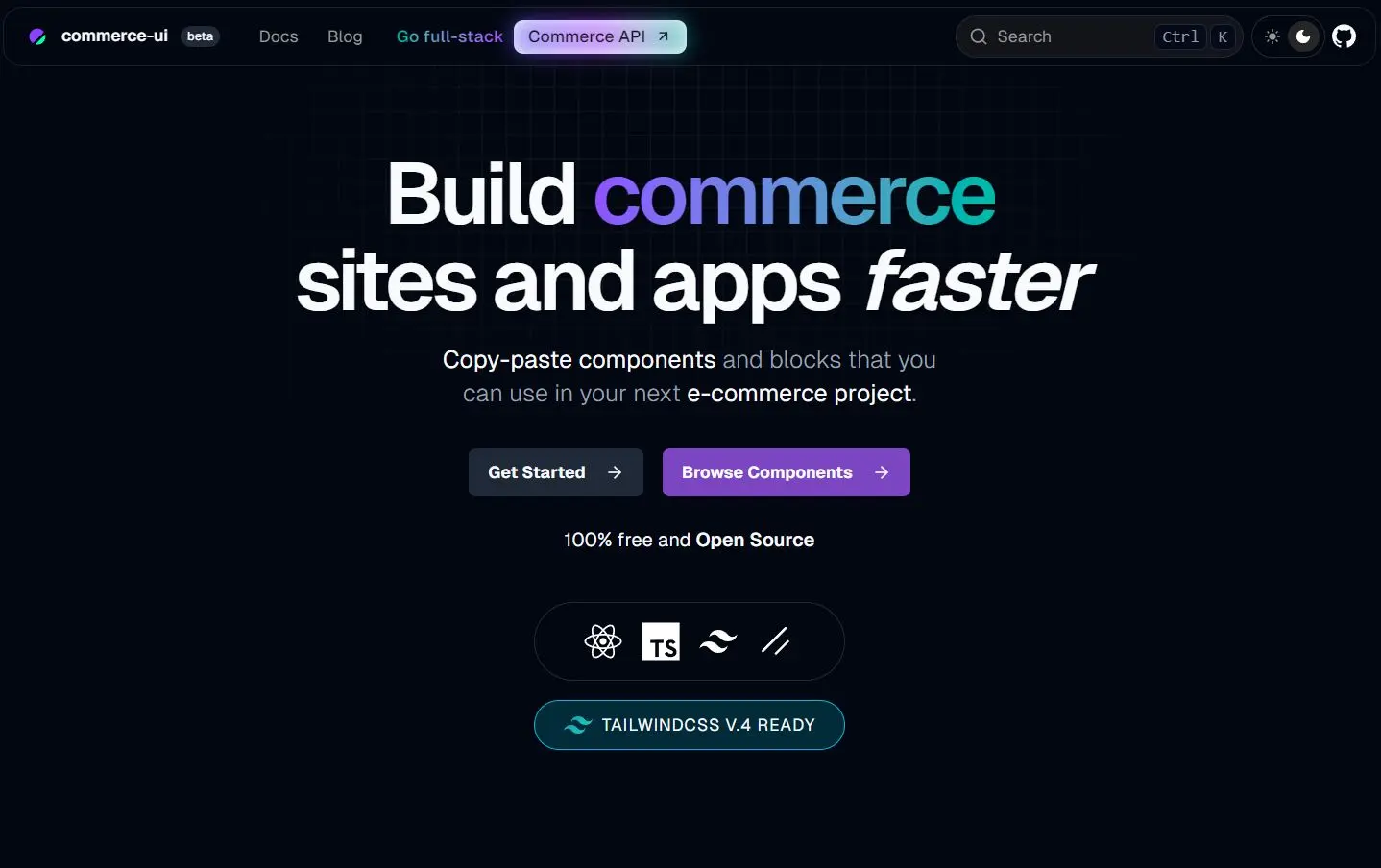
stackzero/commerce-ui is a collection of pre-built UI components and blocks for developing e-commerce websites and applications.
It currently comes with 10+ ready-to-use UI components and 4+ UI blocks that you can copy and paste directly into your React/Next.js apps.
Features
⚛️ React & Next.js Based: Built using modern React principles, suitable for Next.js applications.
🧩 shadcn/ui Integration: Uses components and design patterns from shadcn/ui for consistency and style foundation.
🔧 Easy Customization: Since you own the code after pasting, you can modify components freely to match specific requirements.
🎨 Tailwind CSS Styling: Leverages Tailwind CSS for utility-first styling, making customization straightforward.
✂️ Copy-Paste Implementation: Components are meant to be copied directly into your project, offering full code ownership.
🚀 CLI Tool: Provides a CLI (based on shadcn CLI) for adding components easily.
Use Cases
- Accelerating Frontend Development: Reduce development time by using ready-made UI parts instead of building common e-commerce elements from scratch.
- Rapid E-commerce Prototyping: Quickly assemble functional prototypes for online stores using pre-built elements.
- Building Product Detail Pages: Integrate components like image carousels, variant selectors, quantity inputs, and price formatting to create product pages.
- Implementing User Reviews: Add rating systems (stars, likes, upvotes) and review display blocks easily.
- Standardizing UI Elements: Ensure consistency across different parts of your e-commerce application by using the same base components.
Installation
1. The components require Tailwind CSS. Follow the official Tailwind CSS installation guide for your project setup.
2. Lucide React icons are used within some components. Install the library using your package manager:
npm install lucide-react
# or
pnpm add lucide-react
# or
bun add lucide-react
3. Add Utility Helper. A helper function simplifies conditionally applying Tailwind classes. Add the following cn function to your project, typically in lib/utils.ts:
// lib/utils.ts
import { clsx, type ClassValue } from 'clsx'
import { twMerge } from 'tailwind-merge'
export function cn(...inputs: ClassValue[]) {
  return twMerge(clsx(inputs))
}
You might need to install clsx and tailwind-merge:
npm install clsx tailwind-merge
# or
pnpm add clsx tailwind-merge
# or
bun add clsx tailwind-merge
Usage
1. Run the init command to set up configuration and dependencies if you haven’t used shadcn/ui before.
pnpm dlx shadcn@latest init
# or npm dlx shadcn@latest init
# or bunx shadcn@latest init
Answer the configuration questions prompted by the CLI.
2. Use the add command followed by the component’s URL from the stackzero/commerce-ui documentation.
pnpm dlx shadcn@latest add https://ui.stackzero.co/r/star-rating-basic-ex-01.json
# or npm dlx shadcn@latest add https://ui.stackzero.co/r/star-rating-basic-ex-01.json
# or bunx shadcn@latest add https://ui.stackzero.co/r/star-rating-basic-ex-01.json
This command adds the component code to your project (usually components/commerce-ui/...) and installs any necessary dependencies.
3. Import the added component into your React files.
// Example: Using StarRatingBasic
"use client";
import StarRatingBasic from "@/components/commerce-ui/star-rating/basic/star-rating-basic";
import { useState } from "react";
export default function Rating() {
  const [rating, setRating] = useState(3);
  return (
    <div className="flex flex-row items-center gap-4">
      <StarRatingBasic value={rating} onChange={setRating} maxStars={5} />
      <p>({rating})</p>
      {/* Rest of your code... */}
    </div>
  );
}
4. Monorepo Support. Use the -c flag with the add command to specify the target project path in a monorepo:
pnpm dlx shadcn@latest add https://ui.stackzero.co/r/product-card-01-block.json -c ./apps/www5. You can also directly copy and paste the UI components from DOCs.
// Image Viewer Component
"use client";
import ImageViewer from "@/components/commerce-ui/image-viewer/basic/image-viewer-basic";
const EXAMPLE_IMAGE_URL =
  "https://raw.githubusercontent.com/stackzero-labs/ui/refs/heads/main/public/placeholders/headphone-1.jpg";
const EXAMPLE_THUMBNAIL_URL =
  "https://raw.githubusercontent.com/stackzero-labs/ui/refs/heads/main/public/placeholders/headphone-1.jpg";
export default function ImageViewer_Basic_Ex_01() {
  return (
    <div className="flex w-full flex-col items-center gap-4">
      <ImageViewer
        thumbnailUrl={EXAMPLE_THUMBNAIL_URL}
        imageUrl={EXAMPLE_IMAGE_URL}
        className="max-w-[300px]"
      />
    </div>
  );
}
Related Resources
- shadcn/ui: The underlying component library providing core elements and CLI functionality. (https://ui.shadcn.com/)
- Tailwind CSS: The utility-first CSS framework used for styling. (https://tailwindcss.com/)
- Next.js: A popular React framework, ideal for projects using these components. (https://nextjs.org/)
- Lucide React: The icon library used for vector icons in the components. (https://lucide.dev/)
FAQs
Q: How do I customize the components?
A: You copy the component’s source code directly into your project using the CLI or manually. Then, you can modify the code (React/JSX and Tailwind classes) as needed.
Q: What are ‘blocks’ versus ‘components’?
A: Components are smaller, fundamental UI pieces (e.g., a rating star, a button). Blocks are larger UI sections composed of multiple components (e.g., a product card, a review section).
Q: Is stackzero/commerce-ui free?
A: Yes, it is 100% free and open-source.
Q: Is this library suitable for production applications?
A: Yes, the components are built following best practices for production use. Being open source, you can inspect the code quality and make any necessary optimizations for your specific needs.
Preview