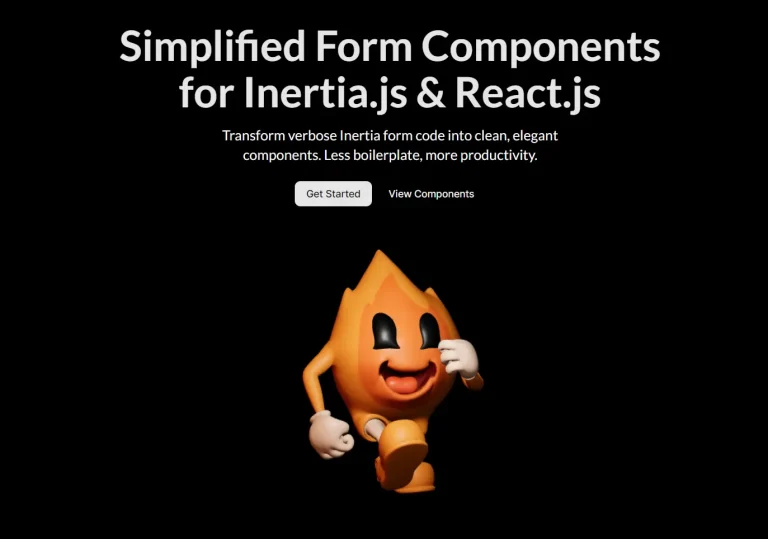
The Future of Web Dev
The Future of Web Dev
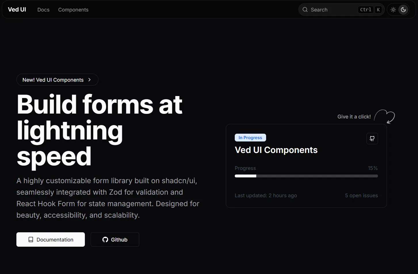
Fast React Forms with Zod Validation & shadcn/ui – Ved UI
Build production-ready forms faster using Ved UI's customizable components with built-in validation, accessibility, and TypeScript support.
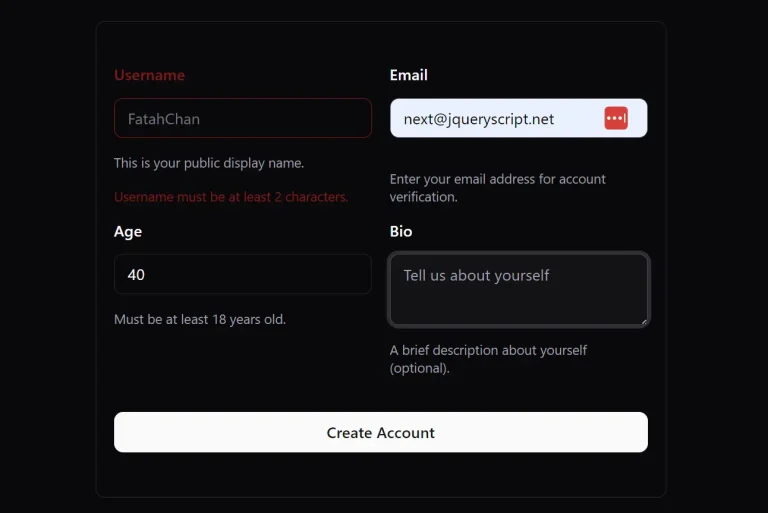
Ved UI is a collection of accessible, reusable form UI components built with shadcn/ui, zod, and React Hook Form.
You can use these UI components to quickly build a variety of forms, from simple contact forms to complex, multi-step wizards.
Features
⚡️ Pre-built form components for rapid development.
🛡️ Integrated Zod validation for type-safe form handling.
🔄 Uses React Hook Form for efficient state management and performance.
🎨 Fully customizable styles to match any design system.
♿️ Adheres to WAI-ARIA guidelines for accessibility.
🌙 Includes built-in support for dark mode.
Use Cases
- User Onboarding: Create multi-step registration forms with complex validation rules for new user sign-ups.
- E-commerce Checkouts: Build user-friendly checkout forms for online stores, complete with address validation and payment inputs.
- Application Settings Pages: Generate detailed settings or profile pages with various input types like text fields, selectors, and date pickers.
- Data Entry Dashboards: Develop internal tools and dashboards that require reliable and scalable data entry forms.
- Booking and Reservation Systems: Implement forms for booking appointments or making reservations, using components like date and time pickers.
How to Use It
1. Create a new Next.js application
npx create-next-app@latest my-app --typescript --tailwind --eslint2. Initialize shadcn/ui:
cd my-app
npx shadcn-ui@latest init
3. Configure your components.json file with the recommended settings. Choose “New York” style for modern aesthetics, “Zinc” as the base color for versatility, and enable CSS variables for easy theming:
{
  "style": "New York",
  "baseColor": "Zinc",
  "cssVariables": true
}
4. Install Base shadcn/ui components
npx shadcn-ui@latest add form button input select5. You can now add Ved UI components using the CLI. Browse the component collection on the Ved UI website and add the ones you need.
For example, to add the input-form component, run the following command.
# NPM
npx shadcn@latest add https://ved-ui.vercel.app/registry/input-form.json
# PNPM
pnpm dlx shadcn@latest add https://ved-ui.vercel.app/registry/input-form.json
# Yarn
yarn dlx shadcn@latest add https://ved-ui.vercel.app/registry/input-form.json
#Bun
bun x shadcn@latest add https://ved-ui.vercel.app/registry/input-form.json
6. Alternatively, you can add components manually. Here’s a basic example of creating a simple contact form using Ved UI components.
# NPM
npx shadcn@latest add input form button sonner

# PNPM
pnpm dlx shadcn@latest add input form button sonner

# Yarn
yarn dlx shadcn@latest add input form button sonner

# Bun
bun x shadcn@latest add input form button sonner
"use client";

import { z } from "zod";
import { useForm } from "react-hook-form";
import { zodResolver } from "@hookform/resolvers/zod";

import { toast } from "sonner";
import { Button } from "@/components/ui/button";
import {
  Form,
  FormControl,
  FormField,
  FormItem,
  FormLabel,
  FormMessage,
} from "@/components/ui/form";
import { Input } from "@/components/ui/input";

const FormSchema = z.object({
  text: z.string().min(2, {
    message: "text must be at least 2 characters.",
  }),
});

export function FormInput() {
  const form = useForm<z.infer<typeof FormSchema>>({
    resolver: zodResolver(FormSchema),
    defaultValues: {
      text: "",
    },
  });

  function onSubmit(data: z.infer<typeof FormSchema>) {
    toast.success(data.text);
  }

  return (
    <Form {...form}>
      <form onSubmit={form.handleSubmit(onSubmit)} className=" space-y-6">
        <FormField
          control={form.control}
          name="text"
          render={({ field }) => (
            <FormItem>
              <FormLabel>Text</FormLabel>
              <FormControl>
                <Input placeholder="Wubba Lubba Dub-Dub!" {...field} />
              </FormControl>
              <FormMessage />
            </FormItem>
          )}
        />
        <Button type="submit">Submit</Button>
      </form>
    </Form>
  );
}
7. All form components:
- Date Expression Input Form
- Date Picker Form
- Date Range Picker Form
- Dual Range Slider Form
- Input Form
- Multiselect Form
- Phone Input Form
- Select Form
- Tag Input Form
Related Resources
- shadcn/ui – The foundational component library that Ved UI extends with additional form capabilities.
- React Hook Form – Performant form library with minimal re-renders and easy validation integration.
- Zod – TypeScript-first schema validation library for runtime type checking and form validation.
- Tailwind CSS – Utility-first CSS framework used for component styling and responsive design.