The Future of Web Dev
The Future of Web Dev
Add Leaflet Maps to shadcn/ui Projects with Custom Markers and Controls
Add interactive Leaflet maps to shadcn/ui projects. Includes markers, popups, tooltips, and drawing tools that match your design system.
shadcn/ui Map is a map component that adds interactive mapping capabilities to your React applications.
The component follows shadcn/ui design patterns and styling conventions while leveraging Leaflet and React Leaflet as its mapping engine.
You can add markers, tooltips, popups, and drawing controls to create location-based UI that matches your existing shadcn/ui design system.
Features
📍 Supports standard markers, custom icon markers, and programmatic marker creation.
💬 Includes popup and tooltip components that attach to markers or display independently.
✏️ Provides drawing controls for markers, polylines, circles, rectangles, and polygons.
🎨 Uses your existing shadcn/ui theme configuration for consistent styling.
📦 Installs through the shadcn CLI like other shadcn/ui components.
🔧 Exposes Leaflet types for TypeScript projects requiring coordinate definitions.
Use Cases
- Store Locators: Display multiple business locations on a map to help users find the nearest store.
- Data Visualization: Plot geographical data points on a map to visualize trends or distributions.
- Real Estate Listings: Show property locations for a real estate website, with popups for details.
- Event Mapping: Pinpoint event locations for a conference or festival on an interactive map.
- Route Planning: Draw and display routes for logistics or travel applications.
How to Use It
1. You need a working shadcn/ui installation in your React project before adding the map component.
2. Add the component files to your project’s component directory and handles dependency installation.
For pnpm:
pnpm dlx shadcn@latest add @shadcn-map/mapFor npx:
npx shadcn@latest add @shadcn-map/mapFor yarn:
yarn shadcn@latest add @shadcn-map/mapFor bun:
bunx --bun shadcn@latest add @shadcn-map/map3. Import the core map components and create a basic interactive map:
import {
    Map,
    MapMarker,
    MapPopup,
    MapTileLayer,
    MapZoomControl,
} from "@/components/ui/map"
export function BasicMap() {
    return (
        <Map center={[40.7128, -74.0060]} zoom={12}>
            <MapTileLayer />
            <MapZoomControl />
            <MapMarker position={[40.7128, -74.0060]}>
                <MapPopup>New York City</MapPopup>
            </MapMarker>
        </Map>
    )
}
The Map component accepts center coordinates as a latitude/longitude array and an optional zoom level. MapTileLayer renders the actual map tiles, and MapZoomControl adds zoom buttons. MapMarker places a pin at specified coordinates, and MapPopup shows information when users click the marker.
4. Replace default marker pins with emojis, icons, or images:
import { Map, MapMarker, MapTileLayer } from "@/components/ui/map"
import type { LatLngExpression } from "leaflet"
import { HomeIcon, BuildingIcon } from "lucide-react"
export function CustomMarkerMap() {
    const locations = [
        {
            name: "Home",
            position: [34.0522, -118.2437] satisfies LatLngExpression,
            icon: <HomeIcon className="w-4 h-4" />,
        },
        {
            name: "Office",
            position: [34.0622, -118.2537] satisfies LatLngExpression,
            icon: <BuildingIcon className="w-4 h-4" />,
        },
        {
            name: "Park",
            position: [34.0722, -118.2637] satisfies LatLngExpression,
            icon: <span>🌳</span>,
        },
    ]
    return (
        <Map center={locations[0].position} zoom={13}>
            <MapTileLayer />
            {locations.map((location) => (
                <MapMarker
                    key={location.name}
                    position={location.position}
                    icon={location.icon}
                />
            ))}
        </Map>
    )
}
5. Attach information displays to markers or show them on other map elements:
import {
Map,
MapMarker,
MapPolygon,
MapPopup,
MapTileLayer,
MapTooltip,
} from "@/components/ui/map"
import type { LatLngExpression } from "leaflet"
export function PopupTooltipMap() {
const markerWithPopup: LatLngExpression = [37.7749, -122.4194]
const markerWithTooltip: LatLngExpression = [37.7849, -122.4094]
const regionBounds: LatLngExpression[] = [
[37.8, -122.5],
[37.8, -122.3],
[37.7, -122.3],
[37.7, -122.5],
]
return (
<Map center={markerWithPopup} zoom={12}>
<MapTileLayer />
<MapMarker position={markerWithPopup}>
<MapPopup className="w-64">
<h3 className="font-semibold">San Francisco</h3>
<p className="text-sm">Click markers to see popups</p>
</MapPopup>
</MapMarker>
<MapMarker position={markerWithTooltip}>
<MapTooltip side="bottom">
Hover for tooltip
</MapTooltip>
</MapMarker>
<MapPolygon positions={regionBounds}>
<MapPopup>Geographic region</MapPopup>
</MapPolygon>
</Map>
)
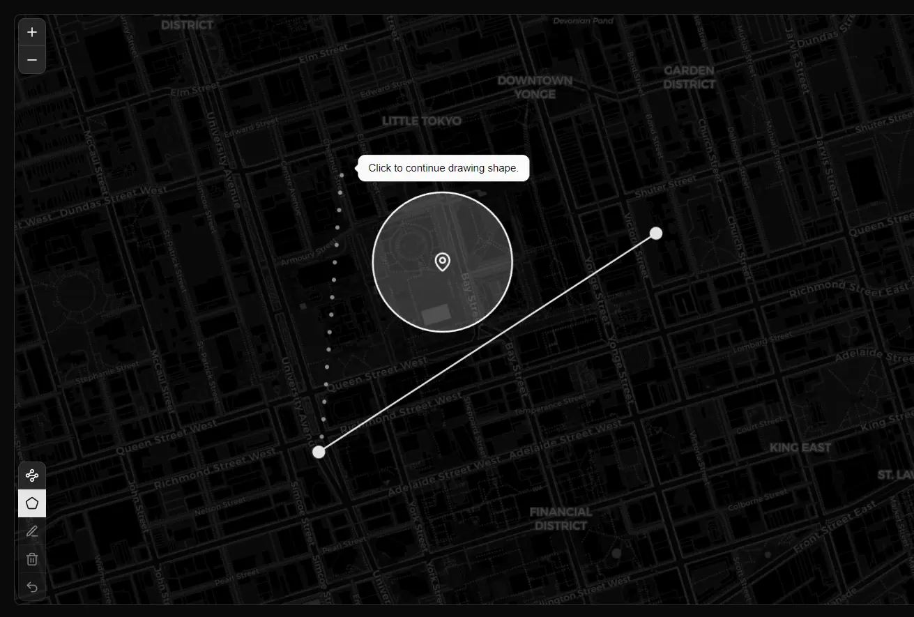
}6. Add controls that let users draw shapes on the map:
import {
    Map,
    MapDrawCircle,
    MapDrawControl,
    MapDrawDelete,
    MapDrawEdit,
    MapDrawMarker,
    MapDrawPolygon,
    MapDrawPolyline,
    MapDrawRectangle,
    MapDrawUndo,
    MapTileLayer,
} from "@/components/ui/map"
import type { LatLngExpression } from "leaflet"
export function DrawingMap() {
    const center: LatLngExpression = [41.8781, -87.6298]
    return (
        <Map center={center} zoom={11}>
            <MapTileLayer />
            <MapDrawControl>
                <MapDrawMarker />
                <MapDrawPolyline />
                <MapDrawCircle />
                <MapDrawRectangle />
                <MapDrawPolygon />
                <MapDrawEdit />
                <MapDrawDelete />
                <MapDrawUndo />
            </MapDrawControl>
        </Map>
    )
}
Related Resources
- shadcn/ui provides the component library foundation and installation CLI.
- React Leaflet offers the underlying React bindings for Leaflet maps.
- Leaflet is the core mapping library powering the component.
- Lucide React supplies the icon library used in examples and custom markers.
FAQs
Q: What mapping service does shadcn/ui Map use for its tile layers?
A: By default, it uses OpenStreetMap, which is a free and open-source map provider. You can configure it to use other tile providers if needed.
Q: Can I customize the appearance of the map and its controls?
A: Yes, since it is built on Leaflet and integrated into your shadcn/ui project, you can use standard CSS and Tailwind CSS utility classes to customize the styles.
Q: Does the component support multiple markers efficiently?
A: Yes. You can render hundreds of markers by mapping over location data arrays. For very large datasets (thousands of markers), consider clustering solutions or filtering visible markers based on zoom level and viewport bounds.