The Future of Web Dev
The Future of Web Dev
Neobrutalism UI Component Library with shadcn-vue & TailwindCSS
Pre-built UI components featuring neobrutalism design. Accordion, Button, Table, Dialog, and 30+ more optimized for Tailwind v4.

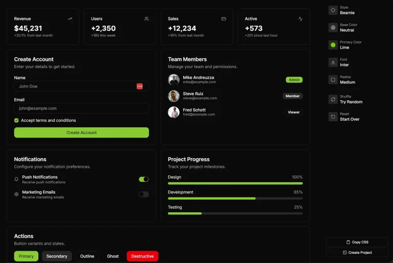
neobrutalism-vue is a collection of open-source UI components inspired by the Neobrutalism design concept.
The Neobrutalism design is characterized by raw and unpolished aesthetics, challenging traditional design principles with bold colors, strong typography, and asymmetrical layouts.
This approach often features thick, well-defined outlines instead of soft shadows and prioritizes function over form.
neobrutalism-vue brings this distinctive style to your Vue.js applications by providing over 30 UI components built on top of shadcn-vue and optimized for Tailwind v4.
Features
📦 Component registry system that installs files directly into your project for full customization control.
♿ Built on Reka UI primitives that follow WAI-ARIA patterns for keyboard navigation and screen reader support.
🎯 Tailwind integration that works with your existing utility classes and configuration.
🔧 Full TypeScript support with type definitions for props and component APIs.
📱 Responsive components that adapt to different screen sizes while maintaining the neobrutalism aesthetic.
🚀 CLI installation through shadcn-vue that adds components as source files you can modify.
How to Use It
1. Installation Prerequisites. Your project needs Vue 3, Tailwind CSS v4, and TypeScript configured.
2. Install components directly from the registry using the shadcn-vue CLI. Each component gets added as source files in your project’s components directory. The following commands demonstrate how to add a button component using various package managers.
For Bun users:
bunx shadcn-vue@latest add https://neobrutalism-vue.com/r/button.jsonFor pnpm users:
pnpm dlx shadcn-vue@latest add https://neobrutalism-vue.com/r/button.jsonFor npm users:
npx shadcn-vue@latest add https://neobrutalism-vue.com/r/button.jsonFor yarn users:
yarn dlx shadcn-vue@latest add https://neobrutalism-vue.com/r/button.json3. Once the component is added to your project, you can import and use it within your Vue files. The example below shows how to implement the newly added button.
<script setup lang="ts">
import { Button } from "@registry/neobrutalism/ui/button";
import { Send, Ellipsis } from "lucide-vue-next";
</script>

<template>
  <div class="flex flex-wrap gap-2">
    <Button>Default</Button>
    <Button variant="reverse">Reverse</Button>
    <Button variant="noShadow">No Shadow</Button>
    <Button variant="neutral">Neutral</Button>
    <Button>
      <Send />
      With Icon
    </Button>
    <Button size="icon">
      <Ellipsis />
    </Button>
  </div>
</template>
4. All UI components.
- Accordion A vertically stacked set of interactive headings that each contain a title, content snippet, or thumbnail representing a section of content.
- Alert A component that displays a short, important message in a way that attracts the user’s attention without interrupting their task.
- Alert Dialog A modal dialog that interrupts the user’s workflow to communicate important information and require a response.
- Avatar An image element with a fallback to the user’s initials.
- Badge A small status descriptor for UI elements.
- Breadcrumb A navigational aid that helps users keep track of their location within a website or application.
- Button A clickable element that performs an action.
- Button Group A container for grouping related buttons.
- Calendar A component that allows users to select a date or a range of dates.
- Card A container for a piece of self-contained information, such as a product, an article, or a user profile.
- Carousel A slideshow component for cycling through elements.
- Checkbox A form element that allows users to select one or more options from a set.
- Collapsible A component that can be expanded or collapsed to show or hide content.
- Combobox An input field that combines a text input with a dropdown list of suggestions.
- Command A component that provides a command menu for users to execute actions.
- Context Menu A menu that appears upon user interaction, such as a right-click.
- Data Table A component for displaying tabular data with features like sorting, filtering, and pagination.
- Date Picker A component that allows users to select a date from a calendar.
- Dialog A window overlaid on either the primary window or another dialog window.
- Drawer A panel that slides in from the side of the screen.
- Dropdown Menu A menu that appears when a user interacts with a button or other control.
- Empty A placeholder component to be displayed when there is no data to show.
- Input A form element for users to enter text.
- Label A caption for an item in a user interface.
- Popover A transient view that appears above other content onscreen when you tap a control or in an area.
- Scroll Area A component that provides a scrollable view for its content.
- Select A form element that allows users to choose one option from a dropdown list.
- Sheet A dialog that slides in from the side of the screen.
- Sidebar A vertical navigation component that is placed on the side of the page.
- Skeleton A placeholder for content that is still loading.
- Table A component for displaying data in rows and columns.
- Tabs A component that allows users to switch between different views within the same context.
- Tooltip A small pop-up that displays information about an element when the user hovers over it.
Related Resources
- shadcn/ui The original inspiration and foundation for the component designs.
- shadcn-vue The Vue implementation of shadcn/ui that neobrutalism-vue is built upon.
- Reka UI Provides the accessible primitives that power the components in this library.
FAQs
Q: Do I need to install all components at once?
A: No. You install only the components you need through individual CLI commands. Each component is self-contained with its dependencies.
Q: Can I use this library with Nuxt 3?
A: Yes. The components work with Nuxt 3 since it supports Vue 3. Follow the standard installation process and import components in your Nuxt pages or components.
Q: How do I update components after installation?
A: Run the add command again for any component you want to update. The CLI will prompt you to overwrite existing files. Back up any custom modifications before updating.
Q: Are the components production-ready?
A: Yes. The components are built on stable libraries like Reka UI and follow accessibility standards. Test thoroughly in your specific use case before deploying.