The Future of Web Dev
The Future of Web Dev
45+ Neobrutalist UI Components Built on shadcn/ui – BrutalizmUI
A neobrutalist React UI component library for Next.js and Tailwind CSS. Built on shadcn/ui with full dark mode and a free styling builder.
BrutalizmUI is a React UI component registry that wraps shadcn/ui primitives in neobrutalist styling presets, bold shadows, and sharp borders.
It comes with CSS variable themes, 4 pre-built templates, and a full registry of UI primitives you install through the standard shadcn CLI.
Features
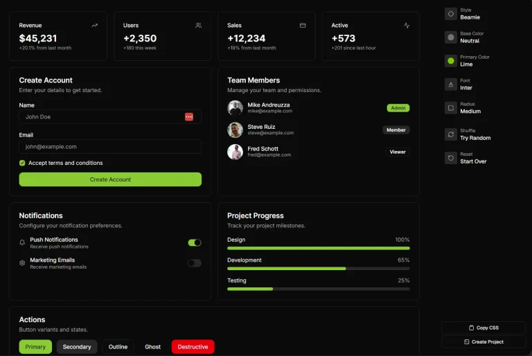
🧩 Neobrutalist component set: All standard UI primitives (buttons, dialogs, tables, sidebars, charts, and more) carry hard box shadows, black borders, and high-contrast color tokens.
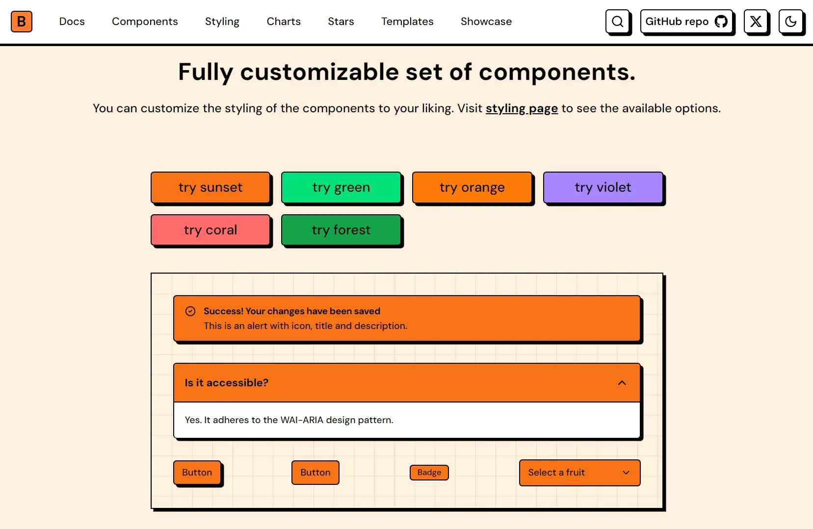
🎨 CSS variable theme presets: Ready-to-paste themes (sunset, blue, forest, and others) define --main, --background, --shadow, and chart color tokens via OKLCH color values with both light and dark variants.
⭐ Stars library: 40 geometric star shapes ship as individual React components for use as layout accents or decorative elements.
🖥️ shadcn CLI registry: Every component installs through a direct registry URL, so the shadcn add command handles file placement into your src/components/ui/ directory.
🛠️ Styling Builder: An interactive online tool allows you to review and export theme presets ready to drop into globals.css.
📐 Free Tailwind templates: Four fully customizable project templates (Bento, Blog, Portfolio, Windowed Portfolio).
Use Cases
- Creative Portfolios: Developers construct highly visual personal websites using the included windowed portfolio template.
- Design Agency Landing Pages: The bold typography and hard shadows establish a strong brand identity for creative businesses.
- Modern SaaS Dashboards: You apply the neobrutalist data tables and charts to make administrative interfaces visually distinct.
How to Use It
1. BrutalizmUI installs on top of an existing shadcn/ui setup. If your project does not have shadcn initialized, run the init command first:
pnpm dlx shadcn@latest initFollow the official prompts to select your framework (Next.js) and Tailwind CSS configuration.
2. Open the Styling Builder at brutalizmui.pages.dev/styling, pick a preset, and copy the output. Paste the full block into your globals.css, replacing any existing shadcn color tokens.
Below is an example of what the full CSS block looks like for the default sunset preset:
@import "tailwindcss";
@import "tw-animate-css";
@custom-variant dark (&:is(.dark *));
:root {
  --background: oklch(96.1% 0.028 78.4);
  --secondary-background: oklch(100% 0 0);
  --foreground: oklch(0% 0 0);
  --main-foreground: oklch(0% 0 0);
  --main: oklch(73.5% 0.186 46.2);
  --border: oklch(0% 0 0);
  --ring: oklch(0% 0 0);
  --overlay: oklch(0% 0 0 / 0.8);
  --shadow: 4px 4px 0px 0px var(--border);
  --chart-1: #F97316;
  --chart-2: #E11D48;
  --chart-3: #EAB308;
  --chart-4: #22C55E;
  --chart-5: #A855F7;
  --chart-active-dot: #000;
}
.dark {
  --background: oklch(24.6% 0.031 39.2);
  --secondary-background: oklch(23.93% 0 0);
  --foreground: oklch(92.49% 0 0);
  --main-foreground: oklch(0% 0 0);
  --main: oklch(69.4% 0.178 43.8);
  --border: oklch(0% 0 0);
  --ring: oklch(100% 0 0);
  --shadow: 4px 4px 0px 0px var(--border);
  --chart-1: #FB923C;
  --chart-2: #FB7185;
  --chart-3: #FACC15;
  --chart-4: #4ADE80;
  --chart-5: #C084FC;
  --chart-active-dot: #fff;
}
@theme inline {
  --color-main: var(--main);
  --color-background: var(--background);
  --color-secondary-background: var(--secondary-background);
  --color-foreground: var(--foreground);
  --color-main-foreground: var(--main-foreground);
  --color-border: var(--border);
  --color-overlay: var(--overlay);
  --color-ring: var(--ring);
  --color-chart-1: var(--chart-1);
  --color-chart-2: var(--chart-2);
  --color-chart-3: var(--chart-3);
  --color-chart-4: var(--chart-4);
  --color-chart-5: var(--chart-5);
  --spacing-boxShadowX: 4px;
  --spacing-boxShadowY: 4px;
  --spacing-reverseBoxShadowX: -4px;
  --spacing-reverseBoxShadowY: -4px;
  --radius-base: 5px;
  --shadow-shadow: var(--shadow);
  --font-weight-base: 500;
  --font-weight-heading: 700;
}
@layer base {
  body {
    @apply text-foreground font-base bg-background;
  }
  h1, h2, h3, h4, h5, h6 {
    @apply font-heading;
  }
}
The @theme inline block re-exports every CSS variable as a Tailwind token. After adding this block, classes like bg-main, text-foreground, shadow-shadow, and border-border all resolve correctly.
3. Install Components from the Registry. Each component installs individually through the shadcn CLI pointing at the BrutalizmUI registry. Run the add command for the component you need.
Using pnpm:
pnpm dlx shadcn@latest add https://brutalizmui.pages.dev/r/button.jsonUsing npx:
npx shadcn@latest add https://brutalizmui.pages.dev/r/button.jsonUsing Bun:
bunx --bun shadcn@latest add https://brutalizmui.pages.dev/r/button.jsonThe CLI places the component file into src/components/ui/ as an editable TypeScript file. Swap out button.json for the name of any other component in the library (e.g., card.json, dialog.json, sidebar.json).
4. Once the file lands in src/components/ui/, import it the same way you would any shadcn/ui component:
import { Button } from '@/components/ui/button'
export default function Page() {
  return (
    <div>
      <Button>Default</Button>
      <Button variant="neutral">Neutral</Button>
    </div>
  )
}
The component reads your --shadow, --border, and --main CSS variables automatically, so the neobrutalist styling applies without extra class names.
5. BrutalizmUI currently includes four open-source Tailwind templates. Each template repo starts with the full CSS variable theme, the component set, and a page layout already assembled. Check the template repository for clone instructions.
| Template | Description |
|---|---|
| Bento | Grid-based layout for dashboards or feature showcases |
| Blog | Content-focused layout with neobrutalist typography and card styles |
| Portfolio | Personal site layout with project cards and contact sections |
| Windowed Portfolio | Portfolio variation with a windowed/desktop OS aesthetic |
6. All UI components:
- Layout & Structure: Accordion, Card, Carousel, Collapsible, Drawer, Resizable, Scroll Area, Sheet, Sidebar, Tabs.
- Navigation & Menus: Breadcrumb, Context Menu, Dropdown Menu, Menubar, Navigation Menu, Pagination.
- Forms & Inputs: Checkbox, Combobox, Date Picker, Form, Input Otp, Input, Label, Radio Group, Select, Slider, Switch, Textarea.
- Feedback & Overlays: Alert Dialog, Alert, Dialog, Hover Card, Popover, Progress, Skeleton, Sonner, Tooltip.
- Data Display: Avatar, Badge, Chart, Command, Data Table, Image Card, Marquee, Table.
Related Resources
- shadcn/ui: The underlying component system that BrutalizmUI extends. Components install as editable files through the CLI registry.
- Tailwind CSS: The utility-first CSS framework that processes all BrutalizmUI class names and
@theme inlinetoken exports.
FAQs
Q: Can BrutalizmUI components coexist with standard shadcn/ui components in the same project?
A: Yes. Each component installs as an independent file in src/components/ui/. Standard shadcn components and BrutalizmUI components live in the same directory and read from the same CSS variables.
Q: Do the dark mode styles activate automatically?
A: The .dark class on the html element activates the dark token set. BrutalizmUI uses the @custom-variant dark (&:is(.dark *)) selector, so dark mode ties to the .dark class, not the prefers-color-scheme media query by default. You control the toggle through your own theme switching logic.
Q: How do I modify the shadow direction for all components?
A: You can update the --shadow variable in your globals.css file. Changing the pixel offsets alters the shadow angle globally.