The Future of Web Dev
The Future of Web Dev
80+ Reusable Components with Shadcn, Tailwind & Framer Motion – manfromexistence/ui
Get 80+ professional UI components built with shadcn/ui, Tailwind CSS and Framer Motion. Copy-paste code you own and customize for any project.
manfromexistence/ui is a collection of reusable, copy-paste UI components and blocks built with Ant Design, Shadcn Ui, Tailwind CSS, and Framer Motion.
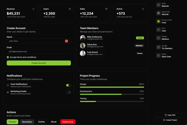
The collection includes over 80 UI components ranging from basic elements like buttons and inputs to complex interface patterns such as Gantt charts, Kanban boards, and 3D carousels.
Each component comes with complete source code that you can directly paste into your projects and modify according to specific requirements.
Features
📋 Copy-paste implementation that provides complete code ownership and customization freedom.
🎯 Compatible with any framework, including Next.js, Astro, Remix, Gatsby, and more.
⚡ Optimized performance with minimal dependencies and clean code structure.
🎭 Advanced animations and interactions powered by Framer Motion.
🎨 Consistent design system based on proven UI frameworks and design principles.
🔧 Modular architecture that allows selective component adoption without bloat.
How to Use It
1. Set up a new or existing Next.js project.
pnpm dlx shadcn@latest init2. The initialization script will ask for configuration details, such as style and color preferences, to create a components.json file.
- Style New York
- Base Color Zinc
- CSS Variables Yes/No
3. After initialization, you can add specific components to your project using the add command.
pnpm dlx shadcn@latest add button4. Once a component is added, you can import it into your React files and use it like any other component. The code for the component will be located in your project’s components/ui directory, where you can modify it as needed.
Here is an example of how to use the Button component after adding it to your project.
import { Button } from "@/components/ui/button"
export default function Home() {
  return (
  <div>
    <Button>Click me</Button>
  </div>
  )
}
UI Components Included
- Calendars
- Gantts
- Kanbans
- Lists
- Tables
- Separators
- Bento
- Spinner
- Buttons
- Tooltip
- Color Picker
- Mention
- Autocomplete
- Anchor
- Cascader
- Description
- Float Button
- Input Number
- Qr Code
- Rate
- Steps
- Timeline
- Time Picker
- Tour
- Transfer
- Tree
- Transfer
- Tree Select
- Dock
- Confetti
- Cool Mode
- Spinner
- Feedback
- Location Input
- Multi Select
- Date Time Picker
- Phone Input
- Password Input
- Tags Input
- File Upload
- Texts
- Backgrounds
- Tablist
- Animated Number
- Bg Animate Button
- Bg Media Hero
- Direction Aware Tabs
- Dynamic Island
- Expandable
- Family Button
- Floating Panel
- Gradient Heading
- Minimal Card
- Popover
- Popover Form
- Shift Card
- Side Panel
- Sortable List
- Text Animate
- Texture Button
- Texture Card
- 3D Carousel
- LightBoard
- Fractal Grid
- Tweet Grid
- Typewriter
Related Resources
- Shadcn UI – The foundational component library that provides the base architecture and design system for many components.
- Tailwind CSS – Utility-first CSS framework used for styling and responsive design implementation.
- Framer Motion – Animation library that powers the interactive elements and smooth transitions throughout the component collection.
- Ant Design – Enterprise-class UI design language that influences the component structure and behavior patterns.
FAQs
Q: Why choose copy-paste over installing as an npm package?
A: The copy-paste approach gives you complete ownership and control over the component code. You can modify styling, behavior, and implementation details without being constrained by package versioning or breaking changes.
Q: Do I need to credit the project when using these components?
A: No attribution is required. The components are free to use for both personal and commercial projects without any licensing restrictions or credit requirements.
Q: How do I handle updates to components?
A: Since you own the code, updates are manual. You can monitor the project repository for improvements and selectively update components in your project. This gives you control over when and how updates are applied.
Q: Are the components production-ready?
A: Yes, all components are designed for production use with performance optimization, accessibility considerations, and cross-browser compatibility. However, you should test components thoroughly in your specific environment before deployment.