The Future of Web Dev
The Future of Web Dev
Responsive Scroll Area Component for Shadcn/UI – Lina
Modern scroll area component that detects input methods and adjusts behavior. Includes edge masks, hover effects, and momentum scrolling.
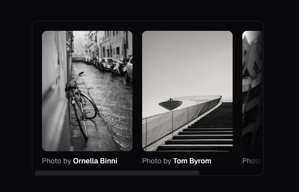
Lina is a responsive scroll area component that adapts its behavior based on user input methods.
You can integrate it into shadcn/ui projects as a direct replacement for the standard ScrollArea component.
The library detects whether users interact through touch or pointer devices and adjusts its rendering approach accordingly.
On desktop, it displays custom scrollbars with hover effects and animations. On mobile devices, it switches to native scrolling with momentum physics and proper touch action handling.
Both modes include adaptive edge masks that appear only when content extends beyond visible boundaries.
Features
🎯 Adaptive Rendering: Detects primary input method and renders either custom scrollbars for pointer devices or native scroll containers for touch interfaces.
🌫️ Dynamic Edge Masks: Displays gradient fades at scrollable edges that update in real time based on scroll position, content dimensions, and active scroll axes.
🖱️ Desktop Micro-interactions: Applies hover and active states to custom scrollbars with scale transitions on the thumb element during interaction.
📱 Touch Optimization: Configures momentum scrolling, passive event listeners, and appropriate touch action values for iOS and Android devices.
🔄 Drop-in Compatibility: Matches the shadcn/ui ScrollArea API structure, accepting the same props and className patterns without requiring code changes.
🧩 Dual Primitive Support: Ships with both Radix UI and Base UI variants that share identical APIs and visual specifications.
How to Use It
1. Install Lina via the shadcn CLI. The will download component files, install required dependencies, and configure your project structure.
Radix UI
npx shadcn@latest add https://lina.sameer.sh/r/lina-radix.jsonBase UI
npx shadcn@latest add https://lina.sameer.sh/r/lina-base.json2. If you prefer manual installation, add the primitive library and animation utilities separately:
# Radix UI
npm install @radix-ui/react-scroll-area
npm install -D tw-animate-css
# Base UI
npm install @base-ui-components/react
npm install -D tw-animate-css
3. Import the ScrollArea component and wrap scrollable content with Tailwind classes for dimensions and styling:
The component automatically handles input detection and applies appropriate rendering modes. On desktop browsers, it renders Radix or Base UI scroll primitives with custom styled scrollbars. On touch devices, it renders a standard div with overflow properties configured for native scrolling.
import { ScrollArea } from "@/components/ui/scroll-area";
export default function ContentPanel() {
  return (
    <ScrollArea className="h-96 w-full rounded-lg border border-gray-200 p-6">
      <div className="space-y-4">
        {Array.from({ length: 20 }).map((_, i) => (
          <p key={i} className="text-sm">
            Content item {i + 1} with additional text to demonstrate
            scrolling behavior and mask appearance.
          </p>
        ))}
      </div>
    </ScrollArea>
  );
}
4. Control gradient mask appearance through the maskHeight prop. Set a pixel value to define mask dimensions, or disable masks by passing zero:
The mask system creates two overlay divs with CSS custom properties that update based on scroll position. Vertical masks appear at top and bottom edges, while horizontal masks appear at left and right edges. Transitions smooth the appearance and disappearance of masks as content scrolls into view.
<ScrollArea
  className="h-80 w-full border rounded"
  maskHeight={40}
  maskClassName="bg-gradient-to-b from-white"
>
  {content}
</ScrollArea>
5. Apply custom classes to the inner viewport element through the viewportClassName prop:
This separation lets you style the outer container independently from the scrollable region, which matters when implementing scroll snap points or custom padding strategies.
<ScrollArea
  className="h-screen"
  viewportClassName="snap-y snap-mandatory"
>
  <div className="snap-start h-screen">Section 1</div>
  <div className="snap-start h-screen">Section 2</div>
</ScrollArea>
6. On desktop devices, adjust how quickly scrollbars fade after scroll interactions stop through the scrollHideDelay prop:
The delay accepts milliseconds. Setting zero keeps scrollbars visible immediately after scrolling stops. Higher values extend the visibility period before the fade animation begins.
<ScrollArea scrollHideDelay={1000}>
  {content}
</ScrollArea>
API Reference
ScrollArea Props
| Prop | Type | Default | Description |
|---|---|---|---|
| className | string | undefined | Tailwind classes applied to the root container element |
| viewportClassName | string | undefined | Classes applied to the inner scrollable viewport div |
| maskHeight | number | 30 | Pixel height of gradient masks at scrollable edges (set to 0 to disable) |
| maskClassName | string | undefined | Additional classes for mask overlay divs |
| scrollHideDelay | number | 0 | Milliseconds before custom scrollbars fade on desktop after scroll stops |
| children | ReactNode | required | Content to render inside the scrollable area |
ScrollBar Props
The ScrollBar component renders automatically on desktop devices and accepts orientation and className props. Touch devices skip scrollbar rendering entirely.
| Prop | Type | Default | Description |
|---|---|---|---|
| orientation | “vertical” | “horizontal” | “vertical” | Axis direction for the scrollbar element |
| className | string | undefined | Additional Tailwind classes for scrollbar container |
Touch Detection Hook
The useTouchPrimary hook returns a boolean indicating whether the current device uses touch as its primary input method. It monitors the pointer media query and touch capability APIs, updating when users connect or disconnect input devices.
import { useTouchPrimary } from "@/hooks/use-has-primary-touch";
function Component() {
  const isTouch = useTouchPrimary();
  return <div>{isTouch ? 'Touch Mode' : 'Desktop Mode'}</div>;
}
Related Resources
- Radix UI Scroll Area: Accessible scroll container primitive that handles cross-browser scrollbar styling and keyboard navigation patterns.
- Base UI Scroll Area: Unstyled scroll component from MUI that separates interaction logic from visual presentation.
- Tailwind CSS: The utility-first CSS framework used for styling the scrollbars and masks.
FAQs
Q: Does Lina work with server components in Next.js?
A: No. The component uses client-side hooks for input detection and state management. Add the “use client” directive at the top of any file that imports ScrollArea.
Q: Why do masks not appear even though content overflows?
A: Check that maskHeight is set above zero and that the ScrollArea has explicit height constraints.
Q: How do I customize scrollbar colors beyond the default border color?
A: Pass custom classes through the ScrollBar className prop or modify the component file directly.
Q: Does the component handle horizontal scrolling?
A: Yes. Masks detect both vertical and horizontal overflow and apply gradients to the appropriate edges.