The Future of Web Dev
The Future of Web Dev
Modern Tags Input Component for Next.js – shadcn-multi-select
Implement filterable multi-select interfaces in Next.js using shadcn/ui components with type safety and custom animations.
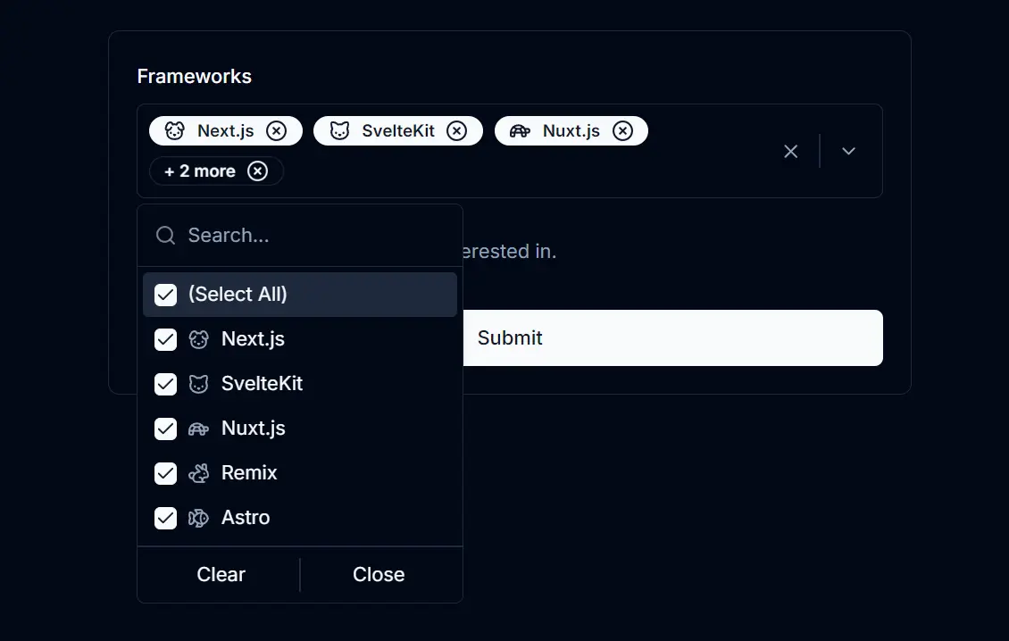
shadcn-multi-select is a UI component built with shadcn/ui that adds a filterable, checkable multi-select functionality to Next.js applications.
This component presents options in a dropdown list where users can search and check multiple items. Selected items appear as tags or tokens directly in the input area.
You can use this component for various tasks that require multiple selections, such as applying multiple filters, selecting tags for content, or assigning categories to items.
Features
✨ Modern UI: Built using shadcn/ui components like Command, Popover, Button, and Badge.
🏷️ Token/Tag Display: Shows selected items as badges within the input area for clarity.
⌨️ Keyboard Accessible: Supports keyboard navigation for selecting and removing items.
🗑️ Clear & Select All: Provides actions to clear all selections or select/deselect all available options quickly.
🔍 Filterable: Includes a search input to quickly find options in long lists.
✅ Checkable Items: Users can easily select and deselect multiple options.
🖼️ Icon Support: You can add icons next to each option for better visual identification.
⚙️ Configurable: Control aspects like placeholder text, default values, maximum displayed tags, and optional animations.
Use Cases
- Filtering Data Tables: Allow users to select multiple status types, categories, or assignees to filter table data.
- Tagging Systems: Implement tag selection for blog posts, articles, or product categorization. Users can search and add relevant tags.
- User Preferences: Let users choose multiple interests, notification preferences, or settings from a predefined list.
- Assigning Roles/Permissions: Create an interface for administrators to assign multiple roles or permissions to users by selecting from a list.
- Product Attributes: Enable selection of multiple product attributes like colors, sizes, or features during configuration or filtering
How to use it
1. Set up shadcn/ui in your Next.js project and install the necessary shadcn/ui components used by the multi-select component.
npx shadcn@latest init
npx shadcn@latest add command popover button separator badge
2. Create a new file named multi-select.tsx inside your components directory (e.g., src/components/multi-select.tsx). Copy the component code into this file.
import * as React from "react";
import { cva, type VariantProps } from "class-variance-authority";
import {
  CheckIcon,
  XCircle,
  ChevronDown,
  XIcon,
  WandSparkles,
} from "lucide-react";

import { cn } from "@/lib/utils";
import { Separator } from "@/components/ui/separator";
import { Button } from "@/components/ui/button";
import { Badge } from "@/components/ui/badge";
import {
  Popover,
  PopoverContent,
  PopoverTrigger,
} from "@/components/ui/popover";
import {
  Command,
  CommandEmpty,
  CommandGroup,
  CommandInput,
  CommandItem,
  CommandList,
  CommandSeparator,
} from "@/components/ui/command";

/**
 * Variants for the multi-select component to handle different styles.
 * Uses class-variance-authority (cva) to define different styles based on "variant" prop.
 */
const multiSelectVariants = cva(
  "m-1 transition ease-in-out delay-150 hover:-translate-y-1 hover:scale-110 duration-300",
  {
    variants: {
      variant: {
        default:
          "border-foreground/10 text-foreground bg-card hover:bg-card/80",
        secondary:
          "border-foreground/10 bg-secondary text-secondary-foreground hover:bg-secondary/80",
        destructive:
          "border-transparent bg-destructive text-destructive-foreground hover:bg-destructive/80",
        inverted: "inverted",
      },
    },
    defaultVariants: {
      variant: "default",
    },
  }
);

/**
 * Props for MultiSelect component
 */
interface MultiSelectProps
  extends React.ButtonHTMLAttributes<HTMLButtonElement>,
    VariantProps<typeof multiSelectVariants> {
  /**
   * An array of option objects to be displayed in the multi-select component.
   * Each option object has a label, value, and an optional icon.
   */
  options: {
    /** The text to display for the option. */
    label: string;
    /** The unique value associated with the option. */
    value: string;
    /** Optional icon component to display alongside the option. */
    icon?: React.ComponentType<{ className?: string }>;
  }[];

  /**
   * Callback function triggered when the selected values change.
   * Receives an array of the new selected values.
   */
  onValueChange: (value: string[]) => void;

  /** The default selected values when the component mounts. */
  defaultValue?: string[];

  /**
   * Placeholder text to be displayed when no values are selected.
   * Optional, defaults to "Select options".
   */
  placeholder?: string;

  /**
   * Animation duration in seconds for the visual effects (e.g., bouncing badges).
   * Optional, defaults to 0 (no animation).
   */
  animation?: number;

  /**
   * Maximum number of items to display. Extra selected items will be summarized.
   * Optional, defaults to 3.
   */
  maxCount?: number;

  /**
   * The modality of the popover. When set to true, interaction with outside elements
   * will be disabled and only popover content will be visible to screen readers.
   * Optional, defaults to false.
   */
  modalPopover?: boolean;

  /**
   * If true, renders the multi-select component as a child of another component.
   * Optional, defaults to false.
   */
  asChild?: boolean;

  /**
   * Additional class names to apply custom styles to the multi-select component.
   * Optional, can be used to add custom styles.
   */
  className?: string;
}

export const MultiSelect = React.forwardRef<
  HTMLButtonElement,
  MultiSelectProps
>(
  (
    {
      options,
      onValueChange,
      variant,
      defaultValue = [],
      placeholder = "Select options",
      animation = 0,
      maxCount = 3,
      modalPopover = false,
      asChild = false,
      className,
      ...props
    },
    ref
  ) => {
    const [selectedValues, setSelectedValues] =
      React.useState<string[]>(defaultValue);
    const [isPopoverOpen, setIsPopoverOpen] = React.useState(false);
    const [isAnimating, setIsAnimating] = React.useState(false);

    const handleInputKeyDown = (
      event: React.KeyboardEvent<HTMLInputElement>
    ) => {
      if (event.key === "Enter") {
        setIsPopoverOpen(true);
      } else if (event.key === "Backspace" && !event.currentTarget.value) {
        const newSelectedValues = [...selectedValues];
        newSelectedValues.pop();
        setSelectedValues(newSelectedValues);
        onValueChange(newSelectedValues);
      }
    };

    const toggleOption = (option: string) => {
      const newSelectedValues = selectedValues.includes(option)
        ? selectedValues.filter((value) => value !== option)
        : [...selectedValues, option];
      setSelectedValues(newSelectedValues);
      onValueChange(newSelectedValues);
    };

    const handleClear = () => {
      setSelectedValues([]);
      onValueChange([]);
    };

    const handleTogglePopover = () => {
      setIsPopoverOpen((prev) => !prev);
    };

    const clearExtraOptions = () => {
      const newSelectedValues = selectedValues.slice(0, maxCount);
      setSelectedValues(newSelectedValues);
      onValueChange(newSelectedValues);
    };

    const toggleAll = () => {
      if (selectedValues.length === options.length) {
        handleClear();
      } else {
        const allValues = options.map((option) => option.value);
        setSelectedValues(allValues);
        onValueChange(allValues);
      }
    };

    return (
      <Popover
        open={isPopoverOpen}
        onOpenChange={setIsPopoverOpen}
        modal={modalPopover}
      >
        <PopoverTrigger asChild>
          <Button
            ref={ref}
            {...props}
            onClick={handleTogglePopover}
            className={cn(
              "flex w-full p-1 rounded-md border min-h-10 h-auto items-center justify-between bg-inherit hover:bg-inherit [&_svg]:pointer-events-auto",
              className
            )}
          >
            {selectedValues.length > 0 ? (
              <div className="flex justify-between items-center w-full">
                <div className="flex flex-wrap items-center">
                  {selectedValues.slice(0, maxCount).map((value) => {
                    const option = options.find((o) => o.value === value);
                    const IconComponent = option?.icon;
                    return (
                      <Badge
                        key={value}
                        className={cn(
                          isAnimating ? "animate-bounce" : "",
                          multiSelectVariants({ variant })
                        )}
                        style={{ animationDuration: `${animation}s` }}
                      >
                        {IconComponent && (
                          <IconComponent className="h-4 w-4 mr-2" />
                        )}
                        {option?.label}
                        <XCircle
                          className="ml-2 h-4 w-4 cursor-pointer"
                          onClick={(event) => {
                            event.stopPropagation();
                            toggleOption(value);
                          }}
                        />
                      </Badge>
                    );
                  })}
                  {selectedValues.length > maxCount && (
                    <Badge
                      className={cn(
                        "bg-transparent text-foreground border-foreground/1 hover:bg-transparent",
                        isAnimating ? "animate-bounce" : "",
                        multiSelectVariants({ variant })
                      )}
                      style={{ animationDuration: `${animation}s` }}
                    >
                      {`+ ${selectedValues.length - maxCount} more`}
                      <XCircle
                        className="ml-2 h-4 w-4 cursor-pointer"
                        onClick={(event) => {
                          event.stopPropagation();
                          clearExtraOptions();
                        }}
                      />
                    </Badge>
                  )}
                </div>
                <div className="flex items-center justify-between">
                  <XIcon
                    className="h-4 mx-2 cursor-pointer text-muted-foreground"
                    onClick={(event) => {
                      event.stopPropagation();
                      handleClear();
                    }}
                  />
                  <Separator
                    orientation="vertical"
                    className="flex min-h-6 h-full"
                  />
                  <ChevronDown className="h-4 mx-2 cursor-pointer text-muted-foreground" />
                </div>
              </div>
            ) : (
              <div className="flex items-center justify-between w-full mx-auto">
                <span className="text-sm text-muted-foreground mx-3">
                  {placeholder}
                </span>
                <ChevronDown className="h-4 cursor-pointer text-muted-foreground mx-2" />
              </div>
            )}
          </Button>
        </PopoverTrigger>
        <PopoverContent
          className="w-auto p-0"
          align="start"
          onEscapeKeyDown={() => setIsPopoverOpen(false)}
        >
          <Command>
            <CommandInput
              placeholder="Search..."
              onKeyDown={handleInputKeyDown}
            />
            <CommandList>
              <CommandEmpty>No results found.</CommandEmpty>
              <CommandGroup>
                <CommandItem
                  key="all"
                  onSelect={toggleAll}
                  className="cursor-pointer"
                >
                  <div
                    className={cn(
                      "mr-2 flex h-4 w-4 items-center justify-center rounded-sm border border-primary",
                      selectedValues.length === options.length
                        ? "bg-primary text-primary-foreground"
                        : "opacity-50 [&_svg]:invisible"
                    )}
                  >
                    <CheckIcon className="h-4 w-4" />
                  </div>
                  <span>(Select All)</span>
                </CommandItem>
                {options.map((option) => {
                  const isSelected = selectedValues.includes(option.value);
                  return (
                    <CommandItem
                      key={option.value}
                      onSelect={() => toggleOption(option.value)}
                      className="cursor-pointer"
                    >
                      <div
                        className={cn(
                          "mr-2 flex h-4 w-4 items-center justify-center rounded-sm border border-primary",
                          isSelected
                            ? "bg-primary text-primary-foreground"
                            : "opacity-50 [&_svg]:invisible"
                        )}
                      >
                        <CheckIcon className="h-4 w-4" />
                      </div>
                      {option.icon && (
                        <option.icon className="mr-2 h-4 w-4 text-muted-foreground" />
                      )}
                      <span>{option.label}</span>
                    </CommandItem>
                  );
                })}
              </CommandGroup>
              <CommandSeparator />
              <CommandGroup>
                <div className="flex items-center justify-between">
                  {selectedValues.length > 0 && (
                    <>
                      <CommandItem
                        onSelect={handleClear}
                        className="flex-1 justify-center cursor-pointer"
                      >
                        Clear
                      </CommandItem>
                      <Separator
                        orientation="vertical"
                        className="flex min-h-6 h-full"
                      />
                    </>
                  )}
                  <CommandItem
                    onSelect={() => setIsPopoverOpen(false)}
                    className="flex-1 justify-center cursor-pointer max-w-full"
                  >
                    Close
                  </CommandItem>
                </div>
              </CommandGroup>
            </CommandList>
          </Command>
        </PopoverContent>
        {animation > 0 && selectedValues.length > 0 && (
          <WandSparkles
            className={cn(
              "cursor-pointer my-2 text-foreground bg-background w-3 h-3",
              isAnimating ? "" : "text-muted-foreground"
            )}
            onClick={() => setIsAnimating(!isAnimating)}
          />
        )}
      </Popover>
    );
  }
);

MultiSelect.displayName = "MultiSelect";
3. Import and use the MultiSelect component within your Next.js page or another component.
"use client";
import React, { useState } from "react";
import { MultiSelect } from "@/components/multi-select";
// Example icons from lucide-react
import { Cat, Dog, Fish, Rabbit, Turtle } from "lucide-react";
// Define your options array
const frameworksList = [
  { value: "react", label: "React", icon: Turtle },
  { value: "angular", label: "Angular", icon: Cat },
  { value: "vue", label: "Vue", icon: Dog },
  { value: "svelte", label: "Svelte", icon: Rabbit },
  { value: "ember", label: "Ember", icon: Fish },
];
function HomePage() {
  // State to hold the selected values
  const [selectedFrameworks, setSelectedFrameworks] = useState<string[]>(["react", "angular"]);
  return (
    <div className="p-4 max-w-xl">
      <h1 className="text-2xl font-bold mb-4">Multi-Select Example</h1>
      <MultiSelect
        options={frameworksList} // Pass your options
        onValueChange={setSelectedFrameworks} // Function to update state
        defaultValue={selectedFrameworks} // Set initial selected values
        placeholder="Select frameworks..." // Customize placeholder
        variant="inverted" // Choose a style variant
        animation={1} // Optional animation duration
        maxCount={3} // Max tags to display before summarizing
      />
      <div className="mt-4">
        <h2 className="text-xl font-semibold">Selected Frameworks:</h2>
        {/* Display selected values */}
        <ul className="list-disc list-inside">
          {selectedFrameworks.map((framework) => (
            <li key={framework}>{framework}</li>
          ))}
        </ul>
      </div>
    </div>
  );
}
export default HomePage;
Related Resources
- shadcn/ui: https://ui.shadcn.com/ – The UI component library this multi-select component is built upon. Check the official documentation for other components and usage details.
- Next.js: https://nextjs.org/docs – The React framework. Refer to its documentation for framework-specific features and best practices.
- Lucide React: https://lucide.dev/ – The icon library used for icons within the component examples. Browse their collection for suitable icons.
FAQs
Q: How can I change the component’s appearance?
A: You can apply different styles using the variant prop (‘default’, ‘secondary’, ‘destructive’, ‘inverted’) or pass custom CSS classes via the className prop for more specific adjustments.
Q: Is this component accessible via keyboard?
A: Yes, users can interact with the component using the keyboard. For instance, pressing Enter opens the dropdown, and Backspace can remove the last selected item when the input field is empty.
Q: How do I get the list of selected items?
A: The component uses a controlled pattern. Provide an onValueChange callback function as a prop. This function will receive the updated array of selected value strings whenever the selection changes.
Q: Can options have icons?
A: Yes, you can include an icon property (a React component type) in each object within the options array. The component will render the icon next to the option label.
Preview
