The Future of Web Dev
The Future of Web Dev
Tron-Inspired Design System for shadcn/ui – The GridCN
Add Tron aesthetics to your React/Next.js project with The GridCN. 50+ styled components, HUD elements, and full TypeScript support built on shadcn/ui.
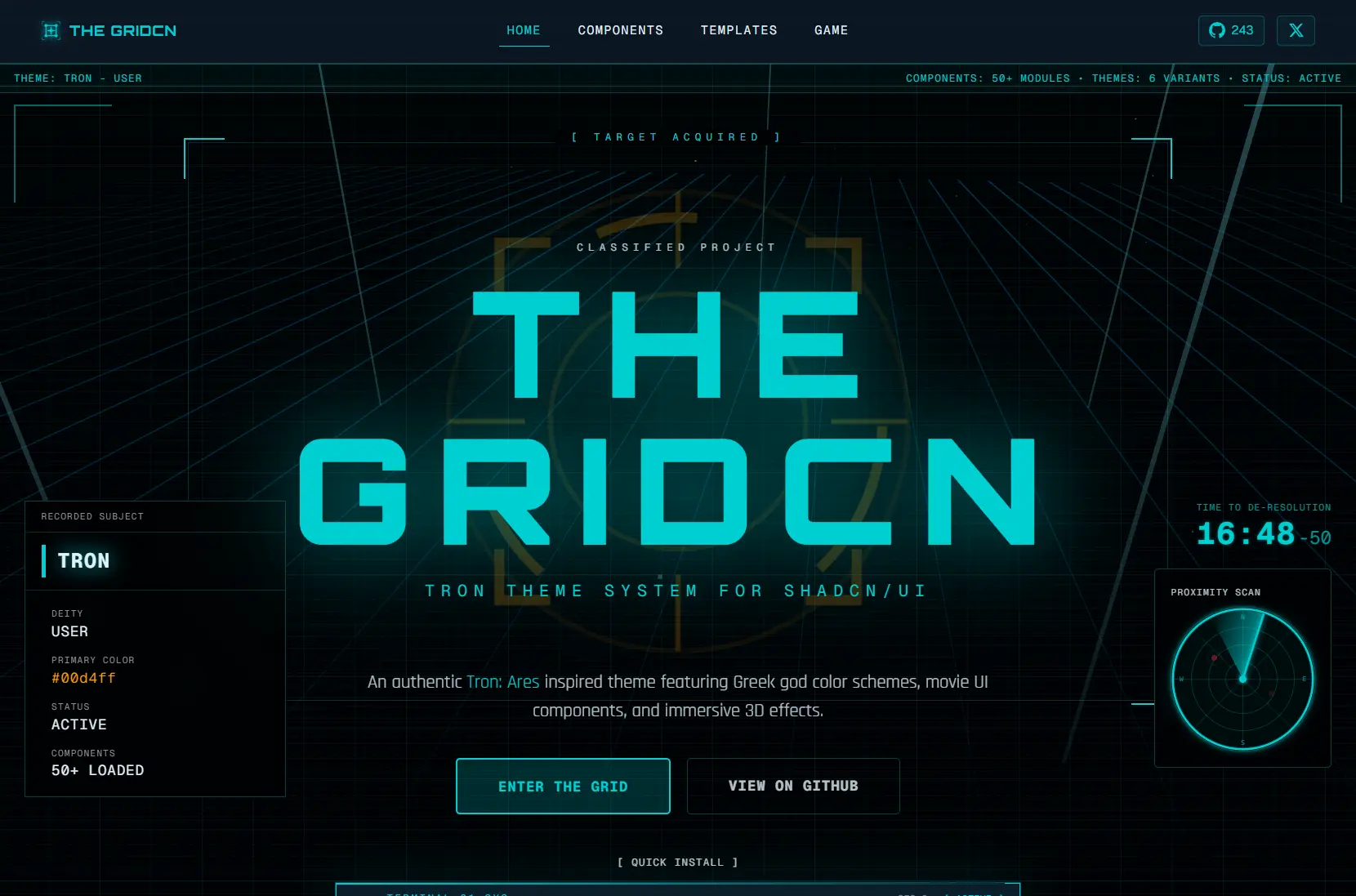
The GridCN is a Tron: Ares-inspired design system that layers 50+ fully-styled components, six Greek god-themed color palettes, HUD-style UI elements, and Three.js-powered 3D effects on top of shadcn/ui.
Every component lands in your project as editable source code, following the same ownership model as shadcn/ui itself. You can restyle, extend, or rip out anything.
Features
🎨 Six Greek God Themes: Color schemes named Ares, Tron, Clu, Athena, Aphrodite, and Poseidon, each defined in the oklch() color space for precise hue and chroma control.
🧩 50+ Tron-Styled Components: The complete shadcn/ui component set reskinned with neon accents, Tron-style borders, and theme-aware color tokens.
🎬 HUD-Style UI Elements: Specialized components for dossier data cards, status strips, radar displays, uplink headers, and de-resolution countdown timers modeled on Tron film interfaces.
✨ Three.js 3D Effects: Interactive 3D grid floors, particle systems, light beams, and fly-through tunnel effects, all loaded client-side.
🎯 Glow and Scanline Utilities: CSS utilities for neon glows, animated scanlines, and pulsing effects that respond to the active theme’s color token.
🎭 Persistent Theme Switching: The built-in theme provider reads and writes the active theme to persistent storage so user preferences carry across sessions.
How to Use It
Table Of Contents
Installation
1. The GridCN requires an existing shadcn/ui project. If you do not have one initialized, run this first:
pnpm dlx shadcn@latest init2. Cloning and Running the Full Project. The development server starts at http://localhost:3000.
git clone https://github.com/yourusername/project-ares.git
cd project-ares
pnpm install
pnpm dev
3. Building for Production
pnpm build
pnpm start
Setting Up the Theme Provider
Wrap your root layout with ThemeProvider and set a default theme name:
import { ThemeProvider } from "@/components/theme";
export default function RootLayout({ children }: { children: React.ReactNode }) {
  return (
    <html>
      <body>
        <ThemeProvider defaultTheme="ares">{children}</ThemeProvider>
      </body>
    </html>
  );
}
Switching Themes at Runtime
import { useTheme } from "@/components/theme";
function ThemeSwitcher() {
  const { theme, setTheme } = useTheme();
  return (
    <button onClick={() => setTheme("tron")}>
      Switch to Tron
    </button>
  );
}
Using Standard and Tron-Specific Components
import { Button } from "@/components/ui/button";
import { DataCard } from "@/components/thegridcn";
export function ProgramProfile() {
  return (
    <div>
      <Button>Enter the Grid</Button>
      <DataCard
        subtitle="PROGRAM"
        title="FLYNN"
        status="active"
        fields={[
          { label: "STATUS", value: "ACTIVE" },
          { label: "TYPE",   value: "USER"   },
        ]}
      />
    </div>
  );
}
Adding Individual Components via CLI
To pull a single component into an existing shadcn/ui project:
pnpm dlx shadcn@latest add @thegridcn/[component-name]To see the full list of available components:
pnpm dlx shadcn@latest list @thegridcnCustomizing or Creating Themes
Themes live in src/app/globals.css as CSS custom properties. Each theme’s block targets a [data-theme] attribute selector. Override any existing variable or add a new block to define a custom theme:
[data-theme="my-theme"] {
  --primary:    oklch(0.65 0.25 200);
  --glow:       oklch(0.65 0.25 200 / 0.4);
  --glow-muted: oklch(0.65 0.25 200 / 0.15);
  --radius:     0.25rem;
  --font-orbitron: "Orbitron", sans-serif;
  --font-rajdhani: "Rajdhani", sans-serif;
}
Pass the new theme name string to setTheme() to activate it.
Related Resources
- shadcn/ui: The component system The GridCN extends.
- Radix UI: The accessible, unstyled primitive layer.
- Three.js: The 3D graphics library.
- next-themes: The theme persistence library the GridCN wraps to handle storage and system preference detection.
FAQs
Q: Do I need to clone the full repository, or can I add components to an existing project?
A: Both approaches work. Clone the repository to run the complete showcase with all pages and themes active. To bring individual components into an existing shadcn/ui project, run pnpm dlx shadcn@latest add @thegridcn/[component-name] from your project root instead.
Q: Will the Three.js components affect my page’s initial load time?
A: No. All three 3D components use Next.js dynamic imports with ssr: false. They initialize only when the browser mounts the component.
Q: Does The GridCN work with Vite, Remix, or Astro?
A: Yes. In non-Next.js environments, replace the dynamic() import pattern with each framework’s equivalent client-only loading mechanism for the Three.js components.
Q: How do I add a completely custom theme beyond the six included ones?
A: Write a new [data-theme="your-name"] block in globals.css, define your color tokens using oklch() values, and call setTheme("your-name") to activate it.