The Future of Web Dev
The Future of Web Dev
Extend shadcn-svelte with 20+ Extra UI Components
Complete your shadcn-svelte projects with 20+ production-ready components. Avatar groups, chat interfaces, file uploads, and more. Install via CLI.
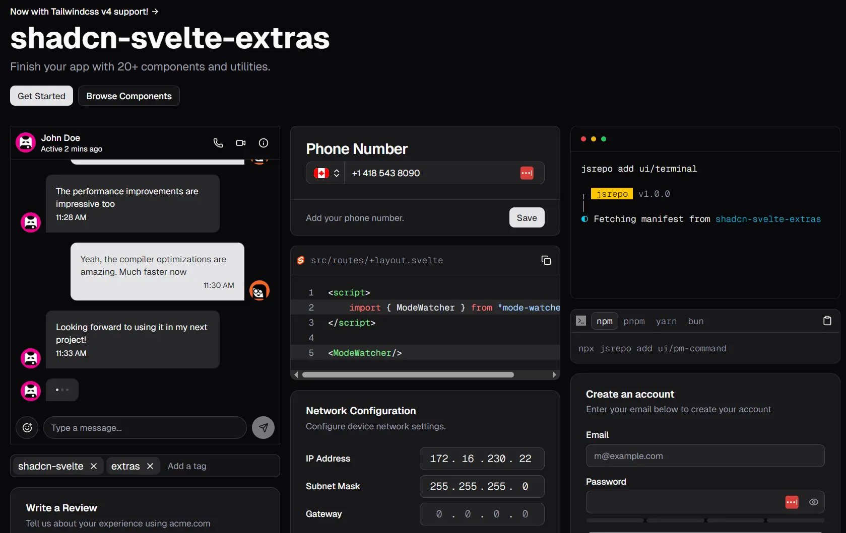
shadcn-svelte-extras is a component library that extends the popular shadcn-svelte by providing additional, well-designed, commonly needed UI components like chat interfaces, file drop zones, image croppers, and more.
The components maintain the same design principles of quality and style as shadcn-svelte. Each is designed to be highly composable, so you can customize it to fit your project’s specific requirements.
Features
⚡ Performance Optimized – Built to the same performance standards as shadcn-svelte with efficient rendering and minimal bundle impact.
📦 Modern Package Management – Uses jsrepo for semantic versioning, easy updates, and CLI-based component installation.
🎨 Style Consistency – Maintains visual and behavioral consistency with shadcn-svelte design language and patterns.
🔄 Tailwind 4 Ready – Fully support Tailwind CSS v4 with backward compatibility for v3 projects.
How to Use It
1. Install jsrepo globally to manage your component installations. This is optional but recommended for the best development experience.
npm i -g jsrepo2. Initialize jsrepo with the shadcn-svelte-extras registry in your project directory.
jsrepo init @ieedan/shadcn-svelte-extras3. Configure the paths in your jsrepo.json file to ensure components install in the correct directories. This configuration maps different component types to your project structure.
{
    "paths": {
         "*": "$lib/blocks",
         "ui": "$lib/components/ui",
         "hooks": "$lib/hooks",
         "actions": "$lib/actions",
         "utils": "$lib/utils"
    }
}
4. If you’re using Tailwind v3, pin your registry version to maintain compatibility.
{
    "repos": ["@ieedan/[email protected]"]
}
5. Install individual components (avatar component in this example) using jsrepo. Each component includes all necessary files and dependencies.
jsrepo add ui/avatar-groupOR
# Using pnpm
pnpm dlx jsrepo add ui/avatar-group

# Using npm
npx jsrepo add ui/avatar-group

# Using bun
bun x jsrepo add ui/avatar-group
6. Import and use components following the composable pattern established by shadcn-svelte. Here’s an example using the Avatar Group component.
<script lang="ts">
   import * as AvatarGroup from '$lib/components/ui/avatar-group';
   const members = [
      {
         username: 'huntabyte',
         image: 'https://github.com/huntabyte.png'
      },
      {
         username: 'AdrianGonz97',
         image: 'https://github.com/AdrianGonz97.png'
      },
      {
         username: 'shyakadavis',
         image: 'https://github.com/shyakadavis.png'
      }
   ];
</script>

<AvatarGroup.Root>
   {#each members as member (member.username)}
      <AvatarGroup.Member>
         <AvatarGroup.MemberImage src={member.image} alt={member.username} />
         <AvatarGroup.MemberFallback>
            {member.username[0]}
         </AvatarGroup.MemberFallback>
      </AvatarGroup.Member>
   {/each}
   <AvatarGroup.Etc plus={2} />
</AvatarGroup.Root>
7. Configure MCP (Model Context Protocol) support for AI-assisted development in your preferred AI editor. For Cursor, add the configuration to your .cursor/mcp.json file.
{
   "mcpServers": {
      "jsrepo": {
         "command": "npx",
         "args": ["jsrepo", "mcp"]
      }
   }
}
All Available Components
- AvatarGroup: A component for grouping multiple avatars together.
- Button: An extended button component with additional features.
- Chat: A component for creating live chat interfaces.
- Code: A component for displaying blocks of code.
- Copy Button: A button used to copy text to the clipboard.
- Emoji Picker: A composable component for selecting emojis.
- Field Set: A component for grouping related form fields.
- File Drop Zone: A component that allows users to drag and drop files for uploading.
- Image Cropper: A component for uploading and resizing images.
- IPv4Address Input: An input field specifically for entering IPv4 addresses.
- Kbd: A component to denote user input from a keyboard.
- Light Switch: A toggle component for changing the theme, typically between light and dark modes.
- Link: A simple, styled link component.
- Modal: A responsive dialog or popup component.
- NLP Date Input: An input that accepts natural language for date entry and provides suggestions.
- Password: An input component for entering passwords, often with a visibility toggle.
- Phone Input: A component for inputting phone numbers, often with country code selection.
- PM Command: A component for displaying package manager commands.
- Snippet: A component for showcasing small pieces of code or text.
- Star Rating: A component for selecting a rating using stars.
- Tags Input: An input field for entering and managing a list of tags.
- Terminal: A component that emulates the appearance of a MacOS terminal.
- Theme Selector: A component that allows users to click to select a theme.
- Tree View: A component for displaying hierarchical data, like a file tree.
- Window: A component that creates a windowed container for content.
- And more…
Related Resources
- shadcn-svelte – The foundation library providing core UI components and design patterns for Svelte applications.
- jsrepo – Component registry and management system that powers the installation and versioning system used by shadcn-svelte-extras.
- Tailwind CSS – The utility-first CSS framework that provides styling foundation for all components in the ecosystem.
- Svelte – The reactive JavaScript framework that serves as the underlying technology for all components and applications.
FAQs
Q: How compatible is shadcn-svelte-extras with the original shadcn-svelte?
A: The library maintains full compatibility with shadcn-svelte. Team members contribute to the original project and stay current with all changes.
Q: How do updates work for installed components?
A: jsrepo handles component updates with semantic versioning. You can update individual components or your entire component library while maintaining version compatibility and tracking changes.