The Future of Web Dev
The Future of Web Dev
Create GitHub-Style Activity Graphs – svelte-heatmap
Use svelte-heatmap to add GitHub-style contribution graphs to your Svelte projects. Visualize activity data easily.
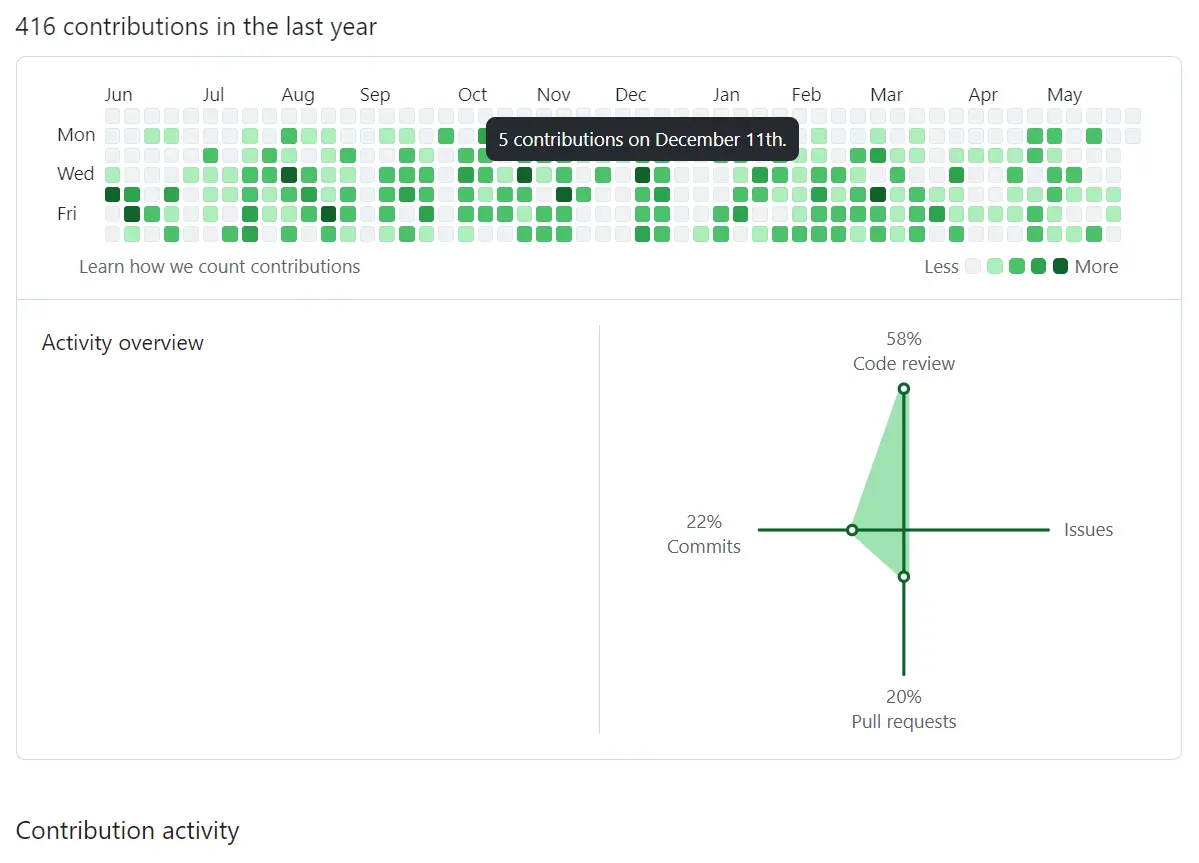
svelte-heatmap is a Svelte component for generating heatmap visualizations similar to GitHub’s contribution graph.
It allows you to represent data values over time using a color-coded grid. You can customize colors, control label visibility, and add interactive features like click handlers and hover events.
Features
📅 GitHub-inspired calendar heatmap layout with automatic date positioning
🎨 Fully customizable color schemes with default GitHub-style colors
📱 Responsive design that adapts to different screen sizes
🖱️ Interactive cells with click, mouseover, and mouseout event handling
🏷️ Optional day-of-week and month labels for better context
📊 Automatic data scaling and cell intensity calculation
Use Cases
- Visualizing User Activity: Track and display user engagement on a platform, showing login frequency or feature usage over a year.
- Project Contribution Graphs: Similar to GitHub, showcase contributions to projects, commits, or task completions over time.
- Habit Tracking: Allow users to visualize their consistency with daily or weekly habits, like exercise or study sessions.
- Data Logging Visualization: Represent server uptime, sensor data readings, or any time-series data in a compact, visual format.
- Personal Finance Overview: Display daily spending or saving patterns across a year to identify trends.
How To Use It
1. Install and import the svelte5-heatmap component into your Svelte project.
# NPM
$ npm install svelte5-heatmap
import Heatmap from "svelte5-heatmap";
2. Prepare your data to showcase in this heatmap. The data object should contain date strings in ISO format (YYYY-MM-DD) as keys and numerical values representing activity levels. The component automatically handles missing dates by displaying them as empty cells.
<script>
  import Heatmap from "svelte5-heatmap";
  let data = $state({
    '2025-01-01': 3,
    '2025-01-02': 7,
    '2025-01-03': 1,
    // ... more date entries
  });
  let year = 2025;
  function handleCellClick(event) {
    const date = event.target.dataset.date;
    const value = event.target.dataset.value;
    console.log(`Clicked ${date} with value ${value}`);
  }
</script>
<Heatmap
  {data}
  {year}
  onclick={handleCellClick}
/>
3. Available component props.
data(object, required): An object with date keys (YYYY-MM-DD) and numeric values. Example:{ '2025-01-02': 5 }.colors(array, optional): Array of color strings for cells. Uses GitHub colors by default.year(number, optional): The year to display. Defaults to the current year.lday(boolean, optional): Show day-of-week labels. Defaults totrue.lmonth(boolean, optional): Show month labels. Defaults totrue.
4. Available callback functions.
onmouseover(function, optional): Function called on mouse hover over a cell.onmouseout(function, optional): Function called when mouse leaves a cell.
FAQs
Q: Does the component handle leap years correctly?
A: Yes, the component automatically calculates the correct number of days for any given year, including leap years.
Q: Can I disable the day or month labels?
A: Yes, you can control label visibility using the lday prop for day-of-week labels and lmonth prop for month labels.

