The Future of Web Dev
The Future of Web Dev
App & Marketing Components & Blocks for Tailwind CSS – HyperUI
Free Tailwind CSS components for marketing sites and web apps. Copy-paste ready UI blocks with dark mode, RTL support, and full accessibility.
HyperUI is a free, open-source collection of Tailwind CSS components and blocks that work across marketing websites, admin dashboards, eCommerce platforms, and web applications.
The components and blocks are supplied as HTML snippets. You can copy the code directly from the HyperUI website and paste it into any project that uses Tailwind CSS.
Features
🆓 Free and open-source components with no licensing fees or attribution requirements.
📋 Copy-paste integration that lets you add components directly to your codebase without package installations.
🌓 Dark mode compatibility built into all components with automatic theme switching support.
🌐 RTL and LTR text direction support for building multilingual interfaces.
🎨 Customizable through Tailwind utility classes without modifying component structure.
👁️ Live preview system that shows components at different breakpoints before copying.
All Components & Blocks
Application Components
These components are designed for building the user interface of web applications like admin dashboards, content management systems, or eCommerce platforms.
- Alerts Display contextual feedback messages for user actions.
- Badges Highlight status information or counts.
- Breadcrumbs Show the user’s location in the navigational hierarchy.
- Button Groups Group a series of related buttons together.
- Checkboxes Allow users to select multiple options from a list.
- Details Lists Present data in a key-value format.
- Dividers Visually separate content sections.
- Dropdowns Provide a menu of options that appears on user interaction.
- File Uploaders Enable users to select and upload files.
- Filters Allow users to refine and sort content.
- Grids Arrange content in a responsive row and column layout.
- Inputs Collect data from users via form fields.
- Media Display media objects like images or videos alongside content.
- Modals Show content in an overlay that requires user interaction.
- Pagination Help users navigate through paginated content.
- Quantity Inputs Allow users to specify a numerical amount.
- Radio Groups Let users select a single option from a set.
- Selects Create dropdown menus for forms.
- Side Menu Provide a vertical navigation panel.
- Stats Display key data points and metrics.
- Steps Guide users through a multi-step process.
- Tables Organize and display data in rows and columns.
- Textareas Allow for multi-line text input in forms.
- Timelines Visualize events in chronological order.
- Toggles Function as on/off switches for settings.
- Vertical Menu Offer a list of navigation links arranged vertically.
Marketing Components
These components are suited for building promotional websites, landing pages, and online stores.
- Announcements Display site-wide messages or promotions.
- Banners Showcase prominent messages at the top of a page.
- Blog Cards Present summaries of blog posts in a card format.
- Buttons Create clickable elements for user actions.
- Cards Group related content and actions into a single container.
- Carts Display the contents of a user’s shopping cart.
- CTAs Encourage users to take a specific action.
- FAQs List frequently asked questions and their answers.
- Footers Provide site navigation and information at the bottom of a page.
- Header Display branding and primary navigation at the top of a page.
- Pricing Show different pricing tiers for products or services.
- Product Cards Display information about a single product.
- Product Collections Showcase groups of related products.
- Sections Structure page content into distinct blocks.
How to Use It
1. Go to the HyperUI website and find a component that fits your needs. The components are categorized into “Application” and “Marketing” sections.
2. Preview the component at different screen sizes. You can also check its appearance in dark mode and its compatibility with LTR text direction.
3. Click the “Copy” button to copy the component’s HTML source code to your clipboard.
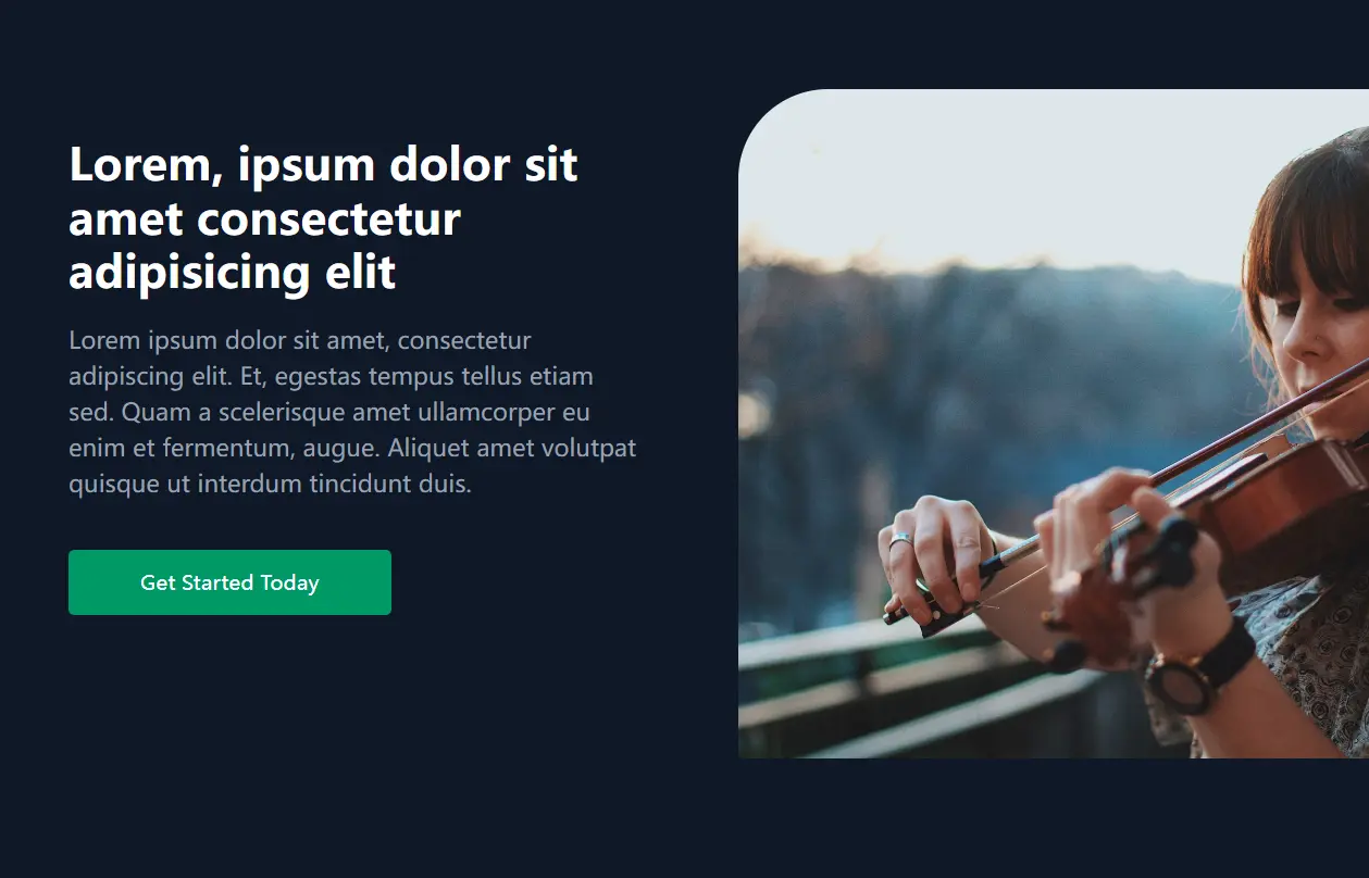
4. Paste the code into the appropriate file in your project. Here is an example of adding a CTA block to your project:
<section class="overflow-hidden bg-gray-50 sm:grid sm:grid-cols-2">
  <div class="p-8 md:p-12 lg:px-16 lg:py-24">
    <div class="mx-auto max-w-xl text-center ltr:sm:text-left rtl:sm:text-right">
      <h2 class="text-2xl font-bold text-gray-900 md:text-3xl">
        Lorem, ipsum dolor sit amet consectetur adipisicing elit
      </h2>

      <p class="hidden text-gray-500 md:mt-4 md:block">
        Lorem ipsum dolor sit amet, consectetur adipiscing elit. Et, egestas tempus tellus etiam
        sed. Quam a scelerisque amet ullamcorper eu enim et fermentum, augue. Aliquet amet volutpat
        quisque ut interdum tincidunt duis.
      </p>

      <div class="mt-4 md:mt-8">
        <a
          href="#"
          class="inline-block rounded-sm bg-emerald-600 px-12 py-3 text-sm font-medium text-white transition hover:bg-emerald-700 focus:ring-3 focus:ring-yellow-400 focus:outline-hidden"
        >
          Get Started Today
        </a>
      </div>
    </div>
  </div>

  <img
    alt=""
    src="https://images.unsplash.com/photo-1464582883107-8adf2dca8a9f?ixlib=rb-1.2.1&ixid=MnwxMjA3fDB8MHxwaG90by1wYWdlfHx8fGVufDB8fHx8&auto=format&fit=crop&w=1770&q=80"
    class="h-56 w-full object-cover sm:h-full"
  />
</section>
Related Resources
- Tailwind CSS: The official documentation for Tailwind CSS, covering installation, configuration, and the complete utility class reference.
- Flowbite: An open-source component library built on Tailwind CSS with interactive elements and JavaScript functionality included.
- DaisyUI: A component library that extends Tailwind CSS with semantic class names and pre-designed themes.
- Headless UI: Unstyled, accessible component primitives built by the Tailwind team for React, Vue, and Alpine.js.
FAQs
Q: Can I use HyperUI components in commercial projects?
A: Yes. HyperUI is open-source and free for both personal and commercial use. You don’t need to provide attribution or pay licensing fees. The components become part of your codebase once you copy them.
Q: Do HyperUI components include JavaScript functionality?
A: HyperUI provides HTML structure and Tailwind CSS styling. Interactive components like dropdowns, modals, and toggles require you to add JavaScript for state management and event handling. You can use vanilla JavaScript, Alpine.js, React, Vue, or any framework to add interactivity.