The Future of Web Dev
The Future of Web Dev
Animated UI Components & Blocks with Motion and Tailwind CSS – SmoothUI
Build animated UI with SmoothUI's UI components and blocks. TypeScript support, dark mode, and Motion-powered animations included.

SmoothUI is a React component library that provides 40+ production-ready UI components and blocks with built-in animations
The component library centers on three core dependencies. Motion drives the animation layer. Tailwind CSS handles styling through utility classes. TypeScript enforces type safety across the component API.
Each component accepts standard props for customization and supports both light and dark color schemes through CSS variables.
Features
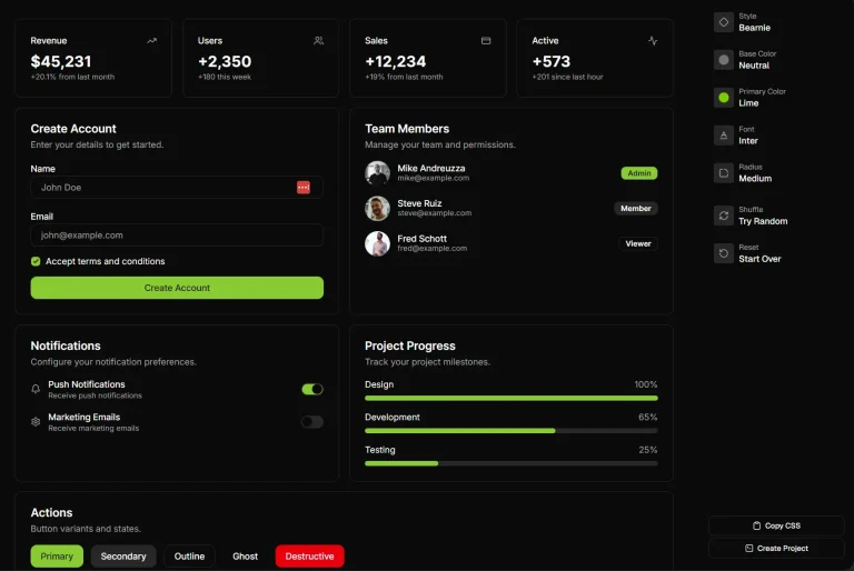
🎨 Components & Blocks: 40+ components including accordions, dropdowns, modals, toasts, buttons, text effects, and UI blocks for pricing, testimonials, and hero sections.
🎭 Theme System: Supports light and dark modes through CSS variables with a dynamic color switcher for runtime theme adjustments.
♿ Accessibility: ARIA attributes, keyboard navigation, and focus management.
🔧 TypeScript Definitions: Includes full type coverage with exported interfaces for props, events, and component state.
🎯 shadcn CLI: Works with shadcn/ui CLInamespace system for component installation and project scaffolding
📦 Modular Installation: Install components individually through CLI commands rather than importing a monolithic package.
Use Cases
- Marketing Landing Pages: Apply animated hero sections, testimonial carousels, and pricing blocks to create modern product pages with motion effects.
- Dashboard UI: Build admin panels with animated dropdowns, modal dialogs, and progress indicators that respond smoothly to user actions.
- Form-Heavy Apps: Implement animated input fields, OTP entry components, and validation feedback with motion-based state transitions.
- Portfolio Websites: Create interactive image galleries, expandable cards, and scroll-triggered text reveals for showcasing creative work.
How to Use It
1. Install components individually through the shadcn CLI. Each component lives under the @smoothui namespace.
pnpm dlx shadcn add @smoothui/basic-accordion
npx shadcn@latest add @smoothui/basic-accordion
yarn dlx shadcn add @smoothui/basic-accordion
bunx shadcn add @smoothui/basic-accordion
2. Import the component from your local components folder. Components require JSX content and configuration through props.
"use client";
import BasicAccordion from "@/components/smoothui/components/basic-accordion";
const FAQSection = () => {
  const items = [
    {
      id: 1,
      title: "What animations does Motion provide?",
      content: (
        <div className="space-y-2">
          <p className="text-gray-600 dark:text-gray-300">
            Motion handles spring animations, layout transitions, and
            gesture recognition for drag and tap events.
          </p>
        </div>
      ),
    },
    {
      id: 2,
      title: "How do I customize colors?",
      content: (
        <div className="space-y-2">
          <p className="text-gray-600 dark:text-gray-300">
            Apply Tailwind utility classes to the className prop or
            modify CSS variables in your global styles.
          </p>
        </div>
      ),
    },
  ];
  return (
    <div className="mx-auto max-w-2xl p-6">
      <BasicAccordion
        allowMultiple={true}
        defaultExpandedIds={[1]}
        items={items}
      />
    </div>
  );
};
3. SmoothUI components accept three customization approaches. Pass Tailwind utility classes through the className prop to modify spacing, colors, and typography. Override CSS variables in your global stylesheet to adjust theme colors and animation timing. Configure component behavior through built-in props.
Available UI Components
Basic UI
- Accordion
- Animated Input
- Animated Progress Bar
- Basic Dropdown
- Searchable Dropdown
- Basic Modal
- Basic Toast
Button
- Button Copy
- Clip Corners Button
- Dot Morph Button
Text
- Wave Text
- Reveal Text
- Typewriter Text
- Scramble Hover
- Scroll Reveal Paragraph
AI
- AI Branch
- AI Input
Others
- Animated OTP Input
- Animated Tags
- App Download Stack
- Apple Invites
- Contribution Graph
- Cursor Follow
- Dynamic Island
- Expandable Cards
- Figma Comment
- Glow Hover Cards
- GitHub Stars Animation
- Image Metadata Preview
- Infinite Slider
- Interactive Image Selector
- Job Listing Component
- Matrix Card
- Number Flow
- Phototab
- Power Off Slide
- Price Flow
- Rich Popover
- Reviews Carousel
- Siri Orb
- Social Selector
- Scrollable Card Stack
- Switchboard Card
- User Account Avatar
Available UI Blocks
- FAQs Blocks
- Footer Blocks
- Hero Blocks
- Logo Clouds Blocks
- Pricing Blocks
- Stats Blocks
- Team Sections Blocks
- Testimonial Blocks
FAQs
Q: Does SmoothUI work with Next.js App Router?
A: Yes. Components include “use client” directives and work in both App Router and Pages Router architectures. Server Components can import and render SmoothUI components that handle client-side interactivity.
Q: Can I modify component source code after installation?
A: Yes. The CLI installs components directly into your project directory. You control the source files and can modify animations, styles, or behavior to match your requirements.
Q: How do I update components to newer versions?
A: Run the shadcn add command again for the specific component. The CLI prompts you to overwrite existing files. Review changes before confirming to preserve any custom modifications.
Q: What bundle size impact do animations add?
A: Motion adds approximately 30KB gzipped to your bundle. Tree shaking removes unused animation features. Installing individual components rather than the full library keeps bundle sizes minimal.
Q: Do components handle mobile touch gestures?
A: Yes. Motion detects touch events and applies appropriate animations for drag, swipe, and tap interactions. Components respond to both mouse and touch input without additional configuration.