The Future of Web Dev
The Future of Web Dev
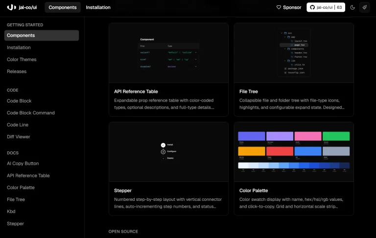
600+ Tailwind CSS Components for HTML, React and Vue – TailGrids
Speed up development with TailGrids. This library offers essential UI components, e-commerce blocks, and dashboard elements powered by Tailwind CSS.

TailGrids is an open-source component library that provides 600+ pre-built Tailwind CSS UI components, blocks, and sections for HTML, React, and Vue projects.
The library hooks into Tailwind’s existing compilation process, so the components inherit your design tokens and configuration without additional bundlers or PostCSS plugins.
Each component renders as static markup styled with Tailwind utility classes. This enables you to maintain full control over responsive behavior, color schemes, and spacing through your standard Tailwind setup.
Features
🧩 600+ Components: Alerts, buttons, forms, navbars, footers, modals, tables, cards, hero sections, pricing tables, testimonials, product grids, dashboards, and authentication layouts across multiple categories.
🎨 Framework Support: Use identical component APIs across HTML, React, and Vue through framework-specific npm packages that share the same plugin architecture.
🔄 Copy-Paste Workflow: Browse the component library, copy markup snippets, and paste them directly into your files with no import statements or component registration required.
🖼️ Figma Integration: Access matching Figma files that mirror the component library for design handoff and prototyping.
Use Cases
- SaaS Admin Panels: Generate complex dashboards using data visualization widgets, sidebars, and table layouts.
- Marketing Websites: Build responsive landing pages quickly by stacking pre-made hero sections, feature grids, and contact forms.
- E-Commerce Storefronts: Create online stores using the dedicated product cards, category filters, and checkout components.
- AI Tool Interfaces: Prototype interfaces for generative AI tools using specific blocks like prompt inputs and result displays.
How to Use It
HTML Setup
Install Tailwind CSS and the TailGrids package in your project directory.
npm install tailwindcss @tailwindcss/cli -D
npm i tailgrids -D
Create an input.css file in your project root and import the TailGrids plugin.
@import "tailwindcss";
@plugin "tailgrids/plugin";
Add a build script to your package.json that compiles the CSS. Adjust the input path if your CSS file lives in a src directory instead of the root.
"scripts": {
  "dev": "npx tailwindcss -i ./input.css -o ./dist/output.css --watch"
}
Run the compilation watcher to generate your output stylesheet.
npm run devLink the compiled CSS in your HTML file’s head section.
<link href="/dist/output.css" rel="stylesheet" />Copy any component markup from the TailGrids library and paste it into your HTML. The Tailwind utility classes render automatically through the compiled stylesheet.
<button class="rounded-lg bg-primary px-6 py-3 text-base font-medium text-white">
  Get Started
</button>
React Setup
Create a new Vite project if you don’t have an existing React application.
npm create vite@latest my-project
cd my-project
Install Tailwind CSS with the Vite plugin and the TailGrids package.
npm install tailwindcss @tailwindcss/vite
npm i tailgrids
Create an index.css file in your src directory and add the TailGrids plugin directive.
@import "tailwindcss";
@plugin "tailgrids/plugin";
Update your vite.config.js to include the Tailwind Vite plugin.
import { defineConfig } from "vite";
import tailwindcss from "@tailwindcss/vite";
export default defineConfig({
  plugins: [tailwindcss()],
});
Start the development server to compile your styles.
npm run devImport the CSS file in your main entry point and begin using TailGrids components. Copy component JSX from the library and paste it into your React files.
function App() { return (
    <div className="container mx-auto px-4">
      <h1 className="text-3xl font-bold">Dashboard</h1>
      <button className="rounded-lg bg-primary px-6 py-3 text-white">
        Add User
      </button>
    </div>
  );
}
Vue Setup
Generate a Vite project configured for Vue.
npm create vite@latest my-project
cd my-project
Install the required dependencies.
npm install tailwindcss @tailwindcss/vite
npm i tailgrids
Create an index.css in the src folder and register the plugin.
@import "tailwindcss";
@plugin "tailgrids/plugin";
Configure Vite to process Tailwind through the plugin.
import { defineConfig } from "vite";
import tailwindcss from "@tailwindcss/vite";
export default defineConfig({
  plugins: [tailwindcss()],
});
Launch the dev server.
npm run devImport your CSS file in your main Vue component and use TailGrids markup in your templates.
<template>
  <div class="container mx-auto px-4">
    <h1 class="text-3xl font-bold">Products</h1>
    <button class="rounded-lg bg-primary px-6 py-3 text-white">
      Add Product
    </button>
  </div>
</template>
All UI Components & Blocks
Core Components
Alerts (11), List Styles (9), Tabs (11), Accordions (5), Form Elements (4), Paginations (6), Buttons (33), Badges (9), Breadcrumbs (12), Progress Bars (4), Checkbox (5), Toast (8), Avatars (12), Toggle and Switch (13), Button Group (3), Dropdown Buttons (4), Tooltips (3), Page Titles (5), Gallery (5), Mega Menus (3), Verification Code Input (4), Sticky Bars (4), Spinners (4), Skeleton (3), Account Dropdown (4), Clipboards (4), Date Picker (4), Time Picker (1).
Application UI Blocks
Error Pages (8), Tables (12), Navbars (8), Auth/Sign In/Up (8), Cookies (4), Table Grids (4), Contacts (14), Footers (7), Cards (16), Blogs (10), Modals (11).
Marketing UI Blocks
Headers & Hero Area (13), Videos (3), Call To Actions (10), Teams (8), Pricing Tables (11), Stats (5), Features & Services (11), Portfolios (7), Testimonials (6), About (13), Brands (8), Newsletter Forms (2).
E-Commerce Blocks
E-Commerce Headers (5), Customer Reviews (5), Featured Products (5), Product Details (5), Checkouts (5), E-Commerce Footers (5), Order Summaries (4), Quick Views (4), Product Grids (9), E-Commerce Navbars (5), Recent Products (5), Product Categories (5), Product Carousels (5), Filters (5), Shopping Carts (4), Wishlists (3), Promo Banner (1).
Dashboard Blocks
Maps (4), Profiles (5), Table Stacks (5), Drawers (2), Dashboard Dropdowns (3), Data Stats (10), Chat Boxes (4), Steps (8), Settings Pages (2), Charts (10), Chat List (3), Popovers (6), Calendars (4), Vertical Navbars (7), Select Box (4), Horizontal Menus (6).
AI Components
AI Navbars (4), AI Hero (6), Prompt to Text Generator (2), Image Generators (4), Code Generators (2), Video Generators.
Related Resources
- Tailwind UI: Official component library from the Tailwind CSS team with premium templates and application UI kits.
- DaisyUI: Component library that extends Tailwind with semantic class names and customizable themes.
- Flowbite: Open-source UI components built with Tailwind CSS for web applications and marketing sites.
- Headless UI: Unstyled, accessible UI components from Tailwind Labs for React and Vue.
FAQs
Q: Can I modify the component styles after copying them into my project?
A: Yes. The components use standard Tailwind utility classes, so you can change any class directly in the markup or override styles through your Tailwind configuration.
Q: Do I need to import components as JavaScript modules?
A: No. TailGrids delivers markup templates that you copy and paste into your files. The plugin handles CSS compilation, but components do not require JavaScript imports or registrations.
Q: Will the components work with my existing Tailwind theme?
A: Yes. Components reference Tailwind design tokens like colors, spacing, and typography.
Q: How do I update to new component versions?
A: Run npm update tailgrids to fetch the latest package. New components and updates appear in the library after you recompile your CSS.
Q: Can I use TailGrids in a Next.js project?
A: Yes. Follow the React setup instructions and adjust the CSS import to work with Next.js App Router or Pages Router conventions.