The Future of Web Dev
The Future of Web Dev
45+ Free, Copy-paste TailwindCSS Components – Joko UI
Build faster with Joko UI's collection of free Tailwind components. Copy complete markup for buttons, forms, cards, and marketing sections instantly.
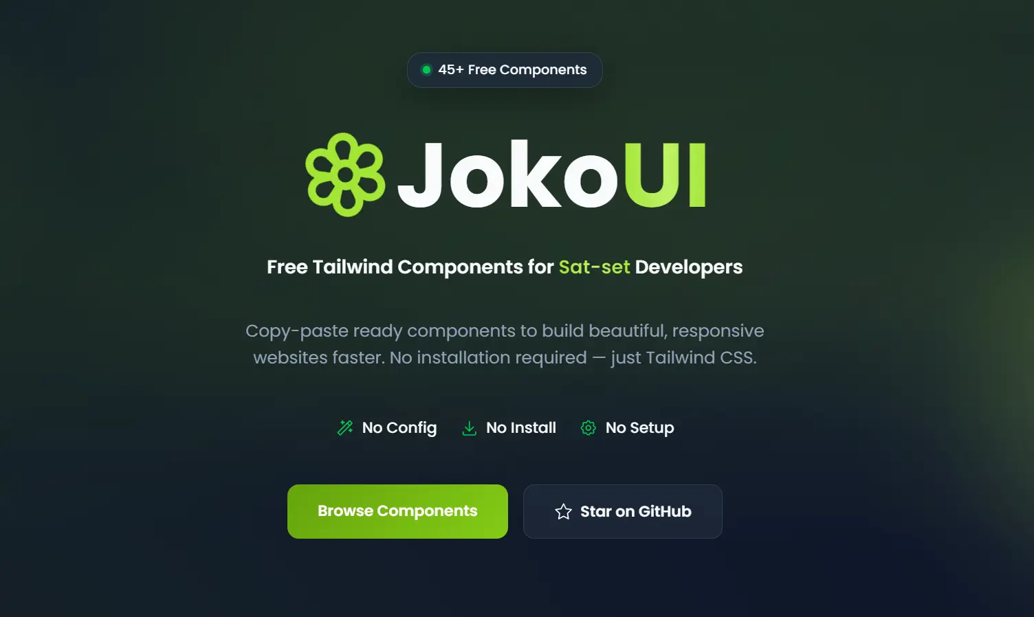
Joko UI is a Tailwind component library that provides a set of ready-to-use, copy-paste Tailwind CSS UI blocks for modern web applications.
The code uses standard Tailwind CSS utility classes without additional Tailwind plugins or configuration.
Features
🚫 Zero Installation: Copy component code directly from the documentation and paste it into your project.
🎨 Native Tailwind Utilities: All components render using standard Tailwind CSS classes without custom configuration or extended theme settings.
📱 Responsive Preview System: Test components across mobile, tablet, and desktop breakpoints before copying code to your project.
🌙 Dark Mode Support: Toggle between light and dark themes in the preview interface to verify component appearance in both modes.
🎯 Marketing Sections: Build landing pages with hero sections, call-to-action blocks, footer layouts, and pricing tables.
📋 One-Click Code Access: Click the code tab or copy button to transfer complete component markup to your clipboard.
Use Cases
- Rapid Prototyping: Developers build functional MVPs quickly by pasting pre-styled blocks into the codebase.
- Marketing Websites: Teams construct landing pages with ready-made hero sections and pricing tables.
- Admin Dashboards: The library structures internal tools using form inputs and data display cards.
How to Use It
1. Your project must have Tailwind CSS configured before you add Joko UI components. If you haven’t installed Tailwind yet, run the following commands in your project directory:
npm install tailwindcss@latest2. Navigate to the Joko UI documentation website and explore the component categories. The library organizes components into Application and Marketing sections. Application components include buttons, forms, cards, and other functional elements. Marketing components cover hero sections, CTAs, pricing tables, and footers.
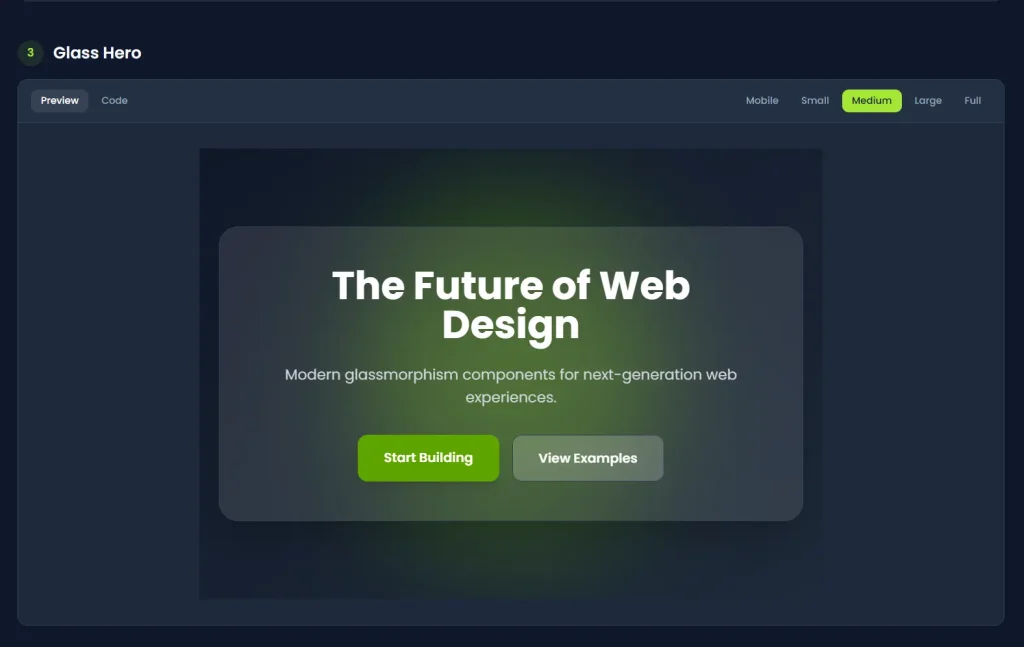
3. Click on any component to open its detail page. The interface displays a live preview that demonstrates how the component appears at different screen sizes.
4. Use the breakpoint toggle to preview the component on mobile, tablet, and desktop layouts. This helps you verify that the component matches your responsive design requirements before you integrate it.
5. If your project implements dark mode, toggle the dark theme option in the preview. The component display updates to show how it renders with dark mode utilities applied.
6. Click the “Code” tab and tap the “Copy Code” button to copy the complete HTML markup. The code includes all necessary Tailwind CSS classes and structural elements.
<section class="py-20 px-6">
  <div class="max-w-4xl mx-auto text-center">
    <h1 class="text-4xl md:text-6xl font-bold text-gray-900 dark:text-white mb-6">
      Build Beautiful Websites
      <span class="text-lime-600 dark:text-lime-400"> Faster</span>
    </h1>
    <p class="text-xl text-gray-600 dark:text-gray-300 mb-8 max-w-2xl mx-auto">
      Free Tailwind CSS components to help you create stunning websites without starting from scratch.
    </p>
    <div class="flex flex-col sm:flex-row gap-4 justify-center">
      <a href="#" class="w-full sm:w-auto px-8 py-4 bg-lime-600 text-white font-semibold rounded-lg hover:bg-lime-700 transition-colors">
        Get Started
      </a>
      <a href="#" class="w-full sm:w-auto px-8 py-4 border-2 border-gray-300 dark:border-gray-600 text-gray-700 dark:text-gray-300 font-semibold rounded-lg hover:border-lime-600 hover:text-lime-600 dark:hover:border-lime-400 dark:hover:text-lime-400 transition-colors">
        Learn More
      </a>
    </div>
  </div>
</section>
7. Paste the copied code into your component file. Modify Tailwind classes directly in the HTML to adjust colors, spacing, or typography:
All UI Blocks
Application Components
- Buttons: 4 button variants covering primary, secondary, outline, and ghost styles.
- Cards: 4 card layouts for content display and information grouping.
- Alerts: 4 alert types, including success, warning, error, and info notifications.
- Forms: 4 form input styles covering text fields, textareas, selects, and checkboxes.
- Badges: 4 badge designs for labels, tags, and status indicators.
- Avatars: 3 avatar components showing user profile images with different sizes.
- Progress: 5 progress bar variants displaying task completion and loading states.
- Skeleton: 4 skeleton loader templates for content placeholders during data fetching.
Marketing Components
- Hero Sections: 3 hero layouts for landing page headers with headlines and call-to-action elements.
- CTAs: 3 call-to-action section designs driving conversions and user engagement.
- Footers: 3 footer templates containing navigation links, social media icons, and company information.
- Pricing: 2 pricing table layouts displaying product tiers and subscription options.
Related Resources
- Tailwind UI: Commercial component library from the Tailwind CSS creators.
- Tailwind CSS Plugin: Discover open-source Tailwind CSS plugins to enhance your project.
FAQs
Q: Does Joko UI require npm installation or configuration files?
A: No. You copy the HTML markup directly from the documentation and paste it into your Tailwind CSS project.
Q: Can I use Joko UI components in React, Next.js, or Vue projects?
A: Yes. Convert the HTML syntax to your framework’s requirements by changing class to className for React and JSX, or adapting the markup to Vue’s template syntax. The Tailwind classes remain identical across all frameworks.
Q: How do I customize component colors and spacing?
A: Edit the Tailwind utility classes directly in the HTML markup. Replace color classes like bg-blue-600 with your preferred colors, and adjust spacing by modifying padding and margin utilities.
Q: Do the components support dark mode automatically?
A: Components include dark mode utilities using Tailwind’s dark: prefix.
Q: Can I modify component structure and layout?
A: Yes. The HTML markup is fully editable. You can add elements, remove sections, nest components, or restructure the layout to match your design requirements.