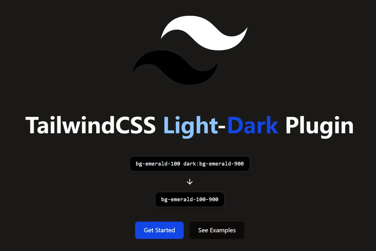
Tailwind Light-Dark is a lightweight Tailwind CSS plugin that generates shorthand classes to handle color variations between light and dark modes. If you find defining separate dark mode classes like dark:bg-gray-800 for every element tedious, this plugin provides a more concise approach.
The core function is to create paired color utilities. You define both the light and dark mode colors within a single class name, such as bg-red-200-700. This class applies bg-red-200 in light mode and bg-red-700 in dark mode automatically.
You can use the plugin to reduce code repetition and makes managing color palettes across different modes simpler, especially for projects requiring distinct light and dark visual styles.
Features
🎨 Shorthand Utilities: Generates concise classes like bg-{color}-{lightShade}-{darkShade} for background, text, border, and more.
🔧 Broad CSS Property Support: Covers utilities for backgrounds, text, borders, fills, strokes, gradients, accents, carets, outlines, shadows, and rings.
🌗 Automatic Mode Switching: Applies the correct color shade based on the active light or dark mode (class strategy required).
⚫⚪ White/Black Shortcuts: Includes convenient pairs like bg-white-black and text-black-white for common inversions.
Use Cases
- Component Theming: Quickly define light and dark mode colors for buttons, cards, and other UI components without writing separate
dark:prefixes for each color property. For instance, usebg-blue-500-700 text-white-blackon a button. - Layout Backgrounds: Easily set background colors for sections or the entire page that adapt to the selected theme. Apply
bg-gray-100-900to your main layout container. - Text and Iconography: Ensure text, links, and SVG icons have appropriate contrast in both light and dark modes using utilities like
text-gray-900-100orfill-current text-primary-500-400. - Consistent Border Styles: Apply adaptive border colors to elements like inputs or containers with classes like
border-gray-300-700.
How to use it:
1. Install the Tailwind Light-Dark plugin with NPM.
# Yarn
$ yarn add tailwind-light-dark

# NPM
$ npm install tailwind-light-dark
2. Import the plugin in your Tailwind CSS projects.
// Tailwind v4+

@import "tailwindcss";

/* Add the plugin */
@plugin 'tailwind-light-dark';

/* Required: Define dark mode based on class */
@custom-variant dark (&:where(.dark, .dark *));

/* Your other CSS... */
// Tailwind v3
// tailwind.config.js
module.exports = {
  darkMode: 'class', // Required
  // ...
  plugins: [
    require('tailwind-light-dark')({ version: 3 }), // Specify version 3
    // ...
  ],
}
3. You can then use the generated utilities directly in your HTML:
<!-- Background color: light red-200, dark red-700 -->
<div class="bg-red-200-700">...</div>

<!-- Text color: light blue-300, dark blue-900 -->
<p class="text-blue-300-900">Some text here.</p>

<!-- White background/black text in light mode -->
<!-- Black background/white text in dark mode -->
<div class="bg-white-black text-black-white">...</div>
4. All utility types generated:
bg-{color}-{lightShade}-{darkShade}text-{color}-{lightShade}-{darkShade}border-{color}-{lightShade}-{darkShade}decoration-{color}-{lightShade}-{darkShade}outline-{color}-{lightShade}-{darkShade}shadow-{color}-{lightShade}-{darkShade}inset-shadow-{color}-{lightShade}-{darkShade}ring-{color}-{lightShade}-{darkShade}inset-ring-{color}-{lightShade}-{darkShade}accent-{color}-{lightShade}-{darkShade}caret-{color}-{lightShade}-{darkShade}fill-{color}-{lightShade}-{darkShade}stroke-{color}-{lightShade}-{darkShade}from-{color}-{lightShade}-{darkShade}to-{color}-{lightShade}-{darkShade}
Special White/Black Pairs:
to-white-black/to-black-whitebg-white-black/bg-black-whitetext-white-black/text-black-whiteborder-white-black/border-black-whitefill-white-black/fill-black-whitestroke-white-black/stroke-black-whitefrom-white-black/from-black-white
Related Resources
- Tailwind CSS Documentation (Dark Mode): Official guide on setting up dark mode in Tailwind CSS. https://tailwindcss.com/docs/dark-mode
- shadcn/ui: Re-usable components built using Radix UI and Tailwind CSS, often requiring manual dark mode class application which this plugin can simplify. https://ui.shadcn.com/
- SkeletonUI: The project that inspired this plugin, offering its own light/dark color pairing system for Svelte + Tailwind projects. https://www.skeleton.dev/
FAQs
Q: Does this work with custom Tailwind colors?
A: Yes, it works with all colors in your Tailwind config, including custom ones.
Q: Can I use different color scales for light/dark modes?
A: Yes, the plugin lets you mix any shades (e.g., bg-green-200-800).
Q: Is there performance overhead?
A: No, the plugin generates standard Tailwind utilities during build.
Q: How does this compare to using @apply with dark: variants?
A: It produces cleaner markup by combining both modes in one class.
Q: Does it support opacity modifiers?
A: Yes, use standard Tailwind opacity syntax (e.g., bg-blue-500-700/80).
Q: How is this different from manually adding dark: prefixes?
A: This plugin reduces verbosity. Instead of writing bg-red-200 dark:bg-red-700, you write bg-red-200-700. This simplifies HTML templates and makes color pairs more explicit.
Q: What CSS properties are supported?
A: The plugin generates utilities for background, text, border, decoration, outline, shadow, ring, accent, caret, fill, stroke, and gradient colors (from- and to-).
Preview