The Future of Web Dev
The Future of Web Dev
FlyonUI: Semantic Tailwind CSS with JS Plugins
The easiest and open-source Tailwind CSS component library with semantic classes.
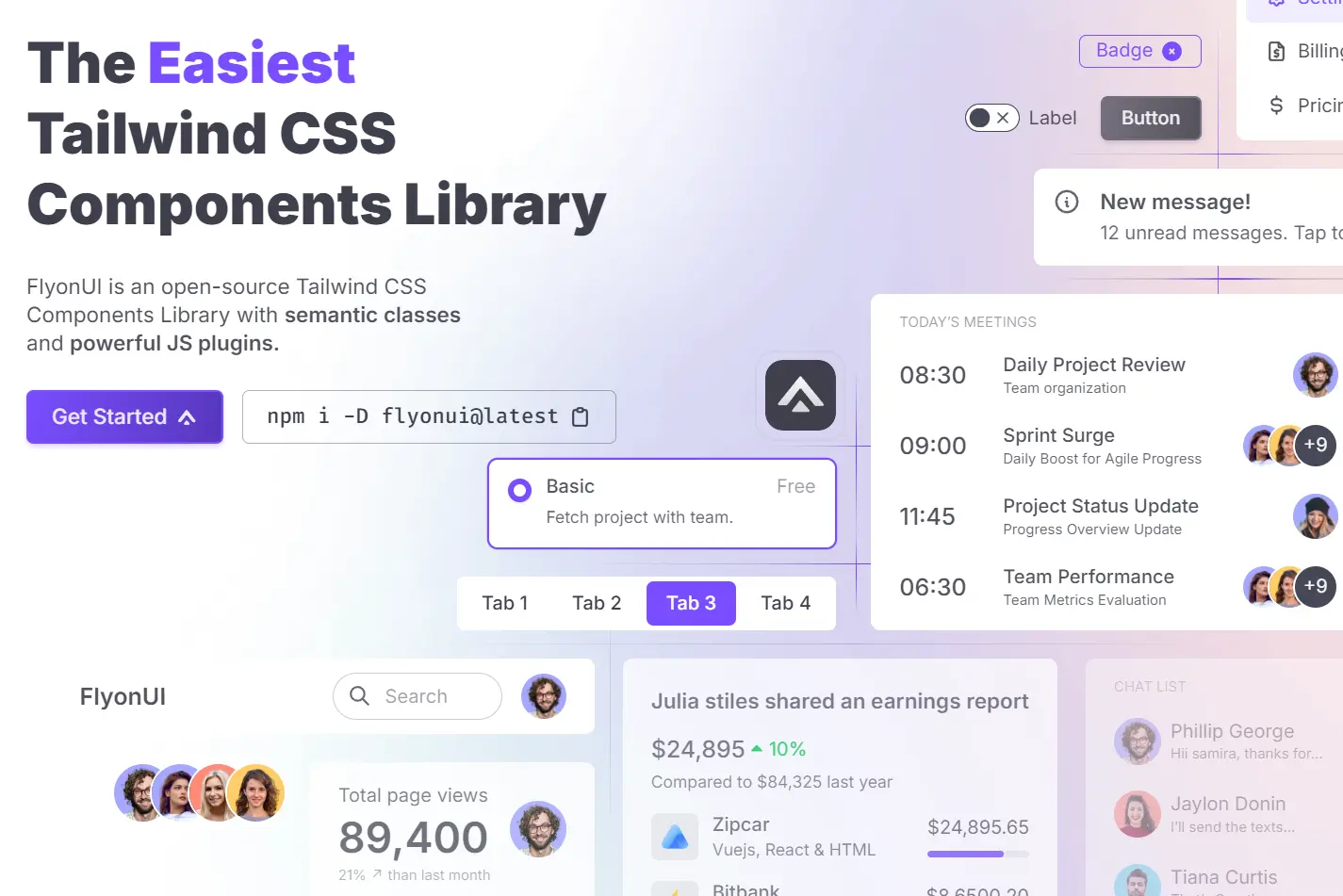
FlyonUI is an open-source Tailwind CSS component library that provides a unique combination of semantic class names and headless JavaScript plugins. It’s built to help web developers and designers create visually appealing, interactive user interfaces with minimal effort.
This library builds on top of Tailwind CSS and DaisyUI, which offer a more organized and maintainable structure while introducing dynamic behaviors with Preline‘s headless plugins. It can be used to enhance the functionality of Tailwind CSS and helps develors build scalable, responsive, and accessible applications.
Features
🎨 800+ pre-built components
🌈 Unlimited theming options
📱 Responsive design with RTL support
🔧 Universal framework compatibility
🧩 Unstyled, accessible plugins
Use Cases
- Rapid Prototyping: Quickly build interactive prototypes using pre-built components and semantic styling. For instance, create a functional landing page with a hero section, feature cards, and a contact form in minutes.
- E-commerce Platforms: Develop engaging product pages with image carousels, accordions for detailed descriptions, and interactive add-to-cart functionality.
- Dashboards and Admin Panels: Construct intuitive interfaces with data tables, charts, and interactive forms for managing data and user interactions.
- Content Management Systems: Empower content creators with user-friendly interfaces featuring rich text editors, image uploads, and customizable layouts.
- Single-Page Applications (SPAs): Build dynamic and interactive single-page applications with smooth transitions and engaging UI elements.
Installation Guide
1. Prerequisites: Make sure you have Node.js and Tailwind CSS installed.
2. Install FlyonUI:
npm install flyonui3. Include FlyonUI in tailwind.config.js:
module.exports = {
  content: ["./node_modules/flyonui/dist/js/*.js"], // For all FlyonUI JS components
  plugins: [
    require("flyonui"),
    require("flyonui/plugin") // For all FlyonUI JS components
  ]
};
For individual components, specify the component’s JavaScript file:
  module.exports = {
    content: ["./node_modules/flyonui/dist/js/accordion.js"]
  };
4. Include FlyonUI JavaScript in HTML: Add the following script tag before the closing </body> tag:
<script src="../node_modules/flyonui/flyonui.js"></script>For individual components:<script src="../node_modules/flyonui/dist/js/accordion.js"></script>Usage Guide
FlyonUI components are easily integrated using semantic classes. For example, to create an accordion:
<div class="flyon-accordion" id="my-accordion">
  <div class="flyon-accordion-item">
    <h2 class="flyon-accordion-header" id="heading-1">
      <button class="flyon-accordion-button" type="button" data-bs-toggle="collapse" data-bs-target="#collapse-1" aria-expanded="true" aria-controls="collapse-1">
        Accordion Item #1
      </button>
    </h2>
    <div id="collapse-1" class="flyon-accordion-collapse collapse show" aria-labelledby="heading-1" data-bs-parent="#my-accordion">
      <div class="flyon-accordion-body">
        Accordion content goes here...
      </div>
    </div>
  </div>
  </div>
</div>
FAQs
What’s the advantage of using FlyonUI over just DaisyUI?
FlyonUI extends DaisyUI by adding interactive JavaScript functionality through Preline plugins, enabling more dynamic user interfaces.
Can I use FlyonUI with React or Vue?
Yes, FlyonUI is framework-agnostic and compatible with any framework that utilizes Tailwind CSS.
How do I customize the appearance of FlyonUI components?
FlyonUI offers theming capabilities to modify the look and feel of your application’s components. Consult the documentation for detailed instructions.
Does FlyonUI follow accessibility guidelines?
Yes, accessibility is a core principle of FlyonUI, and components are designed to meet accessibility standards.
