The Future of Web Dev
The Future of Web Dev
Open-source Gradient Generator for TailwindCSS & Vanilla CSS
Interactive gradient generator for TailwindCSS and vanilla CSS. Create linear and radial gradients with live preview, pattern overlays, and one-click copy functionality.
Gradient Generator is an interactive online tool that enables you to create, customize, and export CSS gradients for both TailwindCSS and vanilla CSS projects.
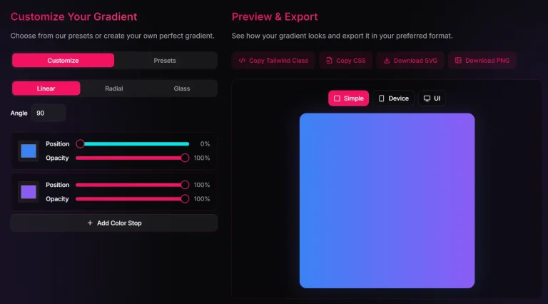
You don’t fight with complex menus. You just adjust colors, directions, and stops in real time, then copy the code directly.
Features
⭐ Live gradient preview: Real-time visual feedback as you adjust colors, directions, and stops.
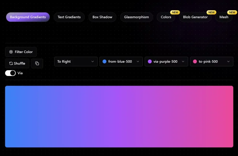
📦 Dual CSS output: Generate both vanilla CSS and TailwindCSS classes instantly.
🎨 Multiple gradient types: Switch between linear and radial gradients with full directional control.
🖼️ Custom color stops: Add, remove, and precisely position multiple color stops.
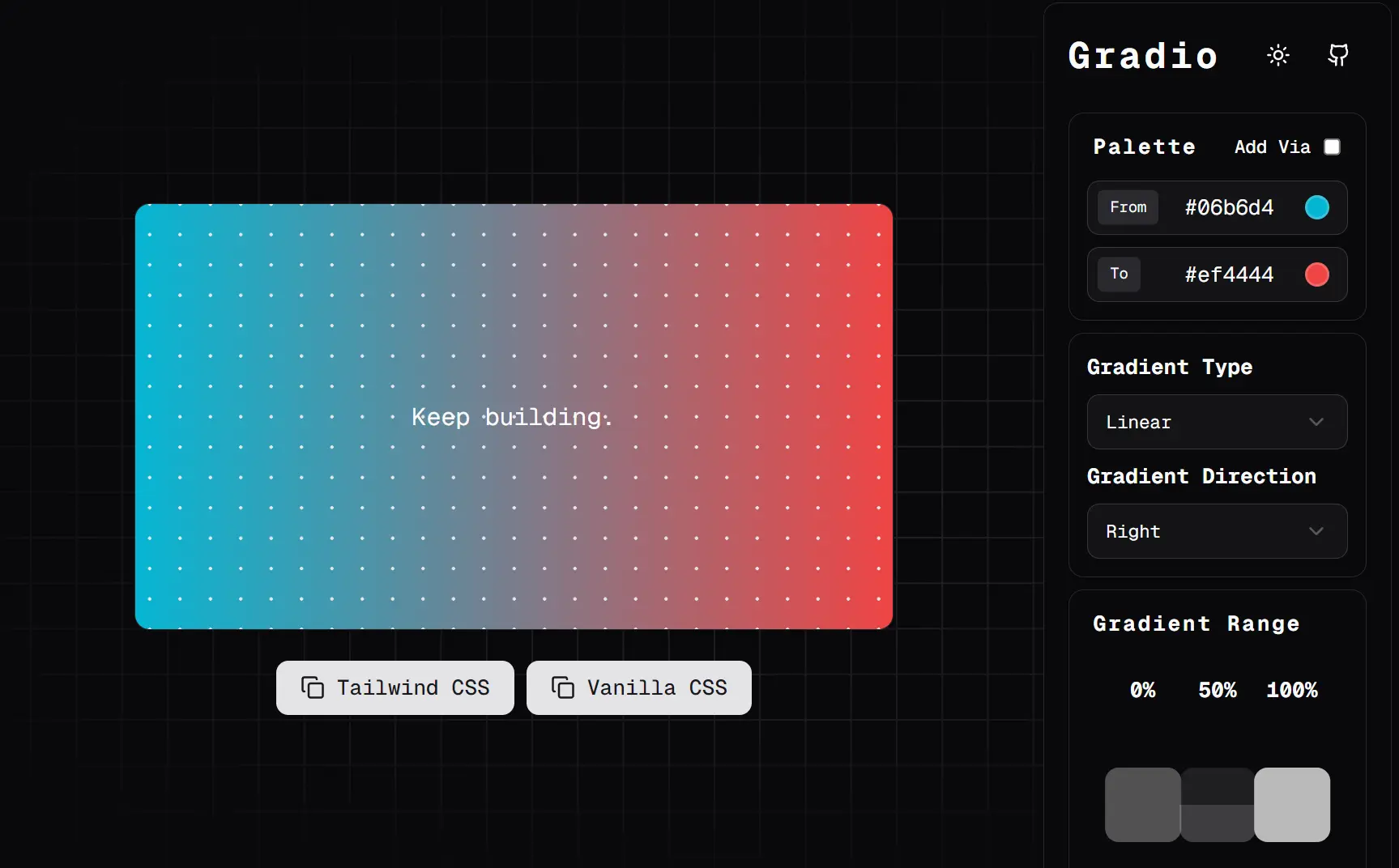
⭐ Pattern overlays: Apply grid or dot patterns on top of gradients for enhanced visual effects.
👤 One-click copying: Copy generated CSS directly to the clipboard without manual selection.
How to Use It
1. Open the tool and pick colors from the pickers on the side. For linear gradients, drag the direction slider to set angles like 45deg or 180deg. Switch to radial with the toggle, then adjust the shape to circle or ellipse.
2. For overlays, check the grid or dots box. Adjust size and opacity sliders. Grids work well at 10px spacing for subtle texture, but dots at higher opacity can overwhelm dark gradients.
3. Once set, hit Vanilla CSS for something like:
background-image: radial-gradient(circle, #e5e7eb 1px, transparent 1px), radial-gradient(circle, #e5e7eb 1px, transparent 1px), linear-gradient(to right, #06b6d4 0%,#ef4444 100%);
background-size: 20px 20px, 20px 20px, cover;
background-repeat: repeat, repeat, no-repeat;
background-position: center, center, center;
Or Copy Tailwind CSS:
<div class="relative bg-[linear-gradient(90deg,#06b6d4,#ef4444)] h-[100vh] w-[100vw]">
<div class="absolute inset-0 bg-[radial-gradient(circle,#e5e7eb_1px,transparent_1px)] bg-[size:20px_20px]"></div>
</div>
FAQs
Q: Can I use the generated gradients in production projects?
A: Yes, the tool generates standard CSS that works in all modern browsers. The vanilla CSS output uses widely supported gradient syntax, and the TailwindCSS output creates standard CSS that integrates cleanly with Tailwind projects.
Q: Do the pattern overlays work on mobile devices?
A: Yes, the CSS-generated patterns are fully responsive and work across all devices. The patterns use background-image properties that scale appropriately with the container size.
Q: Does the generated Tailwind CSS work with older versions?
A: The generated Tailwind code uses arbitrary value syntax (e.g., bg-[linear-gradient(...)]). This feature is enabled by default in Tailwind CSS v3.0 and later. If you’re on an older version, you’ll need to stick to the vanilla CSS output and potentially add it to your custom CSS files.
Q: How are the grid and dot overlays implemented in the CSS?
A: The tool generates a multi-layered background-image. The first layer is your color gradient, and the second layer is another linear-gradient or radial-gradient function that creates the pattern.
Q: Is there any performance impact from using complex gradients?
A: Generally, no. Modern browsers are highly optimized for rendering CSS gradients. Unless you’re animating multiple, extremely complex gradients with many color stops simultaneously, you won’t notice any performance issues.