The Future of Web Dev
The Future of Web Dev
Accessible Astro Component Library with Full Code Control – Starwind UI
Build Astro apps faster with Starwind UI's collection of accessible components. Full source code control and Tailwind CSS support included.

Starwind UI is a collection of accessible, customizable components designed for Astro projects using Tailwind CSS. It helps create modern, accessible user interfaces with a high degree of customization and control over the final output.
This approach means you truly own the code. A user-friendly CLI tool allows you to integrate component code directly into your Astro projects. This offers complete control over the implementation, permitting modifications to suit your project’s specific requirements. You can customize every aspect of each component, from its styling to its functionality.
Features
🚀 Astro Integration – Native .astro files that fully utilize Astro’s component architecture.
🔍 TypeScript Support – Complete type definitions for better development experience.
🌓 Dark Mode Support – All components work perfectly in both light and dark themes.
📝 Source Control – Full access to component source code for complete customization.
🎨 Tailwind CSS – Modern styling with all the latest Tailwind CSS features.
♿ Accessibility Focus – Screen reader friendly and keyboard navigable components.
⚙️ CLI Installation – Simple command-line tool to add components to your project.
🧩 Consistent Patterns – Familiar structure across all elements for easier learning.
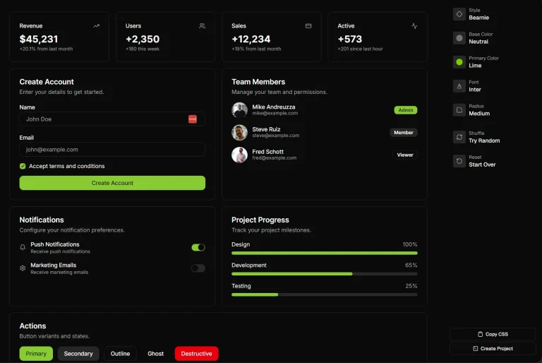
See It In Action
Use Cases
- Custom Design Systems: Build a unique design system for an Astro project where precise control over component appearance and behavior is necessary.
- Accessible Web Applications: Develop web applications that meet accessibility standards by using components designed with keyboard navigation and screen reader support from the ground up.
- AI-Assisted Development: Integrate Starwind UI with AI coding assistants using the provided reference files and MCP server to speed up UI development.
- Rapid Prototyping with Astro: Quickly assemble UI prototypes in Astro projects using a base set of components that can be easily modified and extended.
- Learning Astro and Tailwind CSS: Developers can inspect and modify the component source code directly, offering a practical way to learn how Astro components and Tailwind CSS can work together.
Installation
1. Start a new Astro project or use an existing one.
pnpm create astro@latestFollow the prompts to configure your base Astro project.
2. Add the following path resolution to your tsconfig.json file:
{
  // ...
  "compilerOptions": {
    "baseUrl": ".",
    "paths": {
      "@/*": ["src/*"]
    }
  }
}
3. If you use pnpm, create a .npmrc file in your project root:
auto-install-peers=true
node-linker=hoisted
lockfile=true
4. Use the starwind init command to initialize the project configuration. This creates a starwind.config.json file, adjusts your astro.config.mjs file, and installs dependencies.
pnpx starwind@latest initYou can choose to manually install dependencies later if you opt out during this step.
5. Import the starwind.css file into your main layout file (e.g., src/layouts/Layout.astro):
---
// style import
import "@/styles/starwind.css";
---
<!-- layout code... -->
For manual installation, you would skip step #4 and instead create starwind.config.json, install dependencies, edit astro.config.mjs, and create src/styles/starwind.css as detailed in the official documentation.
Usage
After installation, you can add components to your project using the CLI. For example, to add a Button component:
pnpx starwind@latest add buttonThe command adds the Button component to your project. You can then use it in your Astro files:
---
import { Button } from "@/components/starwind/button";
---
<html lang="en">
<head>
<title>Astro</title>
</head>
<body>
<Button>Hello World</Button>
</body>
</html>
Components support class overrides using the class prop. This allows customization without modifying the source code directly if preferred for minor adjustments.
---
import { Button } from "@/components/starwind/button";
---
<Button>Default Button</Button>
<Button class="bg-purple-700 text-white hover:bg-purple-800 rounded-full">Custom Button</Button>
Theming is managed through CSS variables defined in src/styles/starwind.css. You can customize these variables or add new themes to alter the appearance of components across your project.
Related Resources
- Astro Official Documentation: The primary resource for learning about the Astro framework.
https://docs.astro.build/ - Tailwind CSS Official Documentation: Comprehensive guide to Tailwind CSS, its utility classes, and configuration.
https://tailwindcss.com/docs - Starwind UI AI Reference Files: Files specifically for AI tools and assistants, providing information about Starwind UI in a structured format.
Overview: https://starwind.dev/llms.txt
Comprehensive: https://starwind.dev/llms-full.txt
FAQs
Q: How does Starwind UI differ from other component libraries?
A: Starwind UI gives you direct access to component source code rather than providing a package dependency. This means you have complete control over implementation and can modify code to fit your specific needs.
Q: Do I need to know Tailwind CSS to use Starwind UI?
A: Basic familiarity with Tailwind CSS will help you customize components, but the components work out of the box without modifications.
Q: Is there a way to automate component updates when Starwind UI releases new versions?
A: The Starwind CLI provides an update command to manage component versions, though since you own the code, updates are optional.
Q: How does theming work with Starwind UI?
A: Starwind UI uses CSS variables for theming, making it easy to create custom color schemes or toggle between light and dark modes.